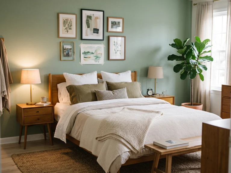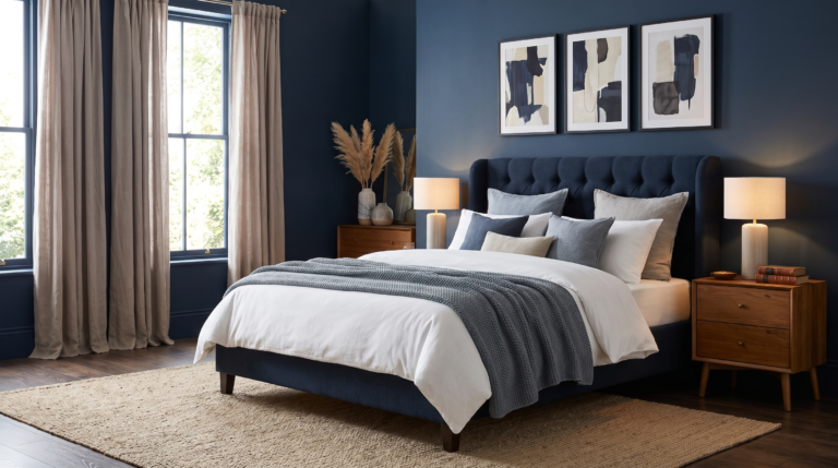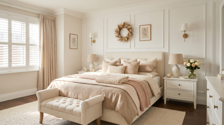
14 Bedroom Color Schemes That Actually Work Together
Choosing a bedroom color scheme is where most people get stuck. Standing in front of a wall of paint chips, holding four that all look fine on their own, with no idea which ones belong together.
The shortcut is to stop picking colors and start picking a ratio. One color for most of the room, a second for the bigger soft things like bedding and curtains, and a third that shows up only in small doses. Three is usually the ceiling. Anything past that and a bedroom starts to feel busy instead of restful, which is the opposite of what the room is for.
The other rule worth knowing is that undertones matter more than shades. A warm gray beside a cool white looks off even when both colors are lovely on their own.
The schemes ahead cover coastal blues, earthy neutrals, moody dark wood, tonal single-color rooms, and a few bolder mixes. Each one explains why the combination holds together, not just what’s in the photo.
1. Unwind by the Sea
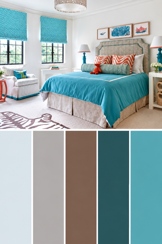
Blue and white is the safest coastal pairing there is, and also the most predictable. Adding sandy brown is what lifts it out of the ordinary, because the third color gives the palette somewhere warm to land.
A light blue duvet is the natural place to start, since the biggest soft surface in the room sets the tone for everything else. From there the brown carries through a bolster pillow, the headboard, the bed skirt, and a few picture frames. That repetition is what makes a scheme read as planned rather than accidental. One small hit of burnt orange in the pillows keeps it from feeling like a hotel room. Waking up in a room like this on a bright morning feels a little like being on holiday.
Best suited for coastal homes, guest rooms, and anyone who finds blue restful.
2. Earthy Inspiration

Trade the sea air for something warmer and the palette gets simpler. White walls with brown running through the furniture is about as easy as a two-color scheme gets, and it still reads as a proper decision rather than a default.
White does the heavy lifting on light. It keeps a bedroom bright in the morning and calm at night, which is exactly what the room needs to do. Brown then stops it going clinical, showing up on the bed frame, the nightstands, and a footboard bench so the warmth sits at different heights. A gray rug adds quiet texture underfoot, while an abstract print and a pair of odd little table lamps keep the whole thing from looking like a showroom.
That rare balance of relaxed and put-together.
💡 Pro Tip: Repeat the wood tone in at least three places around the room. One wooden piece against white walls reads as an accident, while three related pieces read as a deliberate scheme.
3. Moody with Dark Wood

Push that same wood tone much darker and the whole room changes character. Pale gray and white walls with deep brown on the trim, window frames, and doors gives a bedroom weight without turning it into a dark room.
The contrast is doing all the work. Light walls keep the space open, while the dark wood outlines every edge and gives the eye something solid to hold onto. Putting the brown on architectural details rather than large surfaces is what keeps it from feeling heavy. A distressed nightstand adds a little farmhouse character, and small hits of blue in the pillows break up the gray so it doesn’t go flat. Rooms like this look best in the evening, once the lamps are on and the dark frames start reading as shadow.
The finishes catch light differently through the day.
4. Country Charm

Soften those dark edges and a gentler version takes over. Warm gray on the walls paired with cool brown gives a bedroom balance that neither color could manage alone, since one adds warmth while the other pulls it back. For another softer approach to bedroom color, these pink bedroom ideas show how gentle tones can completely change the mood of a space.
A stone wall is what makes this scheme interesting. The gray tones in natural stone cool the room down slightly, and the rough surface adds character no flat paint can copy. Black then sharpens everything through the bed frame and the architectural details, which is what stops a country room drifting into something dated. A crisp white table lamp keeps it current. The artwork matters more than it looks like it should, because pulling the same grays and browns into a print is what keeps the walls from feeling bare.
A room that gets better the longer you sit in it.
👉 Suggestion: Look for artwork that repeats at least two colors already in the room, in a matte or textured finish rather than high gloss. Matte surfaces sit comfortably beside stone, while shiny frames fight the natural texture.
5. Cottage Capture

Strip the stone back out and white takes over completely. A white cottage bedroom sounds plain on paper, and it stops being plain the moment a pair of colors arrives to play against it.
Blue and pink together are the surprise here. They sit opposite each other in temperature, so one cools while the other warms, and the balance keeps either from taking over. Keeping both shades bright but not fully saturated is what makes the room feel lively rather than loud. The colors land on the bed, an ottoman, and a nightstand, with a patterned pink rug making the boldest move in the room. White on the walls and floor keeps everything relaxed. It’s the sort of bedroom that feels cheerful before the coffee has even been made.
The whole room feels lighter for it.
6. Neutral Retreat

Pull all that color out and warmth has to come from somewhere else. A deep, richly toned gray on the walls does it, giving a neutral bedroom real depth instead of the flat beige most neutral rooms settle for.
Darker neutral walls work because they push lighter pieces forward. A white headboard, white table lamps, and pale nightstands stand out clearly against them, which is why the room looks arranged rather than empty. Small amounts of brown and cream in the bedding and on the floor add the warmth, keeping the gray from reading cold. Nothing here shouts, and that’s the appeal. Rooms this quiet are the ones people actually sleep well in, especially after a long week.
A setup that turns any evening into a slow one.
7. Blue Hues

Bring color back in and blue is the one most people reach for first. There’s a good reason for that, since blue reads as restful to almost everyone, and a bedroom built around a few shades of it feels like a genuine break from a busy day.
Layering the shades is what keeps it from going flat. A striped bolster pillow and patterned pillows set the palette, then blue art, a blue and gray striped rug, a light blue nightstand, and a table lamp carry it around the room. White shiplap walls behind all of it make the blues look stronger by contrast. Neutral bones with color in the details is a scheme that survives changing your mind, since swapping pillows costs almost nothing.
Easy to decorate around as tastes change.
💡 Pro Tip: Use three shades of blue at different depths rather than three that sit close together. Light, mid, and deep read as intentional layering, while three near-identical blues just look like a failed attempt to match.
8. Stand Out with Black and Gold
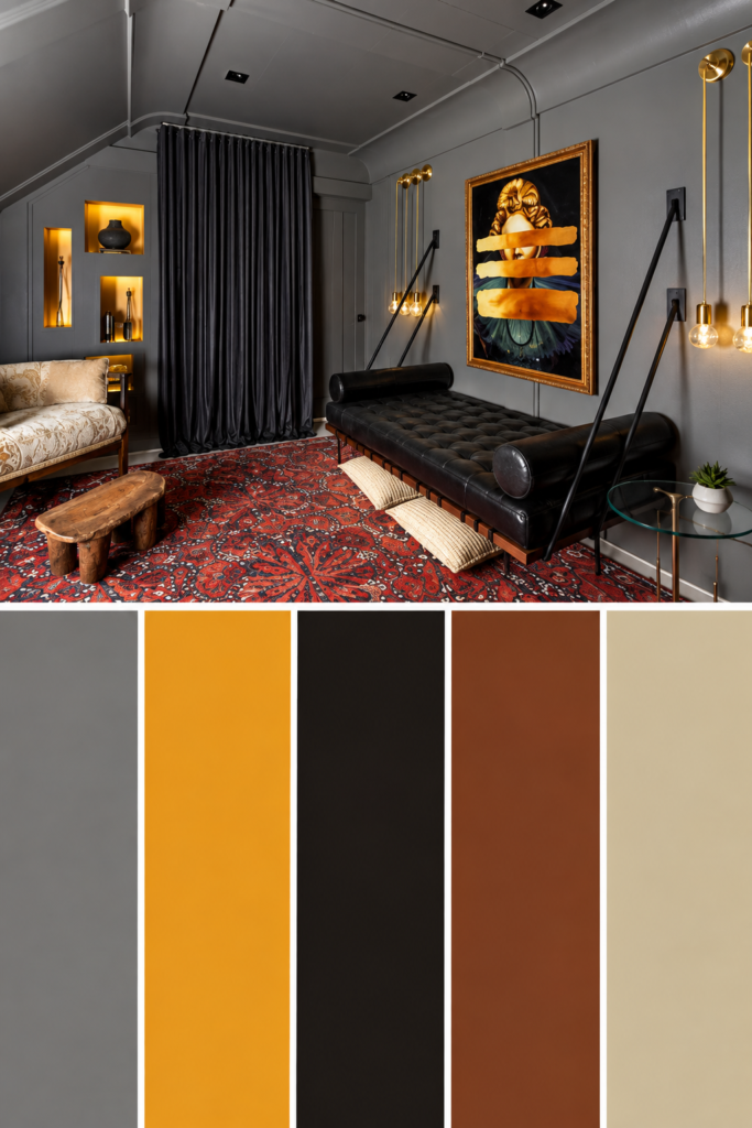
Now for something bolder. Gray and black in a bedroom could easily go grim, and gold is what stops that from happening, because warm metal against dark color reads as drama rather than gloom. If you like this darker, more glamorous direction, these black and gold bedroom ideas offer plenty of inspiration for balancing both shades.
Gold works here for a simple reason. It’s the only thing in a dark scheme that actively throws light back into the room, so it lifts everything around it. A red area rug pushes the contrast further and adds warmth at floor level where dark rooms need it most. The black then brings structure through a sleek, compact bed frame, giving the room clean lines to sit against all that softness. Rooms like this feel deliberate the moment someone opens the door.
The kind of space that shows how much mood matters.
9. Have Fun with Patterned Walls

A quieter version of that same boldness puts the interest on the walls instead of the palette. Brown and gray patterned wallpaper keeps a bedroom calm while still giving it something to look at, which is a harder balance than it sounds.
Grayed-down colors are the reason this works. Muted shades hold pattern well because nothing competes for attention, so the walls read as texture rather than noise. Bright yellow on a footboard bench, an ottoman, and the wall art is what stops the room going sleepy, and a little goes a long way. Blue-gray on the bedspread and pillows bridges the gap between the pale walls and that yellow, which is the detail most people would miss. Getting dressed in a room with this much going on somehow still feels calm.
Sometimes the quietest details do the loudest work.
💡 Pro Tip: Pick your accent color from a shade already sitting inside the wallpaper pattern. Pulling the color out of the paper rather than adding a new one is what makes a bold accent feel like it belongs.
10. Make a Statement
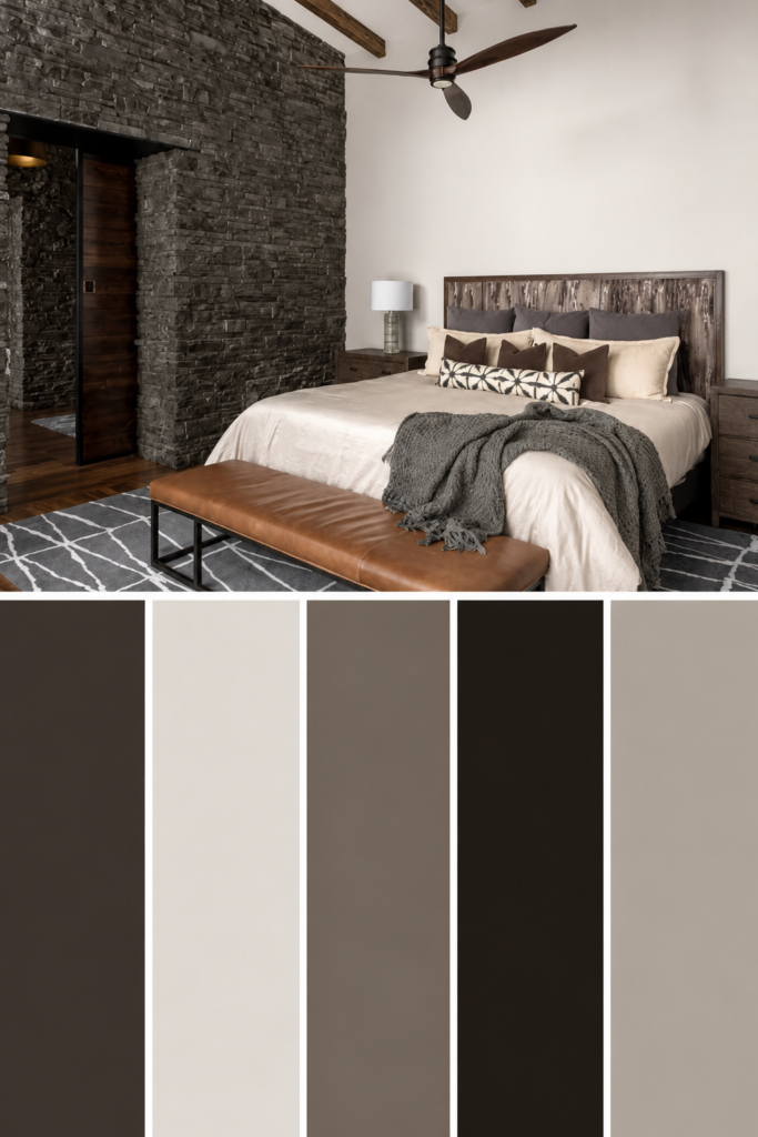
Swap the pattern for raw texture and a neutral room can still command attention. A dark gray stone wall behind the bed brings character to a gray and brown scheme that flat paint would never manage on its own.
Stone works because it changes with the light. The uneven surface catches shadow through the day, so the wall looks different at breakfast than it does at bedtime, and that movement is what keeps a neutral palette from feeling static. A creamy bedspread gives the eye somewhere soft to rest against all that hard surface. Earthy brown on a bench and the flooring adds restrained color at the edges, which keeps the room warm without introducing anything new. Nobody walks past a wall like this without touching it.
Made for homes with good bones and a bit of architectural character.
11. Let Your Bedding Take Point

Forget the walls entirely for a moment. The bed covers more of a bedroom than any other surface, so putting the color there is the fastest and cheapest way to build a scheme from scratch.
Pink, blue, and white across the bedding sets the whole palette in one purchase. From there the rule is simple: pull one color out and repeat it somewhere small. Blue books, a wall-mounted key holder, and a rustic drum do that job here, and the repetition is what turns a colorful bed into an actual scheme. Warm gray walls with crisp white trim and closet doors hold everything together in the background. Best of all, changing the whole look later means buying a duvet cover rather than a can of paint.
A smart pick for renters and anyone who likes changing things often.
👉 Suggestion: Choose a duvet with at least three colors in it rather than a single-color set. A multicolor bedspread hands you a ready-made palette, and matching accessories to colors already in the fabric is far easier than picking them from scratch.
12. Utilize Architectural Features

Some bedrooms hand you the answer before you start. A fireplace nook, a built-in alcove, or a recessed wall is already asking for color, and painting just that feature is often smarter than painting the whole room.
Soft gray walls step back deliberately here, letting a cottage-style fireplace nook take the spotlight in a deep Air Force blue. Concentrating color in one architectural spot gives the room a clear focal point without committing four walls to a bold shade. A red pillow and an orange throw warm the blue up from across the room, and those warm tones are what keep the whole thing feeling welcoming. A dark wood ceiling beam ties it back to the farmhouse look. Rooms with features like this always feel like they came with the house.
Proof that small choices carry the biggest weight.
13. Stick to One Color

The opposite approach also works, and it works beautifully. Committing to a single color across the walls, curtains, headboard, chair, and rug creates a room with no visual interruptions at all, which is why it feels so calm to be in. For a more elevated take on this idea, these boujee bedroom ideas show how thoughtful details can make a bedroom feel polished without overwhelming it.
Monochrome schemes rely on shade variation rather than color variation. Light blue on one surface, deeper blue on another, all in the same family, gives the eye somewhere to travel without ever leaving the palette. A patterned rug carrying small amounts of yellow keeps the floor grounded and stops the blue from going endless. White on the bedding, a footboard bench, and the curtains gives visual relief where the room needs to breathe. Rooms this consistent take real discipline to shop for, and they look it.
One of those setups where every piece earns its place.
💡 Pro Tip: Vary the texture heavily when using a single color. Velvet, linen, wool, and painted wood in the same blue read as five different tones under natural light, which is what saves a monochrome room from looking flat.
14. Start from the Bed

Loosen that grip on a single shade and there’s an easier place to begin. The headboard sits at eye level and fills the wall behind the bed, so building a palette outward from it takes most of the guesswork out of the process.
A textured headboard that blends into brown-gray walls sets a quiet foundation, which is exactly what you want from the largest piece in the room. Starting here works because everything chosen afterward has something to answer to instead of floating on its own. Wall-to-wall gray carpet anchors the floor and keeps the base tones consistent. Light blue then arrives in small doses through a blanket, the pillows, and a pair of table lamps, adding color without weight. It’s the kind of room that stays easy on the eyes at the end of a long day.
A reminder that good design starts with how a space feels.
Frequently Asked Questions
What color scheme is best for sleep?
Muted, low-contrast schemes work best. Sleep improves in rooms that feel visually quiet, so soft blues, warm grays, sage, and deep neutrals all suit a bedroom better than bright, high-contrast combinations. Keeping the walls and bedding within a few shades of each other reduces the visual noise. Save any bold color for small accents rather than large surfaces.
What colors make a small bedroom look bigger?
Pale, warm shades open a room up most reliably, but deep colors can work too. Light walls with light bedding blur the edges of a room, which is what creates the sense of space. Painting all four walls plus the trim in one color also works in tight rooms, since a single accent wall visually chops the space. Keeping the ceiling lighter than the walls helps either way.
How do you pick a bedroom color scheme for a north-facing room?
Lean warm. North-facing rooms get cool, flat light all day, so blue-based colors turn gray and can look dingy by afternoon. Warm shades with yellow, red, or brown in them hold their color much better, which is why cream, camel, terracotta, and warm greige suit these rooms. Warm bulbs around 2700K make a noticeable difference after dark.
What bedroom color scheme works with dark wood furniture?
Warm neutrals and soft greens work best beside dark wood. The furniture is already carrying weight and warmth, so cool gray walls tend to fight it and make the wood look orange. Cream, oatmeal, sage, and warm greige sit comfortably alongside walnut and espresso tones. Repeating the wood tone in a frame or a shelf helps it look chosen rather than inherited.
What should you avoid when choosing a bedroom color scheme?
The most common mistake is mixing warm and cool undertones without noticing. A cool gray next to a creamy warm white looks off even though both colors are fine on their own. Testing samples side by side in daylight makes the clash obvious before any paint gets bought. The second mistake is spreading colors evenly instead of letting one clearly dominate.
Conclusion
A good bedroom color scheme is less about finding the perfect shade than about how the colors behave together. One color leading, a second supporting, and a third showing up in small doses is what separates a room that feels planned from one that feels collected by accident. That structure works no matter which direction you go. Coastal blue and sand, earthy white and brown, moody dark wood, or a single tonal color running through everything.
Pick one scheme, not fourteen. The bedding is the easiest place to start, because it covers the most surface area and costs far less than repainting if the colors turn out wrong. Save your favorite to a Pinterest board, bookmark this for the next free weekend, and send it to a friend still holding four paint chips they can’t choose between. The right scheme makes a room feel finished, and it usually starts with one decision.