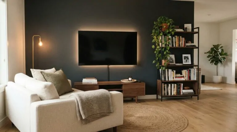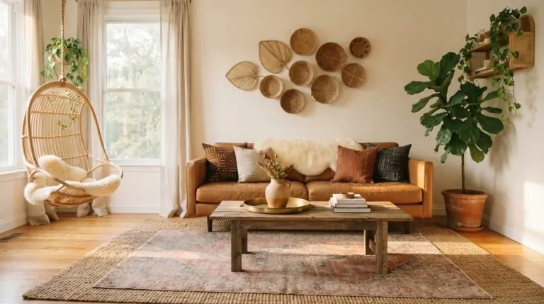
20 Brown and Cream Living Room Ideas That Feel Warm and Timeless
Brown and cream might be the most underrated color pair in home decor. It never shouts, never dates itself, and somehow makes a living room feel calm and grown-up at the same time. Think warm walnut wood against soft oatmeal linen, or a chocolate accent wall behind a cream bouclé sofa. The combo works because brown brings the depth and cream brings the breathing room. One grounds the space, the other keeps it from feeling heavy.
What makes this palette so easy to live with is how forgiving it is. Sunlight shifts it warmer through the afternoon. Lamplight turns it richer at night. And it plays nicely with almost any style, from modern boho to mid-century to full-on lodge cozy.
The 20 ideas ahead cover accent walls, patterned rugs, lighting tricks, texture layering, and a few unexpected accent colors that look surprisingly good next to brown. Some are weekend-simple. Others are worth saving for a bigger refresh. All of them make a room feel like the kind of place people settle into and stay a while.
1. Modern Boho
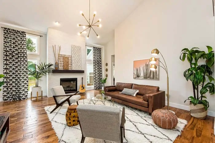
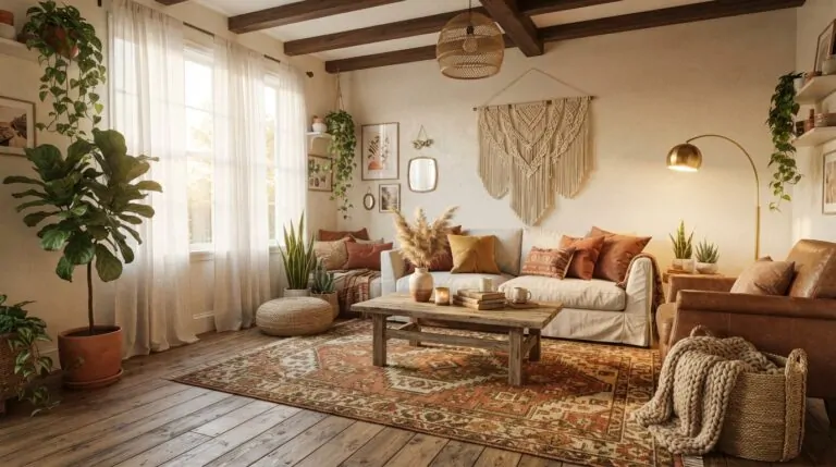
Brown and cream were basically made for boho. A cream bouclé sofa layered with clay-brown pillows, a rattan chair in the corner, and a jute rug underfoot gives that relaxed, collected-over-time feel without the clutter boho sometimes brings.
The reason this version works is restraint. Modern boho keeps the shapes clean and lets texture do the talking, so you get woven baskets and macramé without the room looking like a craft fair. Stick to two or three brown tones (walnut, terracotta, tobacco) against a cream base and everything reads intentional. Hang a few trailing plants and the whole thing softens instantly. It’s the kind of living room where people kick off their shoes within about thirty seconds of walking in.
2. Try a Brown Accent Wall
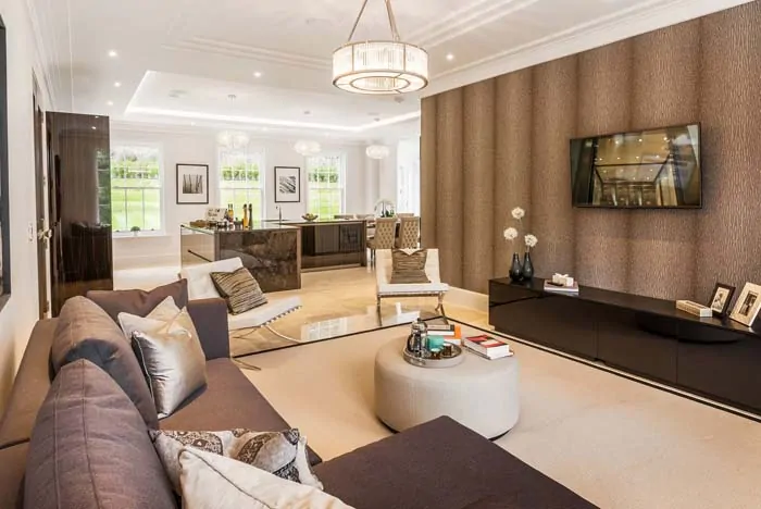
One brown wall changes a room faster than almost anything else you can do in a weekend. Pick the wall behind the sofa or the one framing the fireplace, then go deeper than feels comfortable. Chocolate, espresso, or a soft cocoa all work. Keep the other three walls cream and the dark side reads as intentional depth instead of a mistake.
Here’s why it works: dark colors pull back visually, so that wall recedes and everything sitting in front of it (cream cushions, brass frames, a pale lampshade) suddenly looks sharper. It’s the same reason gallery walls often use moody backdrops.
Matte or eggshell finishes are more forgiving than gloss, which shows every roller mark. Come evening, that wall glows instead of going flat.
3. Use an Area Rug with a Pattern
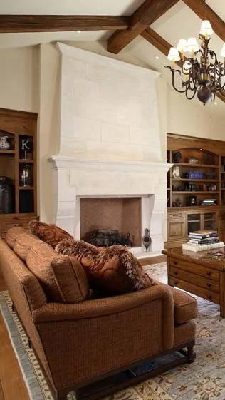
Solid rugs are safe, but a patterned one is what keeps a brown and cream room from feeling like a hotel lobby. A vintage-style Persian in rust and cream, a subtle geometric in two shades of tan, or even a faded kilim gives your eye somewhere to land.
Pattern also hides life. Crumbs, paw prints, the spot where someone dropped coffee last spring. Busy rugs forgive all of it, which matters more than most people admit when they’re picking one out.
Size it generously so the front legs of your seating sit on it, otherwise the room feels chopped up. Pull one color from the rug and echo it in a pillow or a piece of art.
4. Brown and Cream in a Sunny Room
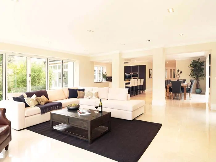
South-facing rooms do something generous to this palette. Morning light keeps cream looking crisp and clean, then the afternoon sun rolls in and everything turns golden. Brown leather softens to caramel. Cream walls pick up a faint honey tint. Nothing looks washed out because brown holds its weight even in strong light.
The trick in a bright room is going a shade deeper than you think you need. Pale beige disappears completely under direct sun, so reach for taupe, mushroom, or a proper mid-brown instead. Sheer curtains help too, filtering the glare without killing the warmth.
Add a few glossy touches (a ceramic vase, a glass side table) and the light bounces around instead of flattening out. Late afternoon in a room like this is genuinely hard to leave.
💡 Pro Tip: Test your paint on the wall that gets the most sun, not the shaded one. Brown shifts dramatically between direct light and shadow, and a swatch that looks perfect in a dim corner can read orange by 4pm.
5. Add The Right Lighting
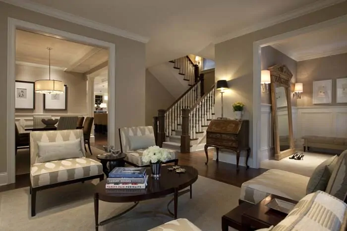
Brown absorbs light, which means one overhead fixture will leave your room looking dull no matter how good the paint is. You need layers. A floor lamp near the seating, a table lamp on the console, maybe a picture light over the art. Three sources minimum, all at different heights.
Bulb temperature matters just as much. Anything above 3000K pushes brown toward gray and makes cream look slightly clinical. Warm white in the 2700K range keeps both colors doing what you hired them to do.
Cream or linen lampshades diffuse light beautifully here, spreading a soft glow instead of a harsh circle. Brass and bronze fixtures blend right in with the palette too.
Get this part right and the room feels twice as expensive.
6. Play Up Architectural Details
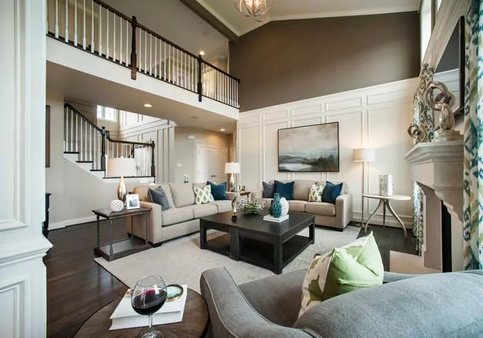
If your room came with good bones, brown and cream will show them off. Paint the walls cream and pick out the crown molding, window casings, or built-in shelving in a deeper brown. Suddenly those details step forward instead of blending into the background.
Exposed beams are the obvious win, but wainscoting, a stair rail, or even a chunky baseboard works the same way. The contrast draws a line around the shape of the room, and your eye follows it.
No architectural features to work with? Slim wood trim panels or a stained board-and-batten section adds structure where there wasn’t any before. It’s a weekend project with a permanent-looking payoff.
Guests tend to assume the house always looked that way.
7. Pale Blue Accent Furniture
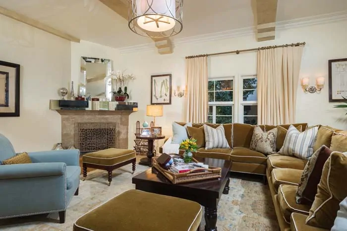
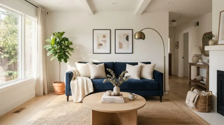
Pale blue against brown is one of those pairings that sounds odd until you see it. A dusty blue armchair in a room full of walnut and cream reads fresh instead of cold, mostly because brown is warm enough to balance blue’s chill. The two sit opposite each other on the color wheel, so the contrast feels deliberate rather than random.
Keep the blue soft. Powder, chambray, faded denim. Anything too saturated fights the brown for attention and the room starts feeling busy.
One piece is usually plenty. An accent chair, a painted console, or a pair of ottomans tucked under a console table. Then echo it faintly in a throw or a stack of books so it doesn’t look stranded.
8. Brown and Cream in An Eclectic Living Room
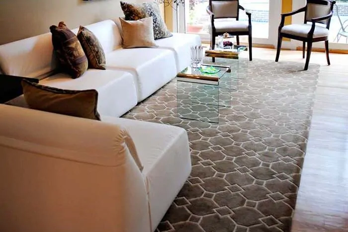
Eclectic rooms fall apart without an anchor, and that’s exactly the job brown and cream do best. Mix a mid-century credenza with an antique wingback and a modern glass coffee table, then let the shared palette hold the whole odd family together.
The rule is simple. Vary the shapes and eras as much as you want, but keep pulling from the same range of browns and creams. Your eye reads the color consistency first and forgives the mismatched styles second.
Layer in whatever you actually love. Flea market art, travel souvenirs, a chair you refinished yourself. Repeat one metal finish throughout for extra cohesion.
9. Warm Brown with Dramatic Lighting
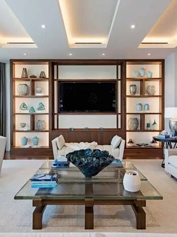
Dramatic lighting is where warm brown stops being a background color and starts performing. Skip the even, all-over glow and aim for pools of light instead. A single pendant hanging low over the coffee table, a wall sconce grazing a textured brown wall, a floor lamp angled up into the corner.
Shadow is the point. Brown reads richest when part of it stays dark, because the contrast makes the lit sections look almost velvety. Cream surfaces nearby catch the spill and reflect it back, so the room never tips into gloomy.
Dimmers make this easy to control. Bright for company, low for a movie, somewhere in between the rest of the time.
The whole space takes on that quiet, lamplit hotel bar look after sunset.
💡 Pro Tip: Aim at least one light source at a textured surface rather than a flat wall. Grazing light across brick, wood grain, or a woven panel throws tiny shadows that make the texture look three-dimensional instead of painted on.
10. Try Orange Accents
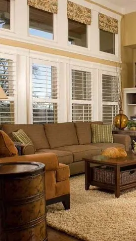
Orange and brown are practically relatives, which is exactly why the pairing feels so easy. Brown is essentially a muted, darkened orange, so when you bring in terracotta pillows or a burnt sienna throw, you’re deepening the palette rather than interrupting it. Cream keeps the whole thing from going too heavy on the warmth.
Pick your orange carefully though. Rust, clay, and pumpkin all sit beautifully next to brown. Bright traffic-cone orange does not, unless you’re going for something intentionally retro.
Small doses are plenty. A ceramic bowl, one framed print, a stack of orange-spined books on the shelf. Dried pampas or eucalyptus in a rust vase works too.
There’s a reason this combination shows up in every cozy autumn photo you’ve ever saved.
💭 Suggestion: If you’re nervous about committing, start with something seasonal you can swap out. A rust throw blanket and two terracotta pillow covers cost very little, live through fall and winter, and tell you within a week whether orange belongs in your room permanently.
11. Brown and Cream in Mid-Century Modern Living Room
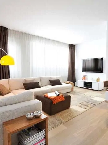
Mid-century design and brown wood go together so naturally that half the work is already done for you. Teak and walnut were the era’s signature materials, all those tapered legs and low, clean silhouettes. Set a cream sofa against them and the shapes stand out instead of blurring together.
Keep the lines restrained. Mid-century rooms breathe because the furniture sits low and nothing crowds the walls. Leave visible floor space around each piece.
A cream shag or low-pile rug, one geometric print, and a sputnik-style fixture overhead pretty much finishes the look. Brass legs and hardware fit the period perfectly.
Best part is how little you need to buy. A few good pieces carry the entire room.
12. Create a Focal Point and Accent with Patterns
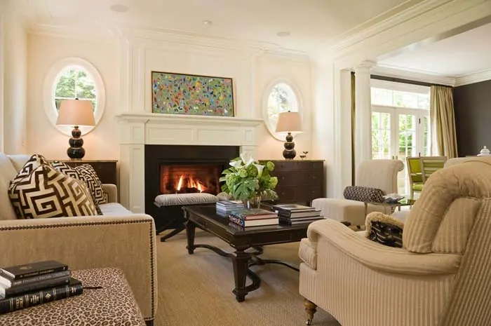
Every room needs one spot your eye goes first. In a brown and cream space that’s usually the fireplace, a large piece of art, or the wall behind the sofa. Decide which one it is, then build pattern around it instead of scattering pattern everywhere.
Mixing patterns works when the scales differ. A large-print rug, a medium stripe on the curtains, a small check on one pillow. Same palette throughout, three different sizes, and nothing competes.
Trouble starts when two bold patterns land at the same scale side by side. Your eye can’t settle, and the room feels restless without anyone knowing why.
13. Use Red, White, and Blue
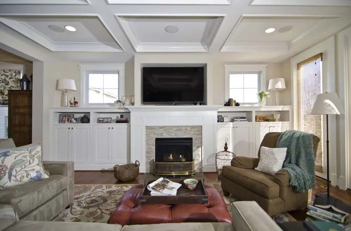
Before you picture bunting and flags, this pairing is subtler than it sounds. Brick red, cream, and navy sitting on a brown foundation reads more English country library than Fourth of July. The brown is what pulls it out of patriotic territory and into something warmer.
Muted tones are the whole trick. Barn red rather than fire engine, ink navy rather than royal, and cream instead of stark white. All three have enough brown in their undertones to sit comfortably beside walnut and leather.
Spread them unevenly too. Let cream dominate, navy take second place, and red show up in just two or three small spots.
Rooms like this photograph beautifully, but they feel even better to actually sit in.
💡 Pro Tip: Keep red the smallest presence in the room, roughly one-tenth of the color you see. It has more visual pull than navy or cream, so a little goes a long way before the balance tips into something loud.
14. Stick to a One Bold Element
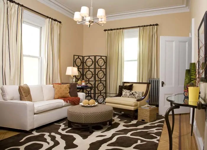
Brown and cream is a quiet palette, so one loud thing goes a long way. Choose a single showpiece and let everything else stay calm around it. An oversized abstract canvas, a sculptural light fixture, a deep green velvet chair, or a fireplace surround in dramatic veined stone.
The logic here is simple. Neutral backgrounds give your eye almost nothing to fight over, which means a bold piece gets full attention rather than half of it. Two bold pieces split that attention and both end up looking weaker.
This also saves money in a real way. You can put your budget into one great thing instead of spreading it thin across five decent ones.
Most people notice the statement piece and assume a designer picked the whole room.
💭 Suggestion: Try photographing your room with your phone before you buy anything bold. Flat, colorless photos of an empty-looking space usually point straight to the wall or corner that’s begging for the statement piece.
15. Gray Accent Color and Live Edge Mantel
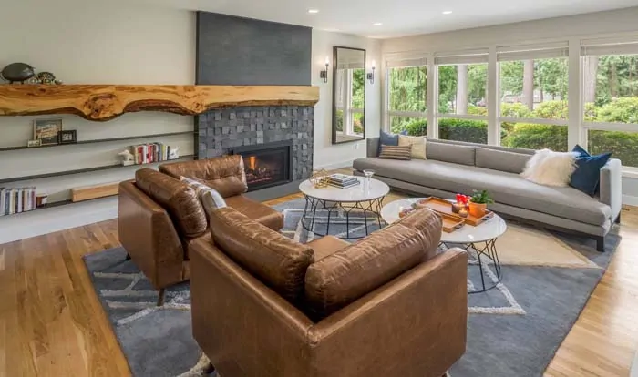
Gray gets a bad reputation next to brown, and it’s usually because someone picked a cool, bluish gray that made the wood look muddy. Warm grays with a hint of taupe behave completely differently. They soften the contrast between dark brown and cream, acting like a middle step rather than a clash.
A live edge mantel is where this really pays off. That raw, uneven wood edge against a gray stone or plaster surround creates a natural focal point without any styling required. The wood grain does all the work.
Bring gray in through upholstery, a wool throw, or the stone itself, and keep it secondary to the browns.
The result is a fireplace wall that looks like it grew there, not like it was installed.
16. Contemporary Living Room Ideas
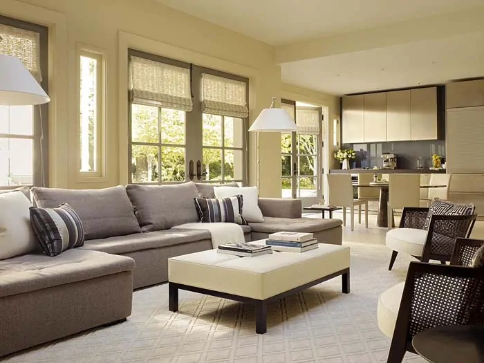
Contemporary rooms lean on clean lines and open space, which makes brown and cream a smart fit. Try a low cream sectional, a walnut slab coffee table, and walls in a warm off-white. No fussy trim, no heavy patterns, just good shapes with room to breathe around them.
What keeps it from feeling sterile is texture. Contemporary style strips away ornament, so a boucle cushion, a matte ceramic lamp, or a chunky knit throw becomes the thing that adds warmth. Without those, brown and cream can go flat pretty quickly.
Keep the accessories few and oversized rather than many and small. One large vase beats six little ones.
Tidying a room like this takes about five minutes, which you’ll appreciate on a Tuesday night.
17. Light Brown Furniture
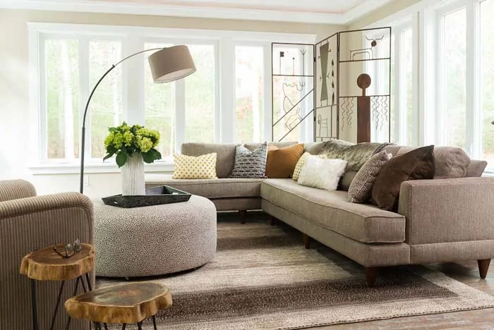
Light brown furniture is the easier entry point if dark wood feels like too much commitment. Oak, ash, and pale walnut sit closer to cream on the color scale, so the whole room stays airy while still reading warm. Small living rooms especially benefit, since lighter wood doesn’t visually crowd the space the way heavy mahogany can.
The catch is contrast. When your furniture and walls are both light and warm, everything can blur into one beige haze. Fix that with a darker rug, black metal legs, or deeper brown pillows to give your eye some structure.
Natural oak also hides dust and pet hair far better than dark finishes do, which is a quiet daily win.
Rooms like this stay bright even in February.
💡 Pro Tip: Match your undertones before you match your shades. Light brown wood can lean yellow, pink, or gray, and pairing a yellow-toned oak floor with a pink-toned oak table will look off even though both are technically the same color family.
18. Brown and Cream Ideas in a Lodge Style Room
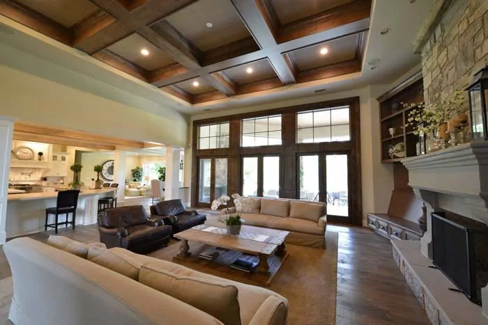
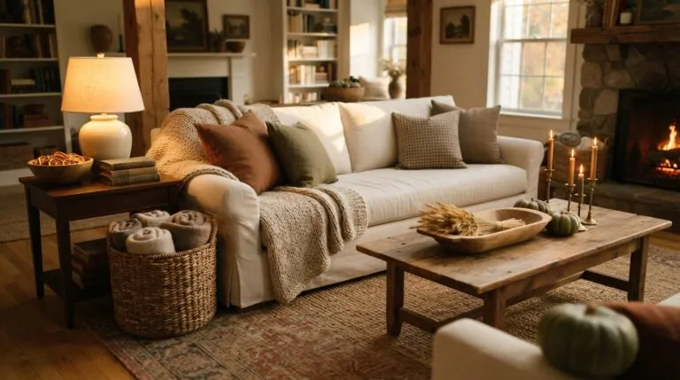
Lodge style is brown and cream turned all the way up. Think exposed timber, a stone fireplace, cream wool upholstery, and a leather chair worn soft in the seat. Everything leans rugged, and the cream is what keeps it from swallowing the light.
Scale is what makes lodge rooms convincing. Chunky beams, a substantial coffee table, an oversized basket by the hearth. Delicate furniture looks lost in this setting, so err heavier than you normally would.
Layer the textures generously too. A hide rug over wide plank floors, a plaid wool blanket, antler or iron hardware. Nothing here should feel precious or breakable.
19. Play with Textures
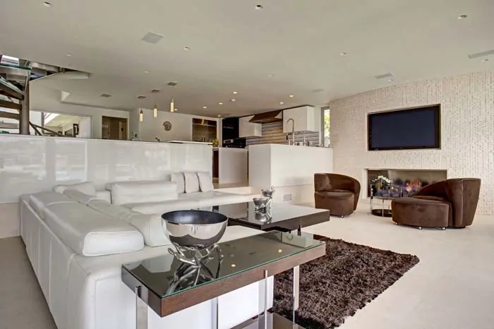
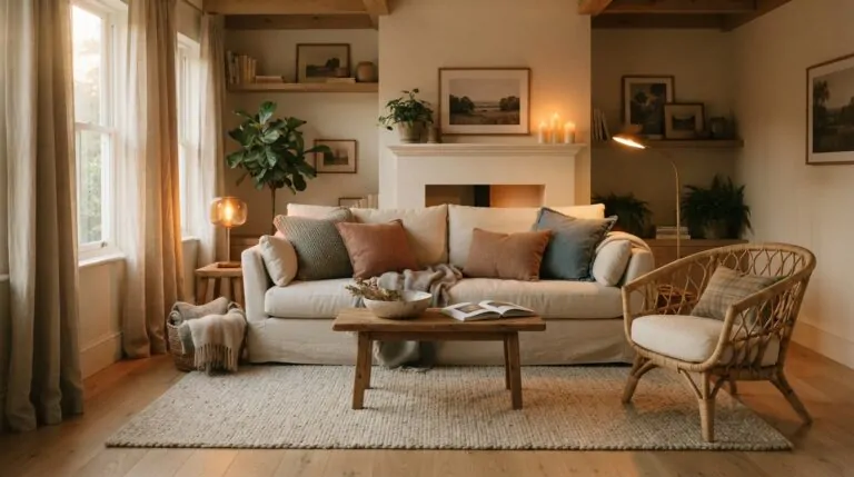
Texture is what saves a two-color room from looking boring, and this is where brown and cream really earn their keep. Nubby bouclé, smooth leather, loose linen, woven jute, polished wood, matte ceramic. Same narrow palette, completely different surfaces.
The reason it works comes down to light. Rough textures scatter it and look darker, smooth ones reflect it and look brighter, so a single shade of cream can appear as three or four tones depending on what it’s sitting on. Your eye registers variety even when the color never changes.
Aim for at least five distinct textures in the room. Fewer than that and things start feeling flat.
Nobody consciously notices texture, but everyone feels the difference when it’s there.
20. Take Your Colors From a Painting
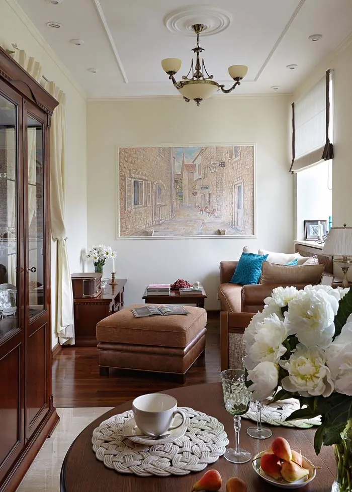
If choosing colors feels overwhelming, let a painting do it for you. Find a piece of art you genuinely love with browns and creams in it, then pull your palette straight from the canvas. That soft ivory in the sky becomes your wall color. The deepest brown becomes your leather chair. A small flash of ochre in the corner becomes your accent.
Artists spend a long time getting those relationships right, so you’re borrowing decisions that have already been tested. The proportions matter too. Whatever color covers the most canvas should cover the most surface in your room.
Vintage landscapes and still lifes are especially useful here since they naturally sit in earth tones.
Frequently Asked Questions
Does brown and cream make a small living room look smaller?
Not if you handle the brown right. Keep the walls cream and let brown show up in furniture, a rug, or one accent wall. Dark colors recede visually, so a single brown wall can actually make a small room feel deeper. Trouble only starts when all four walls go dark and the light has nowhere to bounce.
What’s the difference between cream and beige?
Cream has a yellow or ivory base and reads warmer, almost like unbleached linen. Beige sits closer to gray or tan and can feel flatter next to wood. For brown and cream rooms, cream usually wins because the shared warm undertone makes the two colors look related rather than randomly paired.
Is brown and cream outdated?
It went quiet for a while when cool grays took over, but earth tones came back strong and haven’t left. What keeps this palette from dating is that it isn’t really a trend. It’s just wood and natural fabric, which have been in homes for centuries and will be there long after the next color of the year comes and goes.
How many shades of brown should I use in one room?
Two or three is the sweet spot. Something dark for anchoring, something mid-range for furniture, maybe something warm and reddish for accents. Beyond that the room starts looking accidental instead of layered. And they don’t have to match perfectly. Slight variation actually reads more natural than everything landing on the exact same tone.
What accent colors work best with brown and cream?
Rust, terracotta, and ochre blend in seamlessly since they share brown’s warm base. For contrast, dusty blue and sage green both work beautifully because they sit opposite brown on the color wheel. Muted navy and brick red are great for a more traditional feel. Just keep accents to a small share of the room and let brown and cream carry the rest.
Do I need real wood, or does wood-look furniture work?
Wood-look finishes have come a long way and read fine from a few feet away. Where they fall short is texture. Real grain catches light unevenly, which is a big part of why brown feels rich instead of flat. A reasonable compromise is one genuine wood piece as your focal point, with wood-look supporting pieces around it.
CONCLUSION
Brown and cream is the palette people keep coming back to, and it’s not hard to see why. It doesn’t demand a full renovation, it doesn’t clash with the furniture you already own, and it works whether your taste runs modern boho or full lodge cozy.
The pieces that matter most are the simple ones. Layered lighting instead of a single overhead fixture. Two or three browns rather than seven. Enough texture to keep things interesting. One bold element if the room feels too quiet.
You don’t need to tackle everything at once either. A rust throw and a couple of terracotta pillows will tell you plenty about whether this direction feels right. A brown accent wall behind the sofa can happen over one weekend. Swapping in warmer bulbs takes about ten minutes and changes more than you’d expect.
Start with whichever idea you kept scrolling back to. That’s usually the one your room has been asking for.