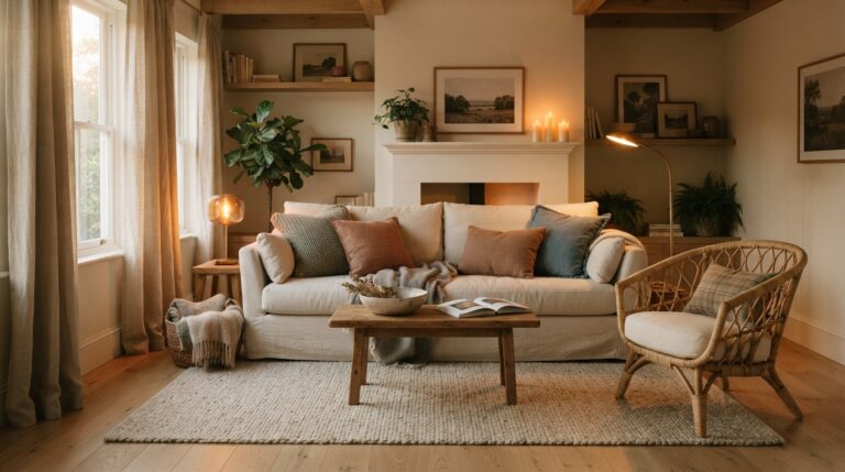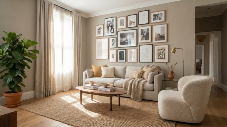
20 Brown Living Room Ideas That Feel Warm and Timeless
Brown is having a real moment in living rooms again, and honestly, it never should have left. There’s a warmth to it that gray could never quite manage. Chocolate, chestnut, walnut, and soft taupe all bring something gray always missed: the feeling that a room has been lived in, loved, and maybe napped in more than once.
The best part is how flexible brown actually is. Pair it with cream and it goes soft and airy. Push it toward charcoal and it turns moody. Add rust or deep red and suddenly the whole space feels rich without trying too hard. It works with leather, linen, oak, rattan, brass, and just about every style from modern farmhouse to Japandi.
What follows are 20 brown living room ideas that show how much range this color really has. Some lean bright and breezy, others go deep and dramatic. A few use brown as the star, while others let it quietly hold everything together.
1. Farmhouse Chic
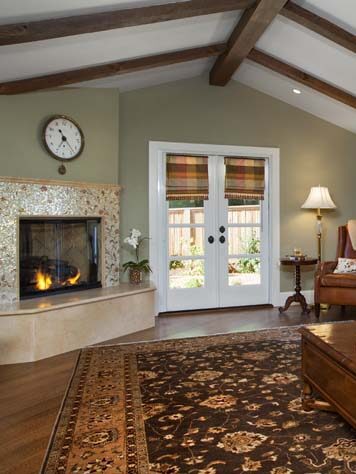
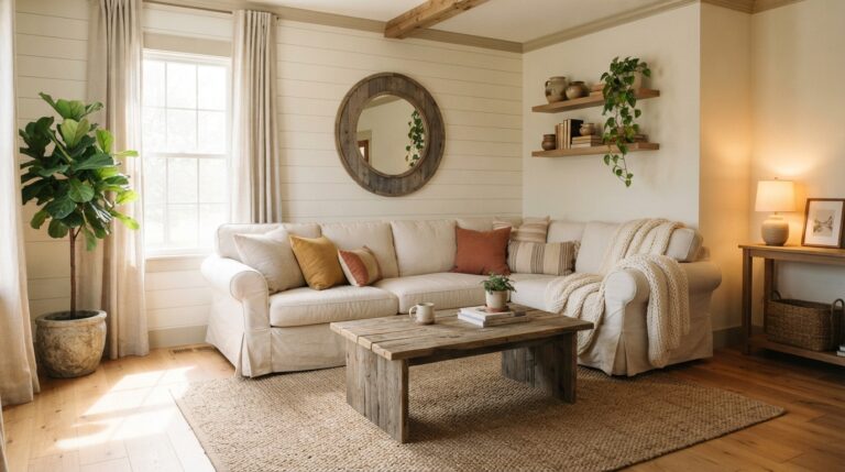
Warm walnut beams overhead and a slouchy oatmeal sofa below. That’s the whole formula, and it’s why farmhouse brown never feels dated no matter how many trends come and go.
The reason this look holds up is balance. Brown shows up in the heavy pieces (a chunky coffee table, a leather armchair, wide-plank floors) while everything soft stays pale and washed out. Linen slipcovers, cream throw pillows, a jute rug with a little fray at the edges. That contrast keeps the room bright instead of cave-like. It’s the kind of space where boots get kicked off by the door and nobody worries about a coffee ring on the wood.
Ideal for open-plan homes that need warmth without losing all that natural light.
2. Coffee and Cream

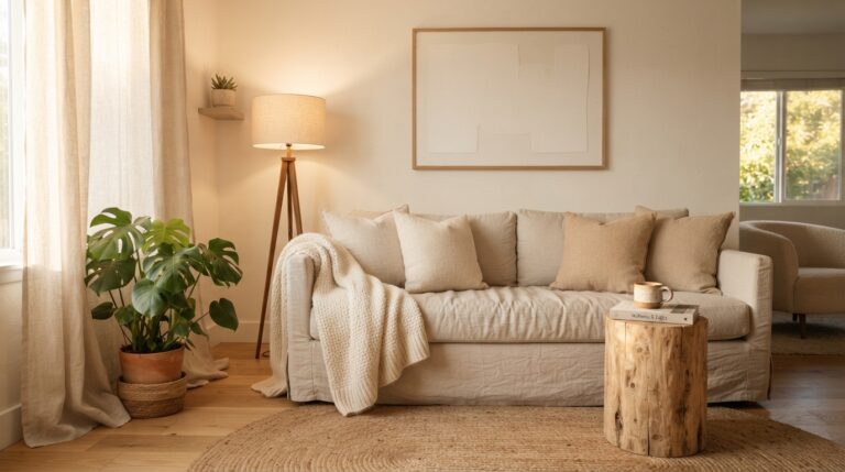
Think of the color of a latte right after the milk goes in. That swirl of pale and deep is basically a color palette waiting to happen.
Cream walls make the room feel twice as big, and then brown comes in through the furniture and the smaller stuff. A caramel leather ottoman, coffee-colored cushions, a few ceramic bowls in muddy neutrals. The trick is keeping the ratio uneven. Roughly two-thirds light, one-third dark, so the eye always has somewhere restful to land.
Morning light does something lovely here too. It bounces off the cream and warms up the brown, and the whole room looks softer before you’ve even had a chance to open the blinds.
3. Contemporary Accent Wall
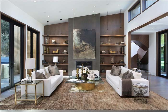
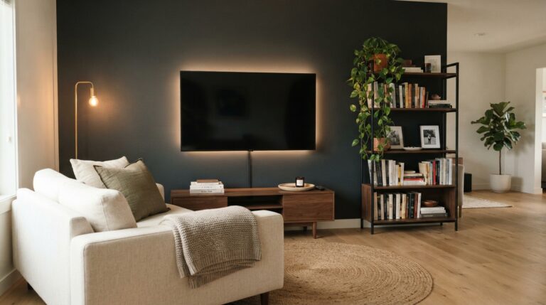
One wall in a deep, saturated brown can do more for a living room than a whole weekend of rearranging furniture.
Pick the wall your eye already goes to first, usually the one behind the sofa or wherever the TV sits. Paint it something rich like espresso or a smoky mushroom brown, then leave the other three walls light. What happens next is a bit of a visual trick: the dark wall recedes, the room reads deeper, and anything you hang on it suddenly looks framed and intentional.
Matte finishes work best because they swallow light instead of bouncing it around. Skip the gloss unless you want every fingerprint on display.
4. Opposites Attract
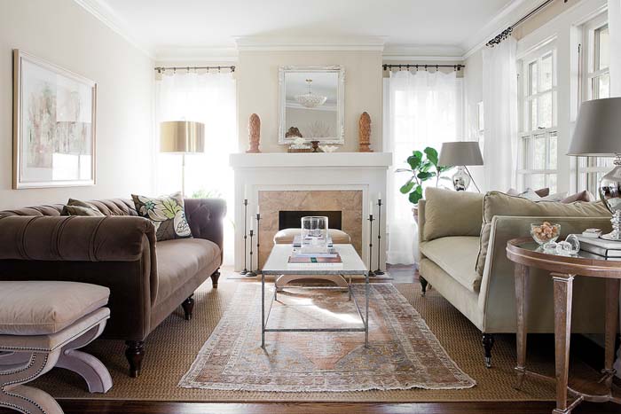
Brown gets interesting the second you put something cold next to it. Icy blue, pale sage, crisp white, even a slate gray cushion. The contrast wakes everything up.
This works because brown is a warm color at its core, so cool tones create tension rather than competition. A chocolate sofa with dusty blue pillows reads sharp and considered. Swap those pillows for beige and the whole thing goes flat. You want that little bit of friction, the sort of pairing that makes a guest pause and ask where you found the cushions.
Keep the cool tones limited to two or three spots so they feel deliberate instead of scattered. A rug, some pillows, maybe one piece of art. That’s plenty.
Pro Tip: Test your cool accent against the brown in both daylight and lamplight before committing. Warm bulbs can push blues toward gray and completely flatten the contrast you were going for.
5. Mix Textures
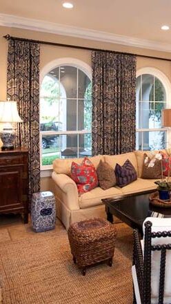
A brown room without texture is just a brown room. Add texture and it turns into something you want to sink into.
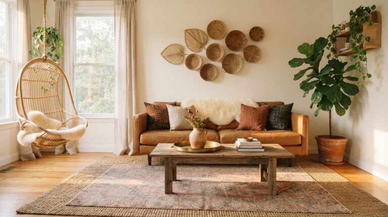
Here’s the thing about brown: it absorbs light rather than reflecting it, so flat surfaces can look a little lifeless. Texture fixes that by creating tiny shadows across every material. Nubby boucle next to smooth leather. A chunky knit throw draped over sleek wood. Rattan, sisal, velvet, raw linen. Each one catches light differently, and together they give the eye something to travel across.
Run your hand along the back of a well-layered brown sofa and you’ll feel the difference before you see it.
Suggestion: Aim for at least four distinct textures in the room, and make sure one of them is something rough or woven. Baskets and jute rugs are the easiest place to start.
6. Deep Chocolate Brown Sofa

A chocolate sofa is the piece that decides everything else in the room, and it earns that authority honestly.
Dark brown upholstery hides more than lighter fabrics ever will. Dog hair, spilled tea, the mystery smudge nobody claims. That practicality is half the appeal. The other half is how it grounds a space visually, giving all the pale walls and light rugs something solid to push against. Without an anchor piece like this, neutral rooms tend to float and feel unfinished.
Go for a shape with some presence. Deep seat, low back, arms wide enough to set a mug on. This is furniture built for long evenings and unhurried mornings, and it should look the part.
7. Use a Dark Brown Ceiling

Painting the ceiling dark sounds like a terrible idea until you actually see it done. Then it makes complete sense.
A brown ceiling lowers the visual weight of a room and pulls the whole space inward, which sounds bad but feels wonderful. Tall rooms especially benefit, because a soaring white ceiling can leave you feeling exposed rather than cozy. Bring it down in color and suddenly the room wraps around you. Add wood beams or paneling and the effect doubles.
Keep the walls a shade or two lighter so there’s still definition where they meet.
Best in rooms where evenings matter more than mornings, like a den or a movie space that rarely sees full sun.
8. Add Patterns and an Accent Color
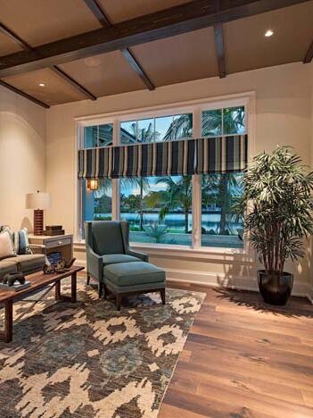
Brown is a fantastic backdrop for pattern because it never fights for attention. It just sits there and lets the print do the talking.
Stripes, florals, geometric prints, a bold ikat cushion. Any of them look good against brown, and the reason is simple. Brown reads as a neutral to the eye even though it carries warmth, so patterns land clearly instead of clashing. Then you pick one accent color from that pattern and repeat it two or three times around the room. Mustard, terracotta, olive, dusty pink. Repeating it is what makes the whole thing look planned rather than accidental.
Two patterns of different scales is usually the sweet spot. One large, one small.
9. Victorian Reboot
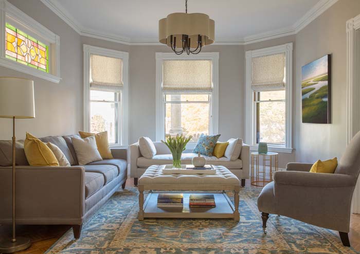
Victorian interiors leaned hard into brown, and there’s a modern version of that look worth stealing.
The old formula was heavy wood, deep tones, and a lot of ornament packed into every corner. The updated take keeps the good parts and drops the clutter. Think carved wood furniture in warm brown, a velvet sofa in something plummy, maybe picture rail moldings painted a tone darker than the wall. Then leave breathing room. Fewer objects, more space between them.
What you get is a room with history in its bones but air in its lungs. Guests notice the details without feeling like they’ve wandered into a museum.
10. Brown Brick Wall
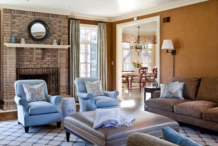
Exposed brick brings a kind of texture you simply cannot fake with paint, and brown brick in particular has this soft, worn quality that never looks harsh.
The variation is what makes it work. No two bricks are quite the same shade, so the wall shifts between rust, clay, tan, and near-black depending on where the light falls. That built-in movement means you barely need art on it. If your home doesn’t have original brick, thin brick veneer panels get remarkably close, and limewashing existing brick softens the color without hiding the texture underneath.
Pair it with warm metals and plenty of greenery. Trailing plants against brick is one of those combinations that just works, every single time.
Pro Tip: Seal interior brick with a matte penetrating sealer rather than a glossy one. It stops the dust shedding without giving the wall that plastic-wrapped shine.
11. Tall Curtain Panels
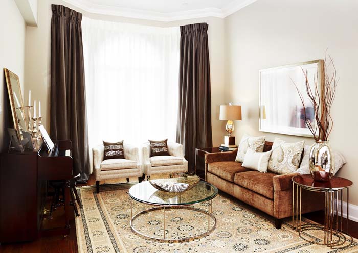
Hanging brown curtains high, close to the ceiling rather than just above the window frame, changes the proportions of a room instantly.
The reason is straightforward. Your eye follows a vertical line all the way up, so the wall reads taller than it measures. In brown, that line also carries weight and warmth, framing the window like a set of soft brackets. Linen and heavy cotton drape best because they fall in loose folds instead of stiff pleats. Let them puddle slightly at the floor if you like a relaxed look, or hem them to graze it for something sharper.
Pull them closed on a rainy afternoon and the whole room turns into somewhere you’d rather stay.
12. Monochromatic, Minimalist, and Modern

Building an entire room from one color family sounds risky, but with brown it turns out to be one of the calmest things you can do.
Start at the palest end with a sandy wall color, then work down through camel, tobacco, and something close to espresso for the deepest pieces. Everything stays in the same family, so nothing interrupts the eye as it moves around the room. Minimalist layouts benefit most from this, because when you strip away extra objects, tonal depth becomes the thing that keeps a space from feeling empty.
Sculptural shapes matter more here than usual. A curved chair, a rounded lamp base, one heavy stone bowl.
13. Bring Cohesion to Built-ins
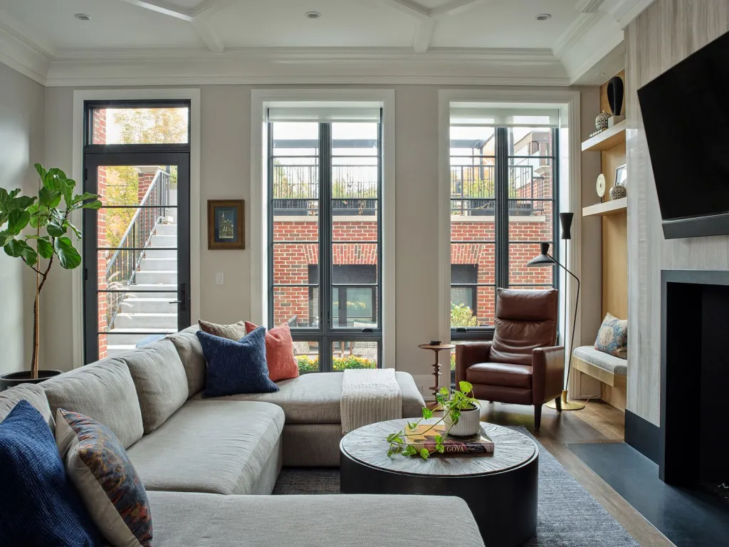
Built-in shelving and cabinetry can either disappear into a room or stick out awkwardly, and brown is what usually decides which one happens.
The problem with built-ins is that they’re often a different wood or finish than everything else, so they read as an add-on rather than part of the architecture. Painting or staining them in a brown that echoes another element in the room fixes that instantly. Match the floor tone, or the coffee table, or the frame of a nearby chair. Once that repetition exists, your brain stops registering the built-ins as separate furniture and starts seeing them as part of the wall.
Backing the inside of open shelves in a slightly deeper brown adds depth too, and it makes whatever sits on them stand out more clearly.
Suggestion: Bring home a stain sample and hold it directly against your flooring before ordering anything. Undertones matter here, and a red-based brown next to a yellow-based one will look off no matter how close the shades seem online.
14. Introduce a Contrasting Accent Color
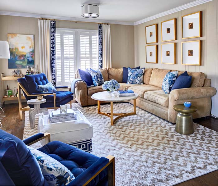
If cool tones felt too subtle, this is the louder option. One saturated color, used with confidence, against all that brown.
Emerald green, deep teal, and mustard all hold their own beside brown without getting swallowed. What makes this different from a soft accent is commitment. Instead of a couple of pillows, you go bigger: a green velvet armchair, a mustard rug, a teal cabinet standing against a brown wall. The scale is what creates the drama. Brown is generous enough to hold a strong color without the room tipping into chaos.
Just keep it to one bold color. Two competing accents and the calm disappears fast.
Suggestion: Choose your accent color first, then buy the brown pieces around it. Working the other way tends to leave you compromising on the shade you actually wanted.
15. Modern Touches in a Traditional Living Room
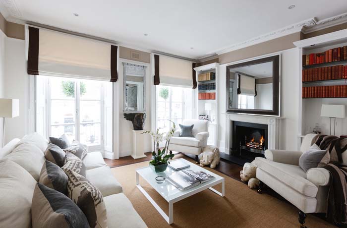
A traditional brown living room can start feeling stuck in time, and the fix isn’t a full renovation. It’s a few sharp modern pieces dropped in on purpose.
Leave the good bones alone. Keep the wood paneling, the antique sideboard, the heavy brown sofa that’s outlasted three sets of curtains. Then bring in something with clean lines and no ornament at all. A slim metal floor lamp, an abstract canvas, a glass coffee table where a fussy wooden one used to sit. The contrast reads as intentional because the old pieces are clearly loved rather than merely inherited.
Three or four modern additions is usually enough. Any more and the traditional character starts slipping away, which defeats the whole point.
16. Easy Accents and Lots of Seating

Some living rooms need to hold six people on a Friday night, and brown handles that kind of use better than almost anything else.
Fill the space with seating that doesn’t match perfectly. A brown sectional, two leather stools tucked under a console, a pair of armchairs in a lighter tan. Because everything sits in the same color family, the mismatch reads as collected rather than random. Then keep the accents cheap and swappable. Cushions, a couple of throws, one vase. Those are the pieces you’ll change when you get bored, and they cost almost nothing to replace.
Extra seating also means nobody ends up perched on the arm of the sofa when a conversation runs long.
17. Warm Up with Deep Reds
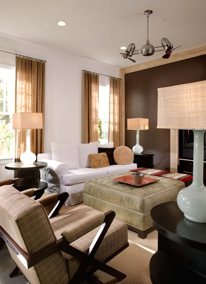
Brown and deep red share a common ancestor, and putting them together brings out something warm in both.
Burgundy, oxblood, brick, rust. Each one sits close enough to brown on the color wheel to feel related, which is exactly why the pairing never jars. Instead of contrast, you get depth. A rust-colored rug under a brown sofa. Burgundy cushions against tobacco leather. Curtains in something between wine and clay. The room stops reading as one flat note and starts having layers, and it happens without introducing a single cool tone.
This palette really comes alive under lamplight. Turn on a couple of warm bulbs after dark and the reds glow while the browns deepen, and the whole space feels like the temperature just went up a few degrees.
18. Create a Gradient
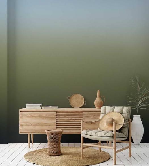
Arranging brown from light to dark across a room gives it a sense of order that’s hard to name but easy to feel.
The usual approach runs vertically. Palest tones up high on the ceiling and upper walls, mid tones through the furniture, deepest brown down at floor level in the rug or the flooring itself. That progression mirrors how light naturally falls in a space, so the room feels settled rather than arranged. You can also run it horizontally, moving from light near the windows to darker in the corners that rarely get sun.
Three or four steps is plenty. Any more and the gradient stops reading as a gradient and just looks like a lot of different browns.
Pro Tip: Squint at the room once it’s put together. If the tones blur into one shape, your steps are too close, and you need more separation between at least two of them.
19. Go Modern, Go Deep
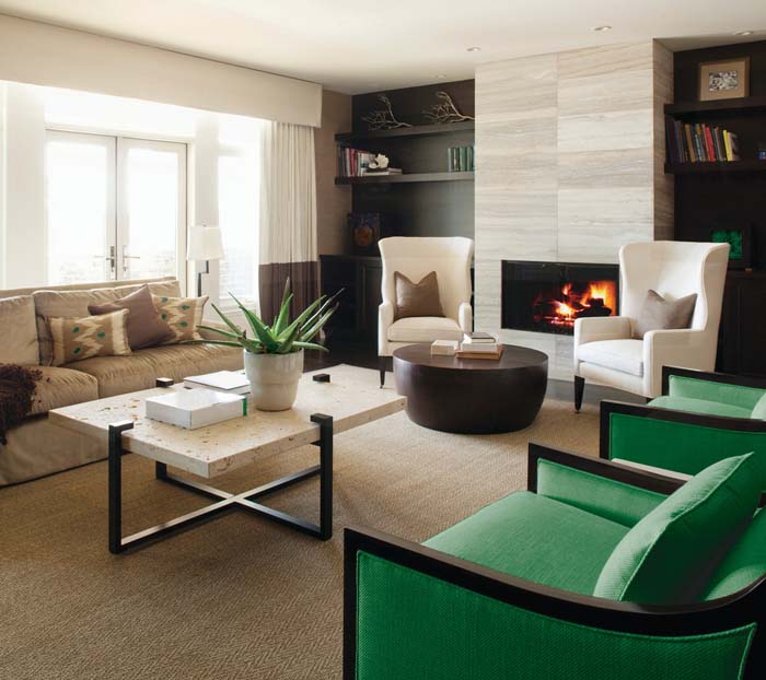
Modern design usually gets described in whites and grays, but push the palette into the darkest browns instead and the whole mood shifts.
This works because modern furniture leans on shape rather than color. Clean lines, low profiles, hardly any ornament. Wrap those forms in a near-black brown and the silhouettes become the entire story, since nothing patterned is competing for attention. A deep brown wall behind a low-slung sofa turns that sofa into something closer to sculpture.
Lighting carries real weight in a room this dark. Skip the single overhead fixture and use a few smaller sources at different heights, and the space starts feeling less like a showroom and more like somewhere you’d happily lose a Sunday afternoon.
20. Frame a Feature Wall
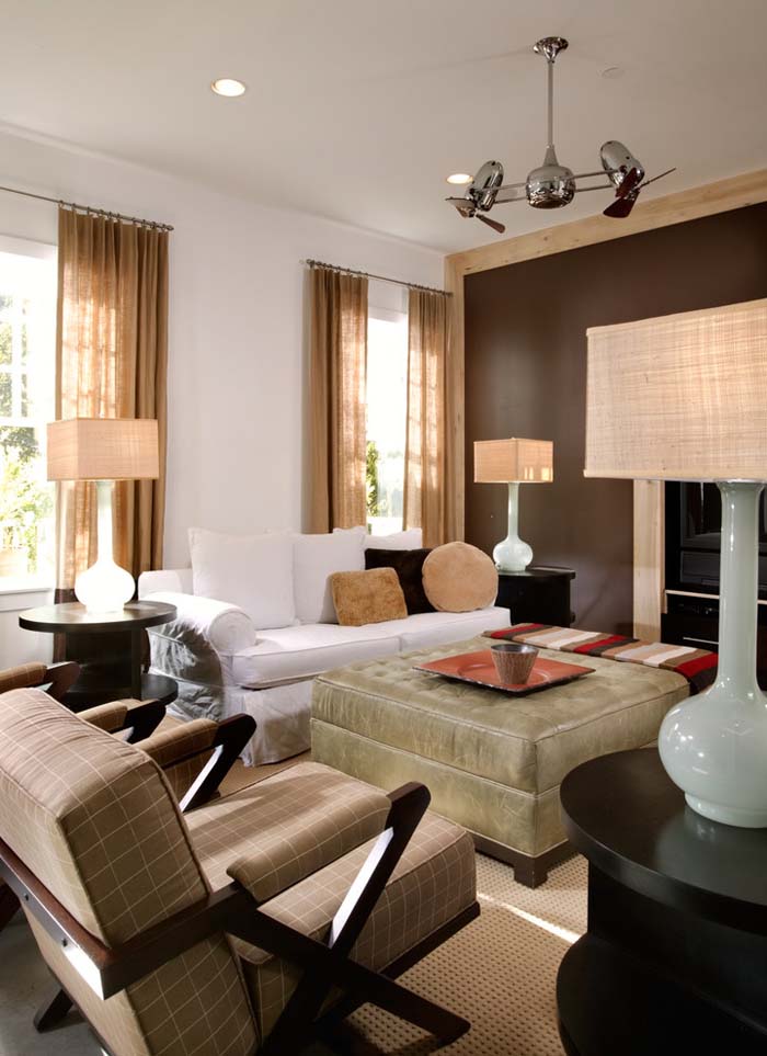
Adding brown trim or molding around one wall turns it into something closer to a piece of art hanging in the room.
The framing effect is doing real work here. A border in stained wood or deep brown paint tells your eye where to stop, which makes whatever sits inside that border feel chosen. Fill it with a gallery of pictures, a single large canvas, wallpaper, or nothing but a painted color. Any of those options land harder once there’s a frame around them. Picture rail molding and simple square battens both do the job without much carpentry skill required.
It’s the sort of small change people comment on without quite working out what you did.
You Might Also Love These Ideas
- 7 DIY Fails. Projects that started with big dreams and ended in crooked shelves, spilled paint, and pure disbelief.
- 12 Home Improvement Fails. Renovations gone sideways, from tilted tiles to paint jobs so uneven you’ll wince and keep scrolling.
- 20 Clever Ideas. Small, satisfying tricks that make everyday rooms feel calmer, tidier, and quietly smarter than they did yesterday.
- 25 Genius Cleaning Hacks. Stubborn grime, dull surfaces, and forgotten corners restored to a soft, gleaming finish with surprisingly little effort.
Frequently Asked Questions
Is brown still in style for living rooms?
Very much so. Brown has come back strongly as people move away from cool grays and toward warmer, more grounded spaces. Chocolate, camel, and taupe now show up across modern, farmhouse, and minimalist interiors alike, which is usually a sign a color has staying power rather than trend status.
What colors go best with brown in a living room?
Cream and beige keep things soft and open. Cool tones like dusty blue and sage add contrast without clashing. For something bolder, emerald green, mustard, and deep burgundy all hold their own beside brown. Just commit to one strong accent instead of two competing ones.
Will a brown living room feel dark or small?
Only if brown is the only thing in the room. Balance it by keeping walls and ceilings lighter, adding plenty of texture, and using several light sources at different heights. Dark brown on one wall can actually make a space read deeper rather than smaller.
Which brown shade should I choose for a sofa?
Deep chocolate and tobacco are the most practical, since they hide marks, pet hair, and daily wear far better than pale fabrics. Lighter caramel and tan work well in bright rooms with low traffic. Consider how the sofa gets used before deciding on the shade.
How do I stop a brown room from looking flat?
Layer textures and vary your tones. Mix leather with linen, boucle with smooth wood, and jute with velvet so light catches differently across each surface. Then work in three or four distinct shades of brown so the eye has somewhere to travel.
Conclusion
Brown earns its place in a living room by doing something gray never managed: it makes a space feel warm before you’ve added a single cushion.
What makes it worth building around is range. The same color family gives you breezy cream-and-caramel rooms, moody chocolate ceilings, brick walls with real texture, and deep modern spaces where shape does all the talking. You can lean traditional or strip everything back to essentials, and brown holds up either way.
Start with one thing. Paint a single wall, swap in a leather chair, hang your curtains higher than feels natural. Then live with it for a week and see how the room feels at different times of day.