17 Navy Blue Bedroom Ideas That Feel Rich & Not Dark
Most people hesitate before painting a bedroom navy. The worry is always the same one: will the room feel like a cave? It’s a fair question, and the answer depends almost entirely on what goes around the color rather than the color itself.
Navy behaves less like a bold shade and more like a dark neutral. It sits under warm wood, crisp white, brass, cream, and coral without fighting any of them, which is why the same paint can read coastal in one room and moody and grown-up in another. The trick is balance. Dark walls need light somewhere, whether that’s white trim, a pale headboard, or a mirror catching what daylight there is.
The ideas ahead cover both ends of that range. Some go all in with paint on every wall, and some bring navy in through curtains, bedding, or a single piece of furniture. Plenty of them work in rentals, small rooms, and bedrooms that never get much sun.
1. Bring a Coastal Feel

One navy wall behind the bed is the safest way into this color. Painting just that single wall keeps all the depth and none of the closed-in feeling, which is exactly why it’s the version most people end up choosing.
Cream does the balancing here. Creamy white on the bedding, pillows, and curtains sits softer than bright white, so the contrast stays warm instead of sharp. Add rustic wood nightstands and a plant or two, and the room lands somewhere between a beach house and a quiet cabin. Morning light hitting that navy wall is the whole reason to do it. The color looks completely different at seven than it does at seven at night.
A smart pick for anyone nervous about painting a whole room dark.
2. Opt for Earthy Accents

Take that same navy and let it cover all four walls instead. The room turns calm and moody rather than dark, as long as brown and gray are doing the heavy lifting alongside it.
Earth tones are what keep navy from feeling cold. A brown and gray bedspread, a couple of ottomans, and a woven bed frame bring warmth the paint can’t provide on its own. Striped shades and a patterned throw carry the blue around the room so the walls aren’t holding it alone. A few white accents keep everything from going muddy. Rooms like this suit people who read in bed with one lamp on and stay there longer than planned.
A room that gets better the longer you sit in it.
3. Introduce Natural Materials

Push that earthy idea further and let texture do the warming instead of color. Woven baskets, a rustic wood floor, and rough linen against navy walls give a bedroom the kind of warmth paint alone can’t manage.
Natural materials work here because they carry warm brown tones and irregular surfaces, so they catch light in a way flat paint doesn’t. That contrast is what stops a saturated navy room from feeling heavy. Keep the bed, bedding, and baseboards white so each element stays distinct rather than blurring into the dark walls. Baskets at the foot of the bed handle the laundry pile that shows up every week, which is a small practical win in a room this quiet.
One of those setups where every piece earns its place.
💡 Pro Tip: Bring in at least three different natural textures rather than one. Wood, woven fiber, and rough linen each reflect light differently, and that variation is what keeps a dark room from looking flat under lamp light.
4. Bring Farmhouse Charm

Swap smooth walls for brick and navy gets even more interesting. Dark paint against exposed brick creates a hard contrast, and that’s what turns one wall into the clear focal point of the whole room.
Brown and gray together used to be considered a mistake. It isn’t, as long as the tones stay in the same warmth family, and navy is what holds them together here. White does the rest of the work, showing up on the headboard, nightstands, and trim so the saturated wall has somewhere to breathe. One oversized piece of art above the bed adds personality without cluttering anything. Old houses with brick walls already have character, and navy just gives it somewhere to land.
Made for older homes with original brick or beams.
5. Go for a Tonal Look

Now for something bolder. Orange sits directly opposite blue on the color wheel, which is why a warm tangerine wall next to navy and blue-gray reads as deliberate rather than random.
Complementary colors pull each other forward. The orange warms up all that cool depth, and the navy stops the orange from getting loud, so both end up looking better than either would alone. Spread the orange thin through a lampshade, a pillow, and a small tray rather than covering more wall with it. Gray undertones in the paint tie into a gray nightstand and throw blanket, which keeps the whole thing calm. It’s the sort of room that feels genuinely cheerful to walk into on a gray afternoon.
The colors stay interesting from morning to night.
👉 Suggestion: Look for a muted or dusty orange rather than a pure bright one. Toned-down oranges (think clay, rust, or soft terracotta) hold up next to navy without turning the room into a color clash.
6. Go for Luxe Finishes

Dial the color back and let metal take over. A gold-framed white headboard against a navy wall does something no paint choice can, because the warm metal edge catches light and lifts the dark color instantly.
Warm metals and navy belong together for a simple reason. Gold, brass, and copper sit on the opposite side of the temperature scale, so they glow against deep blue instead of disappearing into it. Copper-toned nightstands and lamp bases repeat that warmth at bedside height. A cool gray wall alongside the navy accent keeps the room from tipping into anything too formal, and a floral bedspread carries the blue outward. Rooms like this feel expensive without costing much, since the metal is doing most of the work.
Proof that small choices carry the biggest weight.
7. Play with Patterns

Trade shine for print and the room gets a different kind of energy. A patterned accent wall in muted orange next to deep navy gives a bedroom two focal points instead of one, and somehow that works.
Pattern earns its place here because it breaks up large blocks of flat color. Stark white on the fireplace and bedding cuts between the two shades so neither one takes over. Layering navy, orange, peach, and white across the fabrics adds small differences the eye keeps finding, which is what makes the room feel considered rather than busy. Nothing has to match exactly. Rooms with this much going on tend to be the ones people notice first when they walk past the open door.
That rare balance of relaxed and put-together.
💡 Pro Tip: Vary the scale of your patterns rather than the colors. One large print, one medium, and one small in the same palette read as layered, while three prints at the same size compete and make the room feel cluttered.
8. Liven Up Your Palette

A quieter version of that same idea uses green instead of pattern. Green nightstands against navy walls add just enough life to a dark room without pulling focus from the color itself.
Green and navy sit close together on the color wheel, which is why the pairing feels natural rather than surprising. The eye reads them as related, so the green lands as interest instead of contrast. White decor and accents sharpen the whole thing, giving the room clean lines and a fresh look that dark walls usually lose. There’s also a trick worth stealing here: stop the navy just below the ceiling and paint white above it. That gap makes the ceiling read higher, which matters most in bedrooms where the walls feel like they’re closing in.
Sometimes the quietest details do the loudest work.
9. Cozy Up with Gray
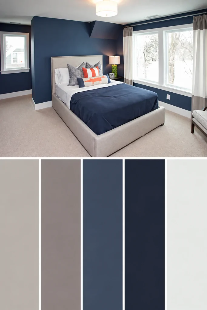
Green brings life to navy. Gray does the opposite job, settling the color down so the room feels calm rather than dramatic.
The pairing works because many grays carry the same cool undertones navy does, so they blend instead of competing. Warm gray on the carpet, bed frame, chair, and curtains keeps that softness underfoot and at eye level, which stops deep walls from feeling severe. A few coral pillows are all it takes to lift the whole scheme out of neutral territory. White on the sheets, trim, and ceiling gives the eye somewhere to rest. Rooms like this are easy to keep looking good, since nothing in the palette clashes with anything else.
Easy to live with day to day without feeling overly designed.
💡 Pro Tip: Match the undertone, not the shade. Hold a gray sample against the navy in daylight and check whether both lean blue or both lean warm, because a warm gray next to a blue-based navy reads muddy every time.
10. Dark with a Touch of Glam

Stay in that same cool family but let the blues layer instead of the neutrals. A gray headboard with blue undertones sitting against a navy wall creates a tonal look that reads rich rather than flat.
Monochrome schemes work because the eye moves through them without stopping. Navy on the wall, muted blue on the bedding, and blue-gray on the headboard give three depths of the same idea, so the room feels considered without needing a second color at all. A white lampshade cuts through it all and stops the scheme going heavy. A clear glass vase adds a small bit of shine at bedside height. Rooms this quiet tend to be the ones people fall asleep in fastest.
The space carries a quieter mood.
11. Layer the Bedroom
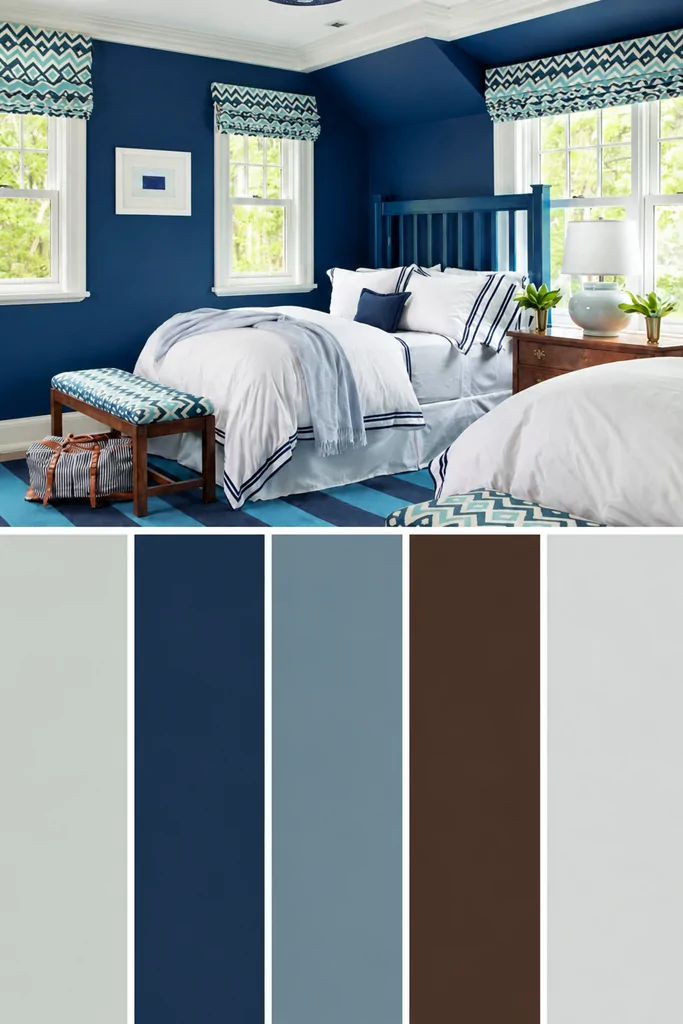
Push past the single-color approach and the room gets more interesting fast. A striped navy and light blue carpet under the bed sets the whole scheme in motion, because the floor is the one surface people forget to use.
Layering works when the patterns talk to each other. Similar stripes on the window shades and a footboard bench create repeat points around the room, so the eye travels instead of landing in one spot. White trim, bedding, artwork, and a table lamp cut straight through all that saturated blue and keep it from closing in. That contrast is doing more work than it looks like. It’s the kind of bedroom where the light stays on a little later than planned.
The kind of space that pulls you in and keeps you there.
👉 Suggestion: Choose a flat-weave or low-pile rug for a layered navy room. Low-pile surfaces hold pattern definition better than shag, and the crisp lines are what make repeated stripes read as deliberate rather than busy.
12. Contrast with the Headboard

Bring the focus back to the bed and one piece does all the talking. A warm brown headboard against a paneled navy wall creates the sharpest contrast in the room, right where everyone looks first.
Paneling is what makes this version work. The vertical lines and shadow gaps give navy texture, so the wall reads layered instead of like one flat block of color. Brown then does the warming, since it sits opposite navy on the temperature scale and stops the whole thing feeling cold. White, cream, and gray fill in through the bedding, pillows, nightstands, lampshades, and carpet, softening everything around that focal point. Leaning back against a wood headboard at the end of a long day is a small comfort worth paying for.
A reminder that good design starts with how a space feels.
13. Inspire with Nautical Stripes

Lighten the whole thing and navy turns breezy. White accents against a deep blue wall keep a mostly-blue bedroom feeling open, which is the trick behind every coastal room that doesn’t go overboard on the theme.
Stripes carry the nautical idea without a single anchor in sight. A light blue striped comforter and matching pillows add gentle contrast, so the room feels layered rather than plain. Cool-toned wood warms it up while bringing in that natural texture dark rooms always need. A chrome swing-arm sconce works here specifically because the clean metal suits the crisp look, and a bit of brown in the artwork keeps it from going too cold. Summer mornings in a room like this feel like being somewhere near water.
Best suited for beach houses, guest rooms, and anyone who wants coastal without the seashells.
💡 Pro Tip: Mount swing-arm sconces about 30 inches above the mattress and slightly wider than shoulder width. That placement puts light on the page for reading without shining straight into the other person’s eyes.
14. Cottage Simplicity
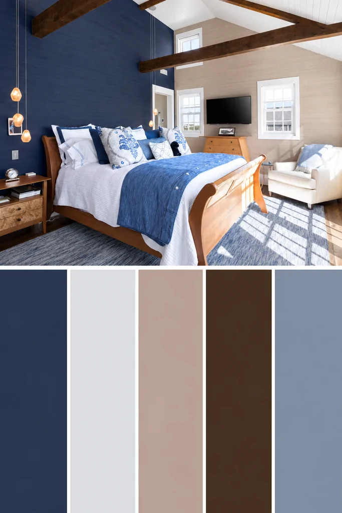
Swap crisp white for something warmer and the room softens right down. A light tan wall next to a navy accent wall opens the space up, and it lets architectural details like exposed beams stand out instead of getting lost in the dark.
Tan is the quiet hero here. It sits warmer than white, so the contrast stays gentle rather than sharp, which is what gives the room that easy cottage feel. Light wood on the bed, nightstand, and console table carries the same warmth at every level. A textured rug, a throw blanket, and patterned pillows add just enough contrast to stop the palette going soft in the wrong way. It’s the sort of bedroom that feels good to come back to after a long drive.
A setup that turns any evening into a slow one.
15. Keep it Simple

Look up, because the ceiling is the most overlooked surface in any bedroom. A navy painted ceiling gives a room drama from an angle nobody expects, and it’s the one design move guests always comment on.
Ceilings work for dark color because you only see them lying down. That means the room keeps all its daylight from white walls, then turns moody the moment your head hits the pillow. White on the walls, bedding, drapes, and furniture sharpens the contrast and stops the ceiling feeling low. A patterned blue and white rug anchors the floor and ties back to the color overhead. One rule worth following with the art: make sure a color from the scheme shows up in the piece, so it belongs.
The kind of space that shows how much mood matters.
👉 Suggestion: Choose a flat or matte finish for a painted ceiling. Flat paint hides the small surface flaws that overhead light exposes, while any sheen bounces light down and makes the ceiling look lower than it is.
16. Make it Adventurous
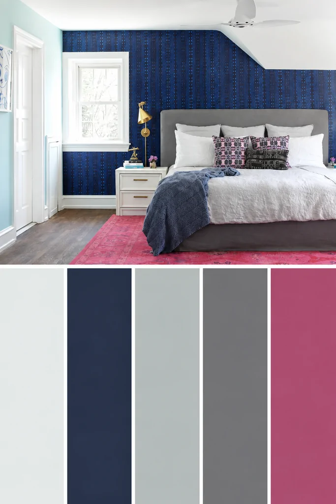
Bring the color back down to eye level and let it get playful. Soft pink against a textured navy wall is the pairing nobody expects to work, and it lands better than almost anything else on this list.
Pink and navy work because pink is a warm color hiding inside a soft one. It heats up the wall without shouting, so the room reads collected rather than loud. A pink area rug and patterned pillows carry it across the floor and the bed, while a gray bed frame and throw settle everything down. White bedding, trim, and a white nightstand keep the contrast clean. A gold sconce is the finishing touch, catching light against all that dark blue. Rooms like this look like they came together slowly, which is the whole appeal.
The kind of corner that quietly becomes everyone’s favorite.
17. Subtle Touches
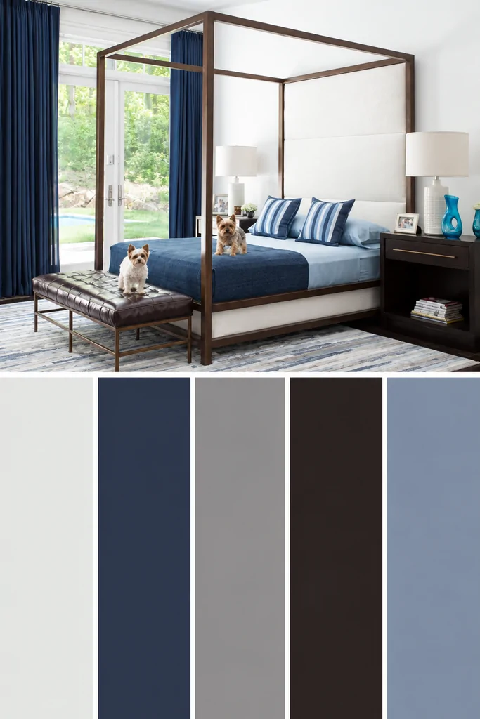
Not every navy bedroom needs a paint can. Floor-to-ceiling navy curtains bring in the same depth in a single afternoon, and they pull the eye upward so the whole room reads taller than it is.
Fabric carries color differently than a wall does. The folds create their own light and shadow, so one panel gives you deep navy and softer navy at the same time, which is why curtains never look flat. A navy comforter and striped pillows spread the color to the bed, while brown on a four-poster frame, a footboard bench, and the nightstands warms the whole high-contrast scheme. The best part is how easy it is to change. Anyone who redecorates every couple of years gets to start over without repainting a thing.
Ideal for renters and anyone who likes changing their color scheme often.
💡 Pro Tip: Buy curtain panels two to two and a half times the width of the window. That extra fabric is what creates deep folds, and folds are the reason navy curtains look rich instead of like a flat sheet hanging on a rod.
You Might Also Love These Ideas
- 16 Smart Teal Bedroom Ideas. Rich teal walls create a calm mood, pairing beautifully with soft bedding and cozy evening details.
- 14 Smart Minimalist Bedroom Ideas. Clean lines and smooth textures bring a peaceful atmosphere, making every corner feel beautifully uncluttered.
- 11 Easy Yellow Bedroom Ideas. Sunny yellow accents add gentle warmth and golden light, creating a cheerful bedroom that still feels cozy.
Frequently Asked Questions
What colors go with navy blue in a bedroom?
Warm colors and warm metals pair with navy best. Navy is a cool, dark shade, so it needs warmth nearby or the room reads flat and chilly. Cream, tan, coral, rust, amber, and blush all work, and brass or copper beats chrome for softening the color. Emerald green and warm gray also blend well because they share undertones with navy.
What trim color goes with navy blue walls?
Warm white or soft cream trim works better than bright white. Pure white creates a hard edge against navy that can look like a paint sample rather than a finished room. Off-whites with a hint of cream or beige keep the contrast clear without the sharpness. Painting the trim the same navy in a satin finish is another option for a richer, tonal look.
Does navy blue make a small bedroom look smaller?
No, and dark navy often makes a small room feel larger. Deep color blurs the corners where walls meet, so the eye stops measuring the room’s edges. The real mistake in a small bedroom is painting one navy wall, which chops the space visually. Painting all four walls plus the trim reads better in tight rooms than a single accent wall.
What bedding works best with navy blue walls?
Crisp white and warm cream bedding work with every shade of navy. Light bedding gives the eye somewhere to rest and stops a dark wall from swallowing the bed, which matters most in rooms with limited daylight. Linen and cotton in oatmeal or soft gray also hold up well. Skip navy bedding against navy walls unless the goal is a full tonal look.
Does navy blue work in a dark north-facing bedroom?
Yes, but the undertone matters. North-facing rooms get cool, flat light all day, so a navy with a warm or black base holds up better than a blue-based one, which can turn gray and gloomy. Warm bulbs around 2700K make a real difference after dark. A mirror placed opposite the window bounces daylight back into the room.
Conclusion
Navy earns its place in a bedroom by behaving like a neutral. It sits quietly under cream, warm wood, brass, and coral without fighting any of them, which is why one color can look breezy and coastal in one house and deep and grown-up in the next. That range is the whole appeal. Farmhouse brick, tonal blue layering, a painted ceiling, or nothing more than a pair of curtains. There’s a version here for almost any room and any level of nerve.
Pick one idea, not seventeen. Curtains and bedding are the easiest place to start, because both bring real color into a room without a paint can or a landlord’s approval. Save your favorite to a Pinterest board, bookmark this for the next free weekend, and pass it along to a friend still stuck on beige walls. Dark rooms are far friendlier than they look, and navy is the easiest one to live with.