9 Living Room Color Palettes That Instantly Feel Warmer
Color is the fastest way to change how a room feels, and it costs less than new furniture. A caramel throw here, a soft clay wall there, and suddenly the whole space reads warmer without a single big purchase.
That’s the idea behind every look below. These palettes lean on shades that already play well together, so the guesswork disappears. Caramel and cream. Sandy beige with driftwood blue. Crisp white paired with oatmeal linen. Each one works because the colors share a common warmth or coolness underneath, which is why they never fight for attention.
There’s a mix of moods too. Some setups feel bright and airy, made for rooms that catch afternoon light. Others go moody and layered, better suited for the corner where everyone piles in on a rainy Saturday.
Nothing here needs a designer or a full renovation. Just paint, textiles, art, and a few smart pairings that make an ordinary room feel considered. Pick the palette that matches how the space actually gets used.
1. Upgrade Your Home’s Aesthetic with Caramel
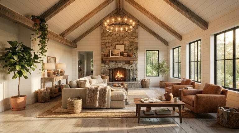
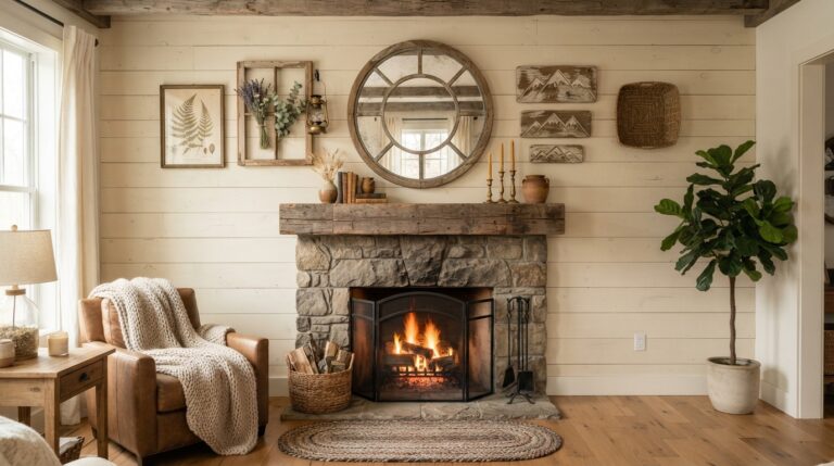
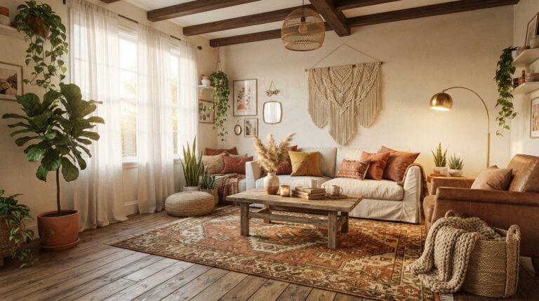
Caramel is the color that makes a room feel like late afternoon sun even at nine in the morning. It sits somewhere between tan and toffee, warm enough to feel cozy but grounded enough that it never tips into orange.
The reason it works so well is balance. Caramel carries just enough depth to anchor a room without swallowing the light, so it holds its own against white walls, oak floors, and cream linen. Try it on a leather armchair, a velvet cushion, or a woven basket by the sofa. It’s the shade that makes a room look good in photos and better in person, especially in that corner where the reading lamp stays on longest.
Small doses go far. The whole room feels warmer without a single wall being repainted.
2. Brighten Up Your Space with Contrasting Accents
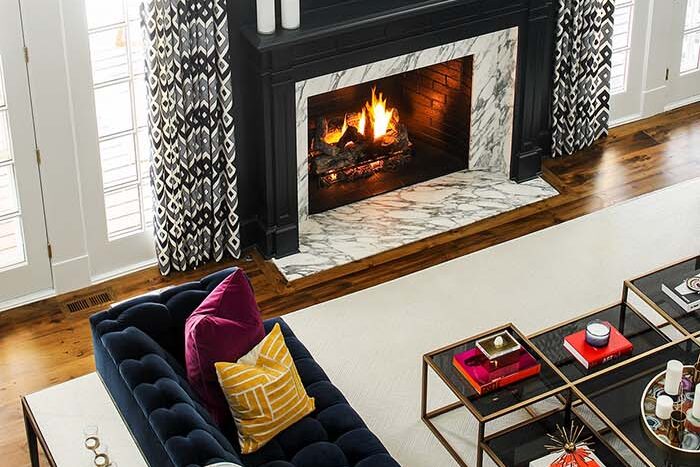
Contrast is what keeps a neutral room from going flat. One dark navy pillow on a pale sofa, a black frame against a chalky wall, and the eye suddenly has somewhere to land.
The trick is why it works: your eye needs a resting point. When everything sits in the same light tone, the space reads soft but slightly unfinished. A few sharper accents give the room structure, almost like outlining a sketch. Charcoal, ink blue, or deep espresso all do the job without feeling harsh.
Keep it to three touches or fewer, spread across different heights. A lamp base, a stack of books, a throw folded over the chair arm.
Guests notice a room like this before they can explain why.
💡 Pro Tip: Choose your contrast color from something already in the room, like the darkest tone in your rug or artwork. It ties the accents in instead of making them look randomly added.
3. Get the Look of Luxury Living with Patterned Accents
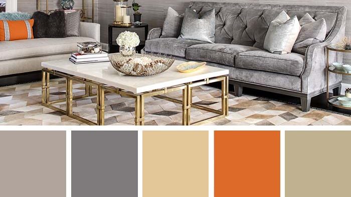
Pattern is the shortcut nobody talks about. A single geometric cushion or a striped ottoman can make a plain sofa look intentional, and it happens instantly.
Here’s why it reads as expensive: pattern adds visual layers, and layers signal that someone made choices. Flat rooms look purchased. Layered rooms look collected. One of the easiest ways to update a dated room is swapping in two patterned pillows and calling it done. Stick to one bold print and one quiet one, like a wide stripe paired with a small woven texture, so they support each other instead of competing.
Keep the colors pulled from your existing palette. Then the pattern feels planned rather than dropped in on a whim.
Coffee gets set down on that ottoman every single evening, and it still looks good.
4. Find the Perfect Balance with Soft Earthy Colors
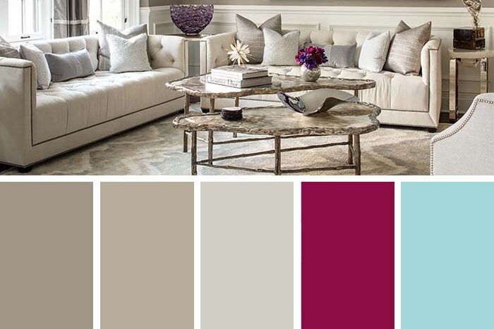
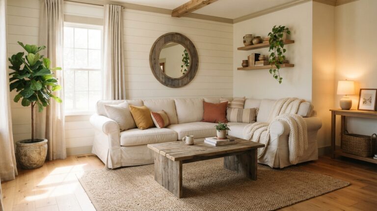
Soft earthy colors are the ones that look like they came from outside. Mushroom, clay, sage, warm putty. Nothing loud, nothing that demands attention the second you walk in.
They balance a room because they all share the same muted base. There’s a touch of gray or brown mixed into each one, which sands off the sharpness and lets them blend instead of clash. That’s why a sage wall can sit next to a clay cushion and a putty curtain without anything feeling off.
Layer two or three of these tones and let texture carry the interest. Linen, jute, unglazed ceramic.
The result is a room that feels calm in a way you notice more with your shoulders than your eyes.
💡 Pro Tip: Test earthy shades in both morning and evening light before committing. These muted tones shift more than bright colors do, and a sage that looks perfect at noon can turn gray and cold by dinner.
5. Make a Bold Statement with Coastal Colors
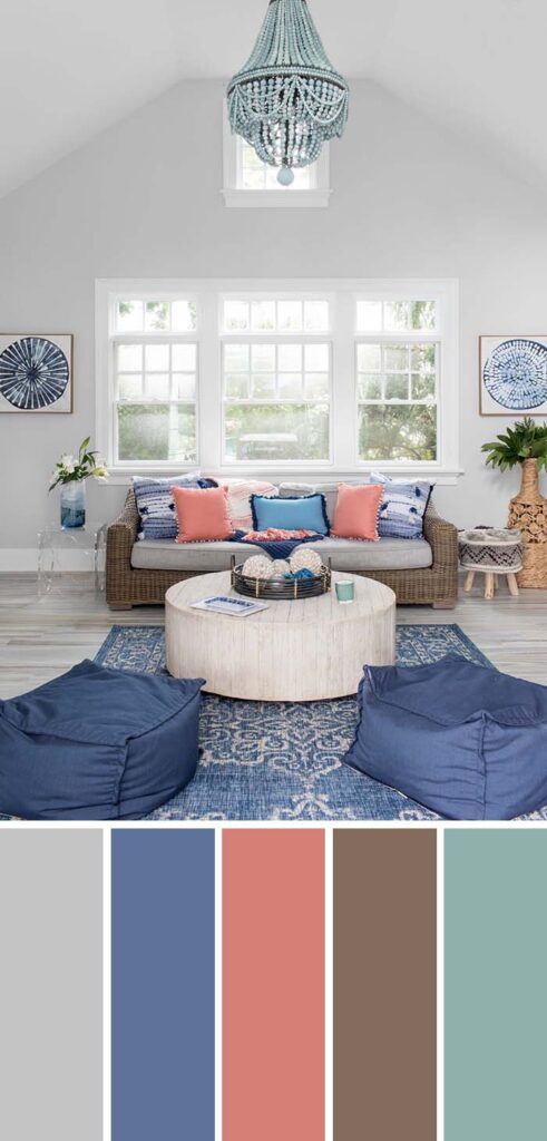
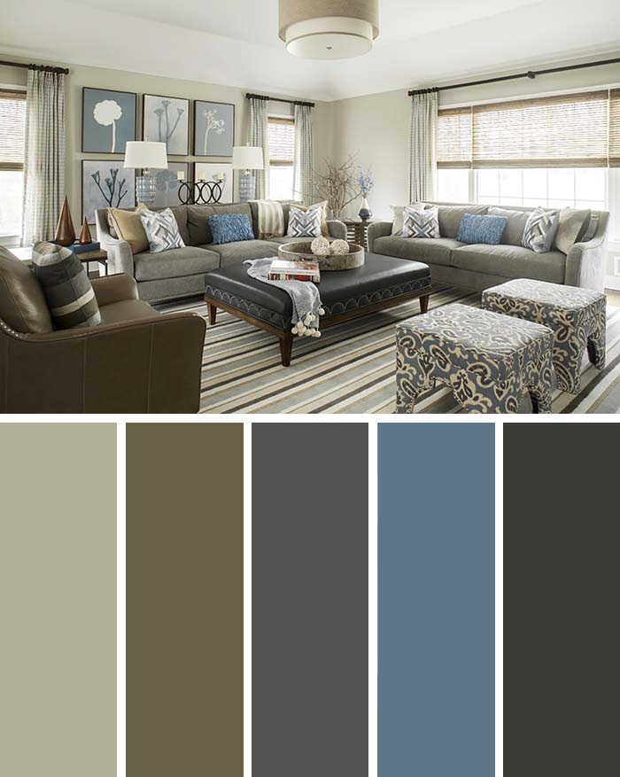
Coastal colors are bolder than people expect. Not pastel beach house, but real depth: deep ocean blue, weathered driftwood gray, and a green that leans toward sea glass.
The reason they land so hard is the contrast built into the palette itself. Sand tones are warm, water tones are cool, and putting them side by side creates natural tension that keeps the room awake. A navy accent wall behind a sandy linen sofa does more work than any single piece of furniture could.
Add a crisp white somewhere to keep it from going heavy. Trim, a vase, a ceramic lamp.
Pair the look with a simple DIY room spray in something citrusy, and the space starts to feel like an open window in July.
6. Transform Your Space with Chic Wall Art and Neutral Accents
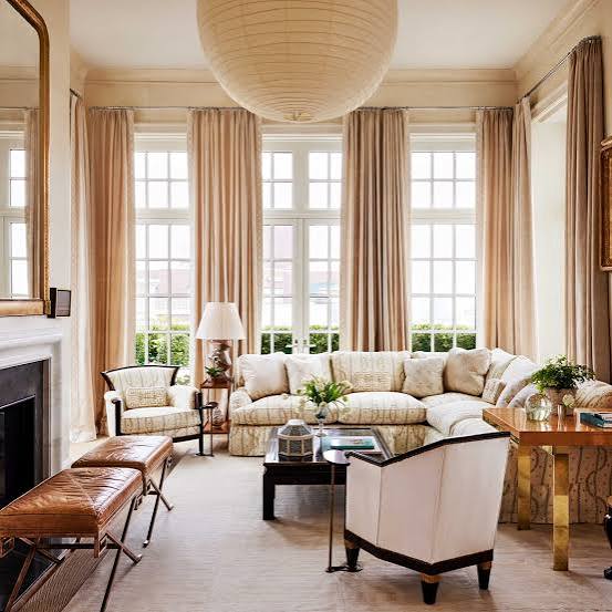
Blank walls make a neutral room feel unfinished, no matter how nice the furniture is. Art fixes that faster than anything else, and it doesn’t need to be expensive or matched.
What makes this pairing work is the division of labor. Neutrals handle the calm, art handles the personality. Because the walls and furniture stay quiet, a single piece with real color or strong lines becomes the focal point automatically. One large frame beats four small ones almost every time.
Then let your accents echo one tone from the art. A rust cushion picking up a rust brushstroke. A black frame answering a black lamp base.
That small repeat is what makes the whole wall feel deliberate instead of decorated.
💡 Pro Tip: Hang art so the center sits at eye level, roughly 57 to 60 inches from the floor. Most people hang too high, and it makes the piece float away from the furniture below it.
7. Bring Vibrancy with Bright and Neutral Colors
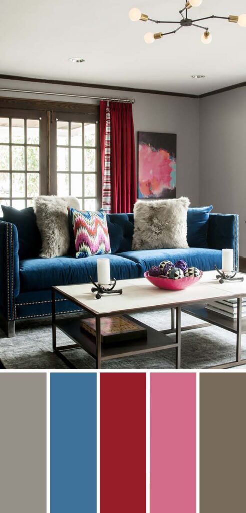
Bright color works best when it has room to breathe. A mustard chair in a beige room reads as confident. That same chair in a room full of competing colors just looks busy.
The neutrals are doing something specific here: they act as negative space. Your eye needs somewhere plain to rest so the bright piece registers as a choice rather than clutter. Keep the ratio lopsided, roughly eighty percent quiet tones to twenty percent color, and the balance holds.
Pick one bright and repeat it twice. A cushion and a vase. A throw and a book spine.
Practically speaking, this is also the cheapest palette to refresh. Swap the accent color next spring and the whole room reads new without touching the furniture.
8. Create a Fairy Tale Wonderland with a Living Room Palette
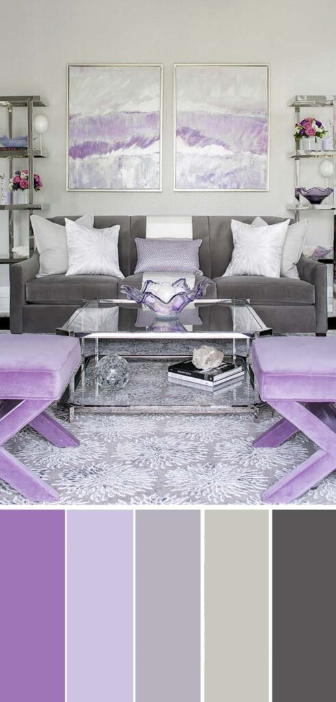
Some rooms are meant to feel a little dreamy, and that comes down to softness in every direction. Blush, dusty lavender, pale sage, and a warm off-white that keeps it from turning sweet.
The magic is in the low contrast. When every tone sits within a few shades of the others, edges start to blur and the room feels hazy in the best way, almost like it’s lit by candles even in daylight. Add sheer curtains and a velvet or bouclé texture, and the light does half the work for you.
Metallics help too. A brushed brass frame, a small gold tray.
9. Accentuate Your White Decor with Neutral Color Furniture
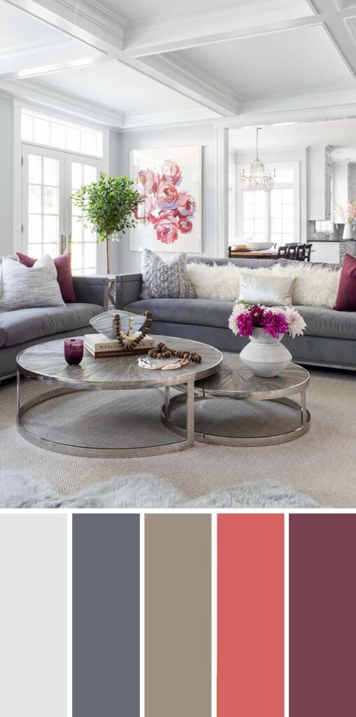
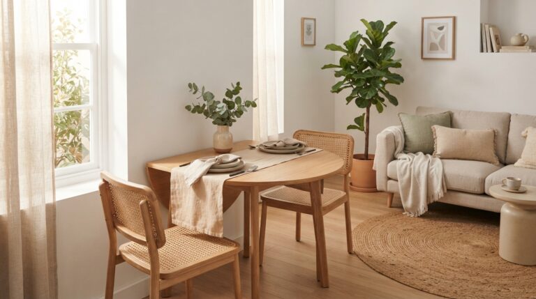
All-white rooms can drift toward cold, and neutral furniture is the easiest fix. An oatmeal sofa, a walnut side table, a taupe armchair, all sitting against those bright walls.
The reason it works is temperature. White is a cool baseline, so warm neutrals push back against it and keep the room from feeling clinical. You get the airiness of white without that showroom stiffness nobody actually wants to sit down in.
Vary your tones slightly instead of matching them. Cream next to greige next to soft tan reads richer than three identical pieces. Bright rooms are flattering for wood grain and honest about everything else, which is how advice on fading age spots naturally ends up in the same weekend as rearranging furniture.
By late afternoon, sun hits those warm surfaces and the whole room glows instead of glaring.
✨ Suggestion: If your white walls still feel flat after adding neutral furniture, bring in one textured element like a chunky knit throw or a jute rug. Texture creates shadow, and shadow gives white rooms the depth that color alone can’t provide.
Frequently Asked Questions
How many colors should a living room palette have?
Three is the sweet spot. One dominant tone for walls and large furniture, one secondary tone for chairs or curtains, and one accent for cushions and small decor. Any more than that and the room starts to feel scattered. If you want extra interest without adding another color, reach for texture instead.
What if my room doesn’t get much natural light?
Skip the cool grays and lean warm. Caramel, clay, cream, and soft tan all bounce what little light you have instead of absorbing it. Dark rooms also handle deep colors better than people think, so a moody accent wall can actually work in your favor here.
Can I mix warm and cool colors together?
Yes, and the coastal palette proves it. The trick is picking a clear winner. Let one temperature dominate about seventy percent of the room and use the other as your accent. Trouble only starts when warm and cool split the space evenly, because then nothing feels settled.
How do I choose a palette for an open floor plan?
Keep one shared neutral running through every zone, then shift the accents. Same oatmeal walls throughout, but rust cushions in the living area and sage in the dining space. The repeated neutral holds it together while the accents quietly mark where one room ends.
Is it better to start with paint or furniture?
Furniture, almost always. Sofas and rugs come in limited colorways, while paint can be mixed to match anything. Pick your big pieces first, then pull a wall color from the tones already in them. Doing it the other way around means hunting for a sofa that matches a color you already committed to.
What’s the cheapest way to change a room’s palette?
Textiles. Cushion covers, a throw blanket, and new curtains cost a fraction of furniture and take an afternoon to swap. Art comes next, especially one larger piece over a wall of small frames. Paint is affordable too, though it’s the bigger time commitment of the group.
Conclusion
Nine palettes, and not one of them requires tearing anything out. That’s the whole point. Color does the heavy lifting that furniture usually gets credit for, and it does it for a fraction of the cost.
Start with how the room actually gets used. A space that catches morning light and hosts coffee wants something different than the corner where everyone watches movies on a Sunday. Match the palette to the mood you already have rather than the one you saw in a photo.
Then go small. Two cushions, one piece of art, a throw over the chair arm. Live with it for a week before adding more, because rooms reveal themselves slowly and what looked right on day one sometimes shifts by day five.
The best rooms aren’t the ones that follow every rule. They’re the ones that feel like somebody actually lives there.