23 DIY Kitchen Sign Ideas to Make This Weekend
A kitchen sign is the cheapest way to put something of yourself on the wall. A board, some paint, an afternoon, and the room stops looking like it came from a catalog.
Most of these take one sitting and no power tools. A few need a saw.
The part nobody mentions is what happens after it hangs. Kitchens throw steam and grease into the air, and an unsealed painted board near the range picks that up fast. A coat of clear sealer at the end is what keeps a sign looking good in year three instead of just year one.
Placement matters too. A small sign on a big wall disappears, and lettering hung too high stops reading as decor and starts reading as a mistake.
The 23 ideas ahead cover farmhouse boards, galvanized metal letters, French market plaques, and simple painted lettering, with the actual method for each one. Pick the style that suits your kitchen and start with a board.
1. Farmhouse Kitchen Signs
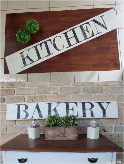
Painted pine with black lettering is the sign that started the whole trend, and it still works because the materials are honest. A plain board, a name or a word that matters, and nothing else competing for attention.
The method is simpler than it looks. Print the letters at a height that fits comfortably inside the board, tape the pages together so the word reads as one piece, then trace lightly onto the wood. Pressing hard here dents the grain and shows through the paint later. Two coats of black fills the letters properly, and a light sanding along the edges softens the whole thing. Seal it and the sign survives years of cooking steam.
Made for anyone starting their first sign with nothing but paint and sandpaper.
2. Impress with a Galvanized Metal Sign
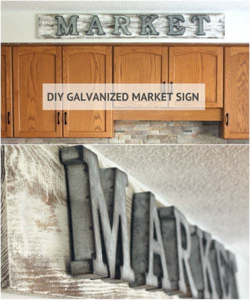
Swap hand-painted lettering for something with a bit of shine. Galvanized metal letters mounted on a weathered board bring in texture that flat paint cannot, and the contrast between rough wood and cool metal is the whole appeal.
Dry brushing is the technique doing the heavy lifting. Load very little white paint on the brush, drag it across the board, and let the grain show through instead of covering it. Sanding afterward deepens the aged look. Once the letters go on, the sign reads like something salvaged rather than made last Tuesday. Sitting on top of the cabinets, it catches whatever light the kitchen gets and softens that hard line near the ceiling.
The finish shifts through the day, bright at noon and muted by evening.
3. Go for a French-Inspired Sign
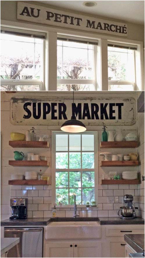
A French market phrase across a weathered board brings a softer, older feeling into a kitchen than plain English lettering does. Something like a little market sign reads as decorative rather than instructional, which is exactly why it ages better than a quote.
Build the base first. Paint the board white, then work dark wax over the surface to age it, which sinks into the grain and settles in the low spots the way real wear does. Trace the printed letters lightly and fill them with black chalk paint. Sanding the letters afterward is what keeps them from looking freshly printed. Hung above the window, it becomes the thing the eye lands on while the kettle heats.
A look that stays fresh long after trends move on.
💡 Pro Tip: Apply dark wax with a soft cloth in small circles, then wipe most of it back off within a minute. Leaving it to sit is what turns an aged finish into a muddy one.
4. Shine with Mason Jar Pallet Artwork

Lettering is not the only thing worth painting on a board. A mason jar shape across pallet wood gives a kitchen sign an illustrated feel, which suits rooms that already have plenty of words on the walls.
Freehand the jar shape or trace around something jar-shaped if a steady hand is not on offer. Painting the glass part a soft aqua and the lid chalky white is what makes the whole thing read as a jar rather than a blob, because the color break does the work the outline cannot. For any lettering inside it, transfer paper under a printed design lets you trace the shape without guessing. Seal it once it dries, since anything hanging in a kitchen eventually meets steam.
Best suited for anyone who wants a sign with a picture on it rather than a phrase.
5. Build a Grocery Corner
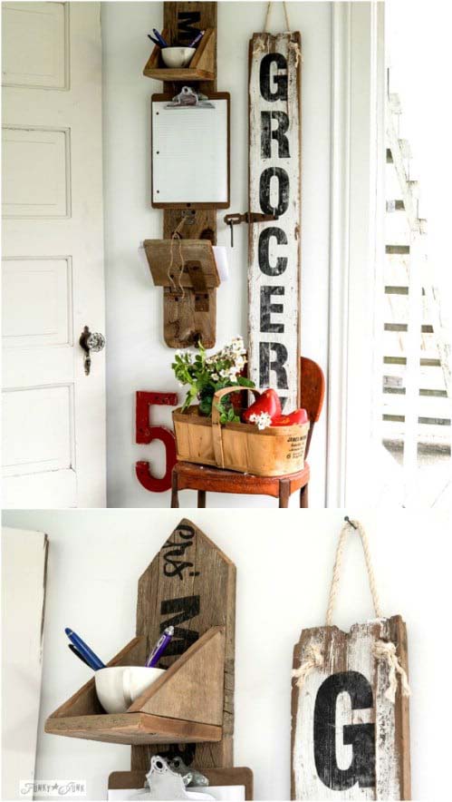
Some walls are too narrow for anything horizontal. A vertical sign solves that, and a single fence plank turns an awkward strip beside a doorway into a proper message corner.
Prep matters more than the paint here. Sand the plank lightly, brush on white in a loose, uneven way rather than aiming for full coverage, then sand again once it cures so the wood shows through in patches. That deliberate roughness is what stops a new plank from looking new. Stencil a word like grocery down the length, drill holes at the top, and hang it on heavy twine. A rusty old chair underneath finishes the corner and gives the whole setup somewhere to land.
Ideal for narrow wall strips where nothing else quite fits.
👉 Suggestion: Look for reclaimed fence planks or old pallet boards with visible weathering rather than new pine. Wood that has already been outdoors carries gray tones and grain texture that paint alone cannot fake.
6. Step into the Market

There is a way to get crisp lettering without a cutting machine or a steady hand. The ink transfer method moves a printed design straight onto wood, and it leaves behind a soft, slightly faded look that painted letters never quite manage.
Print the words reversed so the ink sits facing the board. Tape the paper in place, brush water over each letter, then scribble across the back with something firm like a marker cap to push the ink down into the grain. The result comes out faint on purpose, which is why you paint over the faded outline afterward to bring it back. Stain the board before the white paint for depth, then sand the edges once everything dries.
Proof that small choices carry the biggest weight.
7. Welcome Fall
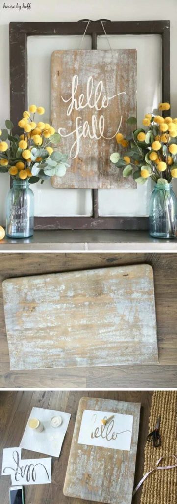
Flowing calligraphy on a rustic board is a softer look than block lettering, and it suits a seasonal message better than anything rigid. A welcome for autumn on an old, scarred piece of wood feels warm before anyone reads the words.
Salvaged boards carry the character here. Something with existing marks and worn edges gives the script a backdrop with history, which is why a new board never quite lands the same way. A vinyl stencil keeps the curves clean, though a printed design and transfer paper does the job just as well. Dab the paint with a sponge rather than brushing it, since sweeping pushes color under the stencil edges. Swapping it out four times a year keeps the wall feeling current.
The kind of piece that quietly marks the turn of a season.
💡 Pro Tip: Measure and mark the center of the board before laying out any lettering, then work outward from the middle in both directions. Starting from the left edge is why so many homemade signs end up crowded on one side.
8. Sell Your Apples
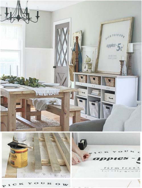
Some signs earn their place through sheer size. A large orchard-style board with a simple framed edge becomes the main event on a kitchen wall, and it takes an afternoon rather than a weekend.
Start by cutting the plywood to a square that suits the wall, sanding the rough edges smooth. Four lengths of framing timber with mitered corners wrap the outside and give it a finished look, which is what separates a real sign from a painted board. Two coats of white chalky paint cover it properly. Print the wording, trace it on, then fill the letters with black using a small brush and sand some of it away afterward. Big signs need less on them, not more.
Made for large blank walls that swallow anything smaller.
👉 Suggestion: Choose a chalky matte paint rather than a satin or gloss finish for the base. Matte surfaces take distressing far better and let the sanded edges read as genuine wear instead of scratched paint.
9. Display a Set of Boards
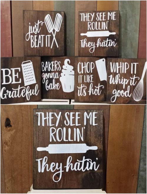
One large sign fills a wall. A set of smaller ones fills it differently, and the grouping gives you flexibility that a single piece never offers.
Three or four boards can stack vertically on a narrow wall, spread across a wide one, or sit in a square block above a counter. That adaptability is why a set works in more kitchens than a big statement piece. Keep the boards the same size and the lettering the same font so the group reads as one thing, then let the words carry the personality. Puns on old song titles turn a cooking session into something faintly ridiculous, which is half the point.
The kind of wall that makes people stop and read on their way past.
10. Stand it Up
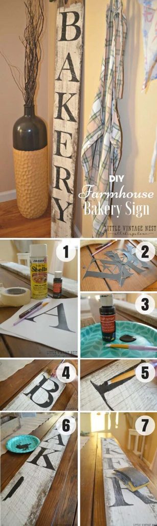
Not every sign needs a nail. Leaning a board against the wall on a counter or a shelf gives the same effect with none of the commitment, which matters a great deal in a rental.
A single word like bakery on white-painted barn wood is the classic version. Print the letters, cut them out, and tape them down with even spacing before painting, because spacing is what separates a considered sign from a homemade one. Basic black acrylic and a small brush handles the lettering, and a hand sander roughs it up afterward. Leaning also means you can shift it along the counter whenever the mood or the season changes.
A smart pick for renters and anyone who hates drilling into a wall.
11. Make a Statement
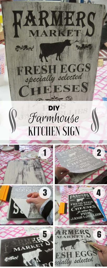
Vinyl stenciling gives the sharpest lettering of any method here, and for a design with real detail it beats tracing by a wide margin. A farmer’s market layout with multiple lines and varied fonts is exactly the kind of thing worth doing properly.
Paint the board creamy white first and let it cure fully, because vinyl lifts paint that has not hardened. Lay the transfer paper down the middle and peel it back in small sections, pulling at an angle rather than straight up so the vinyl stays put. Dab black paint over the lettering with a foam brush instead of brushing across. Pulling the vinyl off at the end is the satisfying part, and tweezers handle any stubborn pieces.
One of those projects where the method matters more than the design.
💡 Pro Tip: Burnish the vinyl down hard with a credit card edge before painting, working from the center outward. Air trapped under the edges is the single biggest cause of paint bleeding beneath a stencil.
12. Inspire with a Quote
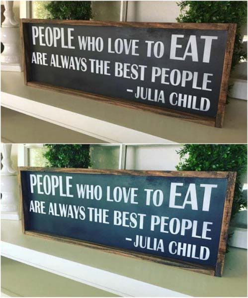
Not every sign has to be built from scratch. A framed quote from a favorite cook brings personality to a kitchen wall with almost no effort, and the words do all the work a hand-painted board would.
Choosing well is the whole thing. A line with a bit of wit in it wears better over years than anything earnest, because a joke stays funny while an inspirational phrase starts to feel like wallpaper. Print it in a clean serif on plain paper, drop it into a simple wood or black frame, and hang it where people stand rather than where the wall happens to be empty. Swapping the print later costs nothing, which is the quiet advantage of framing over painting.
Best suited for anyone who wants the look without a single power tool.
13. Express Gratitude

A framed wooden board with a short message sits somewhere between the painted signs and the printed ones. It carries real texture, but the frame keeps it feeling finished rather than raw.
The painted border is the detail worth copying. Running painter’s tape around the edges before the white coat goes on leaves a clean stained margin that acts like a built-in frame, which saves buying one. Adhesive vinyl letters give the crispest result, and peeling them off with tweezers avoids tearing the paint underneath. Dry brush the white in thin coats so the wood grain still reads through. Sanding back to the stain afterward gives that aged look without any wax.
The kind of piece that becomes part of the room rather than decoration on top of it.
👉 Suggestion: Use a warm mid-tone wood stain under the white rather than a dark walnut. Lighter stains show through distressed edges as a soft honey tone, while dark stains read almost black and can look harsh against white paint.
14. Give Guidance

Words are not the only way to make a sign. Wooden arrows pointing off in different directions bring a bit of humor to a kitchen wall, and they work in rooms where another phrase would be one phrase too many.
Thin craft wood or plywood is all it takes, cut into long shapes with a point at one end. Chalk paint covers cleanly and sands back easily, which is why it suits distressing better than regular latex. Freehanding the arrow shapes is fine here, since slight irregularity is part of the look. Distress the edges with sandpaper, then seal with clear wax to make the color pop instead of sitting flat. Grouped at different angles, they stop the wall from feeling static.
Sometimes the quietest details do the loudest work.
15. Showcase Your Family Values
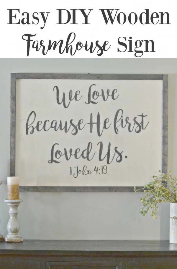
Some signs carry more weight than others. A verse or a phrase that means something to the household turns a painted board into the piece nobody takes down, even when the rest of the decor changes.
Build the canvas first with chalk paint over plywood, then stain some wood studs with an old t-shirt for a softer, uneven finish and glue them on as a frame. For the lettering, a paper transfer gives a cleaner result than tracing. Print the design at full size, coat the lettering side generously with decoupage medium, press it onto the board, and let it dry overnight. Wet the paper the next day and rub the backing away with a damp rag, and the letters stay behind.
A reminder that good design starts with how a space feels.
💡 Pro Tip: Rub the wet paper backing away in small circles with your fingertips rather than scrubbing with a cloth. Fingers feel when a letter edge starts lifting, while a rag takes it off before you notice.
16. Show Some Appreciation
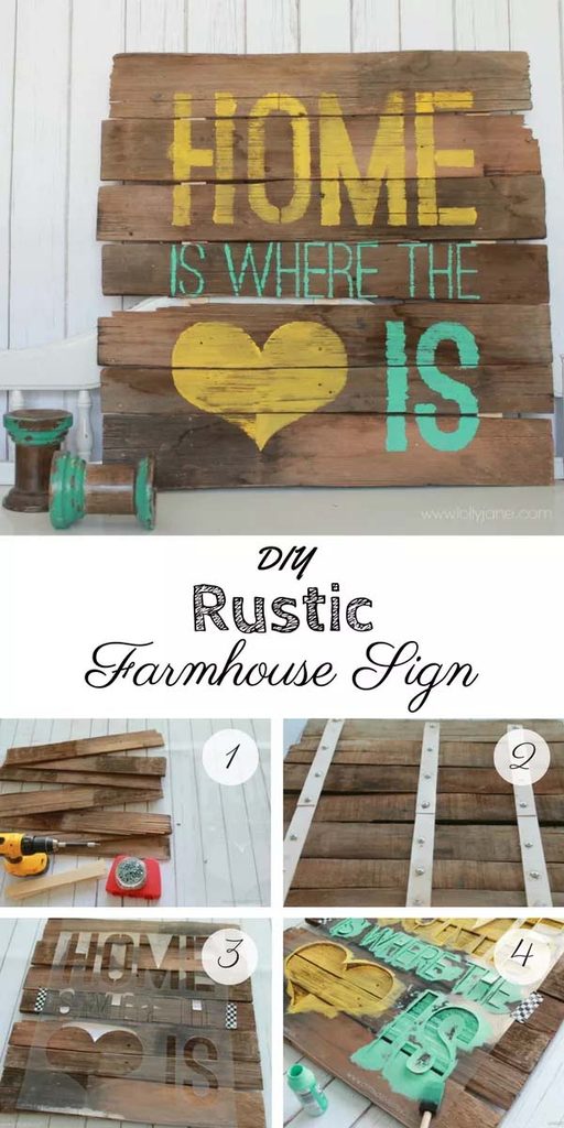
Building a sign from several narrow slats gives it lines and shadows that a single flat board never has. Old wood works best, because the mismatched tones between planks are part of what makes the finished piece look salvaged.
Seven slats held together with short wood shims across the back forms the canvas. Old wood splits easily, so pre-drilling every screw hole is the step that saves the whole project. Paint the assembled boards black, then lay a stencil over the top and secure it with tape. Blot the paint on with a foam brush rather than sweeping across, since sweeping is what pushes color under the stencil edges and blurs the letters.
Ideal for anyone with a pile of salvaged wood and no clear plan for it.
17. Bless Your Guests
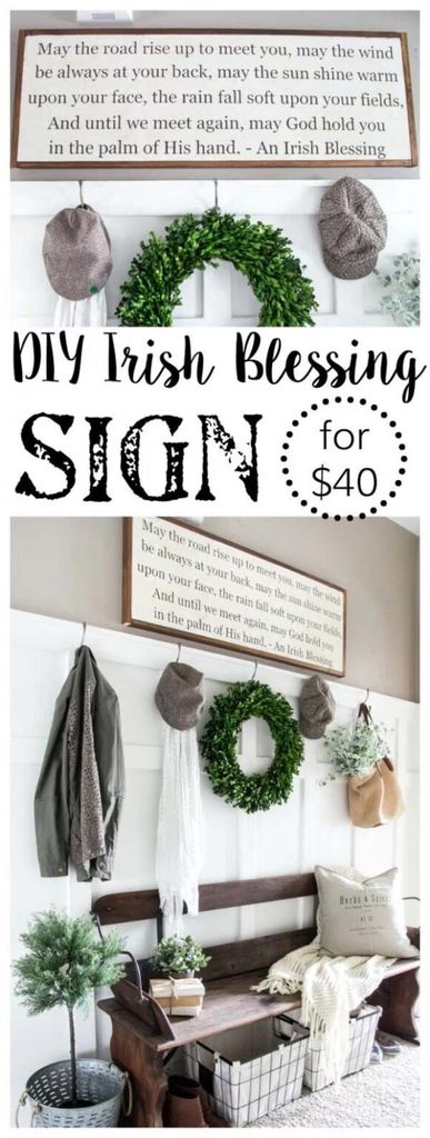
Where a slatted board shows its construction, this one keeps things smooth and lets the message carry the piece. A goodbye or a blessing hung near the doorway greets people on the way out rather than the way in, which is a small shift that changes the whole feeling.
Placement is doing the work here. A sign near an exit gets read at the moment people are leaving, so a warm line lands harder than it would on a blank kitchen wall. Keep the lettering simple and the board plain, because a sentimental message with a busy design starts to feel like too much. Soft neutral tones suit this better than high contrast.
The kind of detail people remember about a house long after they leave.
18. Take a Bold Approach
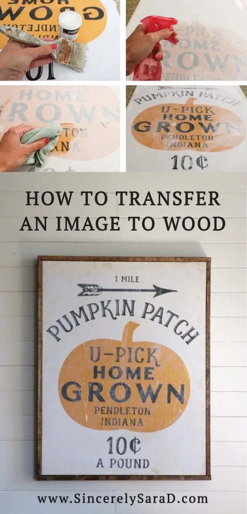
Lettering has limits. Transferring a full printed image onto wood gives a sign real visual weight, and for something seasonal like a pumpkin patch design it beats hand-painting by a wide margin.
The method takes patience rather than skill. Cut the plywood to match the paper size and print the image reversed, then coat both the paper and the board with acrylic gel medium and let that first thin layer dry. A thicker coat goes on the board before the paper presses down, and the whole thing needs to sit overnight. Wet it the next morning and sponge the paper away, which is the part that feels like magic. A light sanding and a coat of varnish brings the color back.
The kind of piece guests always end up asking about.
👉 Suggestion: Choose images with strong dark areas and simple shapes rather than photographs with soft gradients. Transfers lose fine detail during the sponging stage, so bold graphics survive the process where subtle ones turn muddy.
19. Distress Your Sign
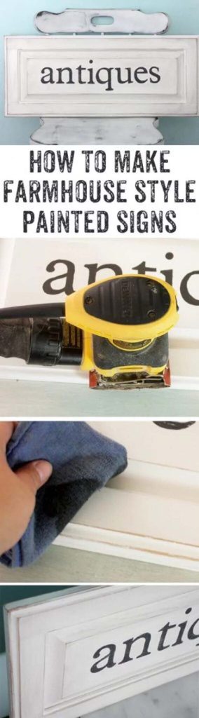
Distressing is the technique that rescues almost any sign that came out looking too new. It adds depth and shadow in about twenty minutes, and it works on painted boards, thrifted doors, and anything else flat.
Flat paint is the right starting point, because matte surfaces take wax and sanding far better than anything with sheen. Let it dry completely, then sand the edges lightly with a palm sander so the wear lands where a real sign would actually rub. Rub dark wax on with a sponge and buff it back. The control comes from building up thin layers rather than one heavy pass, since each round darkens it slightly and you can stop whenever it looks right.
Made for anyone whose first sign came out looking a little too perfect.
20. Make it Charming
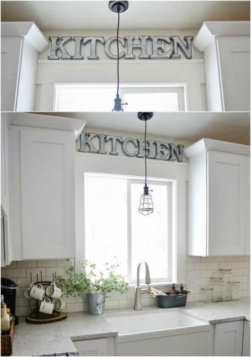
Skip the painting entirely and let hardware do the talking. Metal letters mounted on a board give a kitchen an industrial farmhouse edge, and the whole project takes an evening because there is no lettering to trace or stencil.
The board itself is meant to disappear. Cutting it to fit the space above the sink and painting it the same color as the wall means the letters look like they float, which is the trick that makes this read as designed rather than hung. Screws set into the board hold each letter, so they can be repositioned if the spacing looks off once it goes up. Metal also shrugs off kitchen steam in a way painted wood never does.
A smart pick for anyone who wants the look without picking up a paintbrush.
💡 Pro Tip: Lay the letters out on the floor and photograph the spacing before drilling anything. Letter gaps that look even up close almost always look uneven from across the room, and a photo shows it instantly.
21. Keep it Simple
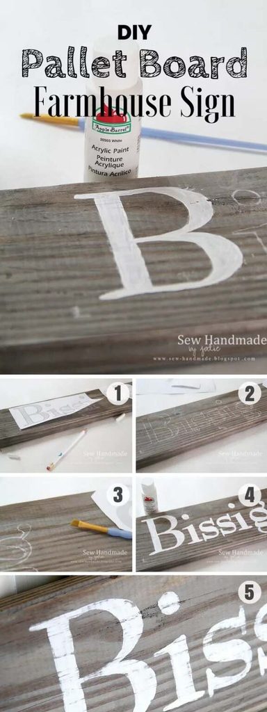
After all the transfers and stencils, the plainest method still holds up. Chalk on the back of a printed page and a pencil is all it takes to move letters onto wood, with nothing bought special for the job.
Color the back of the printout with plain white chalk, lay it face up on the board, then trace the letters firmly with a sharp pencil. The chalk transfers a faint guide onto the wood wherever the pencil presses. Paint inside those lines with white acrylic and a small brush, then sand lightly once it dries for the usual soft farmhouse finish. An old piece of pallet wood is the perfect base, since its rough surface already carries half the character.
Proof that a sign needs almost nothing to look good.
22. Step Back in Time
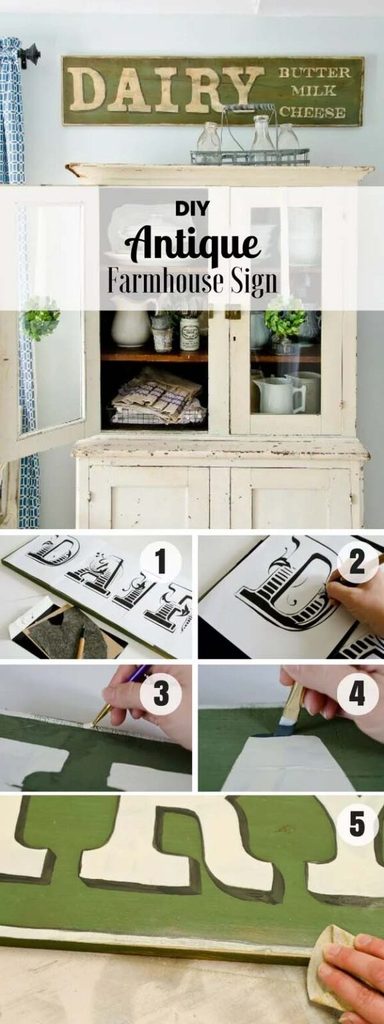
Some signs work because of what they leave out. A dairy-style board with a classic font, soft neutral tones, and faded edges suits a farmhouse kitchen precisely because nothing about it shouts.
Restraint is the whole design. Sticking to two close tones, something like cream on a soft gray board, keeps the sign readable while letting it settle into the wall instead of pulling focus. A traditional serif font reads older than any modern script, which is what sells the vintage feel. Hanging it on a single hook rather than mounting it flat means it can move to a different wall whenever the room changes. That flexibility matters more than people expect.
Easy to live with every day without feeling overly designed.
💡 Pro Tip: Keep the contrast low between the lettering and the background, no more than two or three shades apart. High contrast is what makes a sign look newly printed, while close tones read as sun-faded.
23. Bring it Outdoors
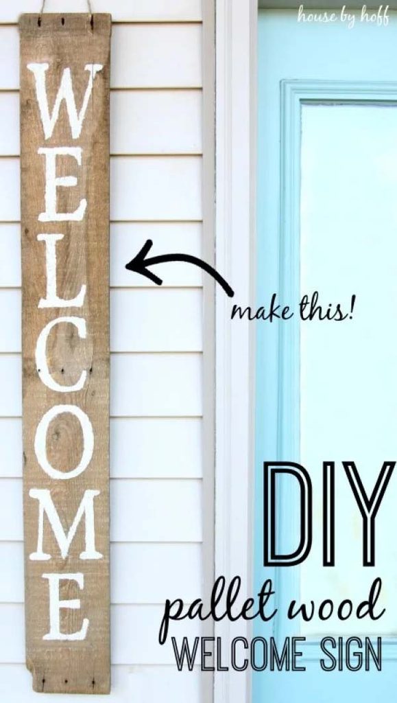
Not every kitchen sign belongs inside. Hanging one by the back door greets people on their way in, and the weathered look these boards already have suits an outdoor spot better than a clean painted wall ever did.
A salvaged pallet plank stenciled vertically with a single word is all this takes. Vertical works well beside a doorframe, where the narrow space rules out anything horizontal. Outdoor signs need a proper exterior sealer rather than an indoor one, since rain and sun will grey untreated wood within a season. Setting a few potted flowers underneath finishes the corner, and the whole thing becomes the first thing anyone sees when they come around the back with groceries.
The kind of small touch that makes a house feel welcoming before anyone steps inside.
You Might Also Love These Ideas
- 17 Smart Remodel Ideas. Real before and after kitchens where closed-off rooms open up into bright, easy spaces.
- 23 White Kitchen Ideas. Creamy cabinets, warm oak, and brass touches that keep white feeling soft instead of cold.
- 14 Storage and Decor Ideas. Open shelves and woven baskets that turn an empty kitchen wall into something useful.
Frequently Asked Questions
What kind of wood works best for kitchen signs?
Reclaimed pallet wood, old fence planks, and barn wood give the best results because they already carry weathering that paint cannot fake. Pine and plywood work fine for a smooth, painted look and cost very little at any home improvement store. Avoid anything warped, since a bowed board never sits flat against a wall. Hardwoods like oak are harder to distress and rarely worth the extra spend.
How do you seal a kitchen sign against steam and grease?
Use a water-based clear polyurethane or a matte acrylic sealer in two thin coats. Kitchens push moisture and cooking oils into the air, and bare chalk paint absorbs both, which is why unsealed signs look dull within a year. Matte sealers keep the flat farmhouse finish, while satin adds a slight sheen. Signs near the range need it most.
How high should a kitchen sign hang?
Center it at eye level, roughly 57 to 60 inches from the floor, unless it sits above furniture. Above a counter or a range, leave about 10 to 12 inches of clear space beneath so the sign relates to the surface instead of floating. On a large blank wall, the sign should cover roughly two thirds of the available width. Too small on too big a wall is the most common mistake.
How do you change kitchen signs for the seasons?
Keep one neutral sign year-round and swap a second seasonal piece beside it. Building two or three boards at once saves time, since the base coats and sanding happen in the same session. Shift the tones with the calendar, using rust and amber in fall, then evergreen and cream through winter. Storing spares flat under a bed prevents warping.
Should you make a kitchen sign or buy one?
Make it if the wording is personal, buy it if the design is complex. Custom phrases, family names, and inside jokes are worth the afternoon, and the materials stay in the budget-friendly range. Intricate vintage-look graphics are usually cheaper and cleaner bought, especially from makers on marketplaces like Etsy. Framed prints split the difference for anyone avoiding paint entirely.
Conclusion
A kitchen sign is one of the few pieces of decor you can actually make yourself in an afternoon. A board, some paint, and a word that means something, and the wall stops looking like it came out of a catalog. The methods matter more than the design, because a clean transfer or a well-judged distressing is what separates a sign that looks made from one that looks homemade. Farmhouse boards, galvanized lettering, French market plaques, and simple painted words all start from the same basic materials.
Pick one project and one wall to start with. Measure the space before cutting anything, because sizing a sign to the wall is what most people get wrong the first time. Save the design you like best to a Pinterest board, bookmark this post for the next free Saturday, and pass it to a friend who has been meaning to make something. Seal it properly and it will still look good years from now.