5 Kitchen Cabinet Colors to Avoid & What to Use
Cabinet paint is the most expensive color decision in a house. Not because the paint costs much, but because nobody repaints twenty doors and drawer fronts on a whim. Whatever goes on them tends to stay for years.
Which is why the wrong shade stings more here than anywhere else.
Most bad cabinet colors do not fail because the color itself is ugly. They fail because of undertone, saturation, and the light the kitchen actually gets. A gray that looks calm on a sample card turns cold and flat on a north-facing wall. A yellow that felt cheerful in the store closes a small room in.
Light direction decides more than personal taste does.
The five colors ahead are the ones that most often end in regret, along with what goes wrong in each case and the shade to reach for instead. None of them are banned. They just need more from a kitchen than most kitchens can give.
1. Sunshine Yellow
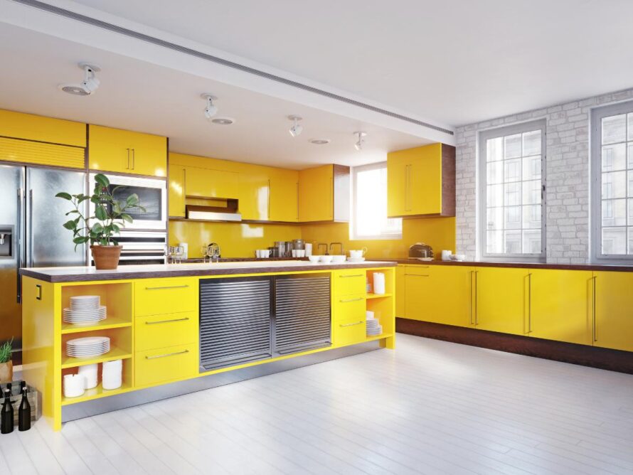
Bright yellow cabinets look cheerful on a sample card and rarely stay that way on a wall. The problem is saturation. A strong yellow reflects onto every surface near it, so the counters, the ceiling, and the walls all pick up a faint tint that nobody planned for.
Small kitchens suffer most. Bright color visually pulls walls inward, which makes a tight room read tighter, and yellow does this more strongly than almost any other shade. It also locks in the rest of the palette, since very little sits comfortably beside it later on. That matters on a gray morning when the room feels loud before the coffee is even made.
Try instead: soft butter or warm cream keeps the cheerfulness without taking over the room.
2. Deep Browns
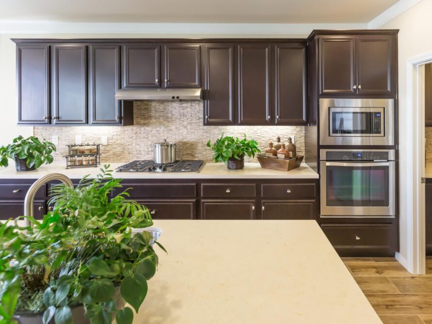
Where yellow shouts, dark brown does the opposite and swallows a room whole. Deep chocolate and near-black wood tones absorb light rather than bouncing it, so a kitchen with brown cabinets needs far more daylight than most kitchens actually have.
The dated feeling comes from context. Dark brown reads as early 2000s builder-grade because that is exactly when it was everywhere, paired with beige walls and speckled granite. Without warm counters and strong lighting to lift it, brown turns heavy and unwelcoming fast. It shows up most in the evening, when the overhead light goes on and the room still feels dim.
Try instead: warm oak, taupe, or almond keep the wood feeling without the weight.
💡 Pro Tip: If dark brown cabinets are already in place, painting only the uppers a soft cream and leaving the lowers dark lifts the whole room for a fraction of a full repaint.
3. Bright Red
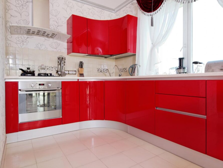
Red is the one color that refuses to sit quietly in a room. On cabinets it takes over completely, because red advances visually while every other color recedes, which makes a kitchen feel smaller and busier than it measures.
The energy is the issue. A kitchen is already a loud room with running water, clattering pans, and people talking over each other, so the walls do not need to add to it. Red also limits everything around it, since most counters and backsplashes fight rather than settle beside it. Looking through the kind of bold choices that show up in real kitchen remodels makes the pattern clear, because the successful ones use strong color in small doses. Late at night, a red kitchen never quite lets you wind down.
Try instead: deep brick or oxblood carries the richness with far less noise.
4. Grays
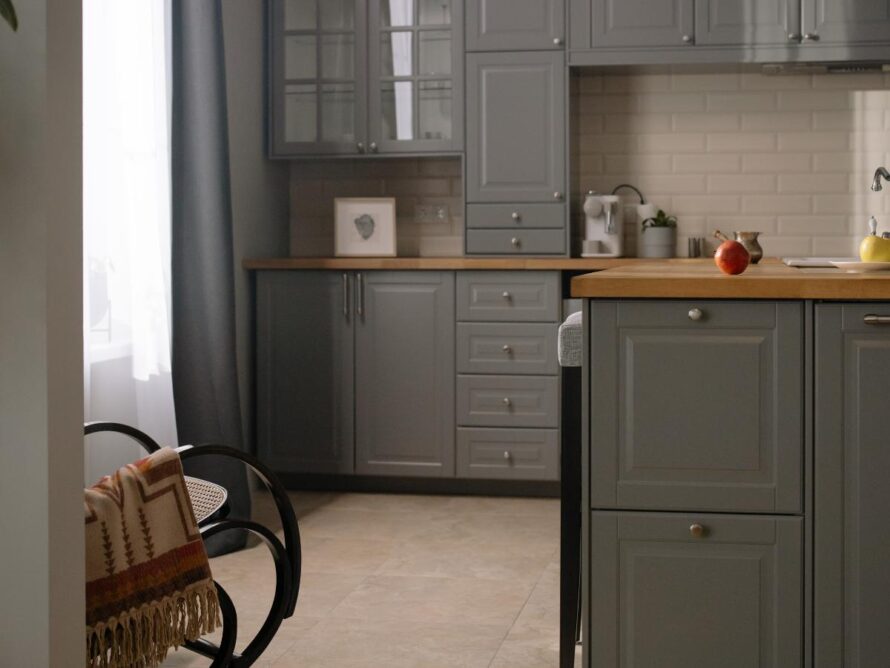
Gray gets blamed as a whole family, which is not quite fair. The colors that actually date a kitchen are the cold, blue-based grays that dominated for about a decade, and those turn flat and lifeless the moment daylight drops.
Undertone decides it. A blue-gray beside stainless appliances reads clinical, because there is nothing warm anywhere in the room to push against all that cool. North-facing kitchens make it worse, since the light coming in is already cool and pulls the gray further toward slate. Warm greige behaves completely differently and still looks current, which is why the same person can love one gray kitchen and find another depressing. The difference shows most in winter, when the room either feels calm or feels cold.
Try instead: warm greige, mushroom, or one of the softer white kitchen looks that lean cream rather than bright.
💡 Pro Tip: Hold a gray sample next to a sheet of plain white paper in daylight. Any blue or violet cast shows up immediately against true white, and that cast is what will read as cold on a full wall of cabinets.
5. Hot Pink and Purples
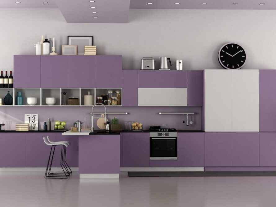
Some colors are wonderful everywhere except on twenty cabinet doors. Hot pink and saturated purple fall squarely in that group, because both are high-personality shades that most people stop loving somewhere around year three.
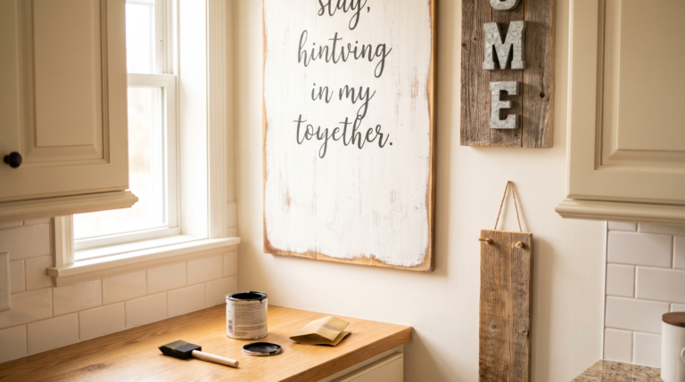
Commitment is the real problem here. Cabinets are the largest painted surface in the room, so a bold color has nowhere to hide and nothing to balance against. Both shades also sit awkwardly beside the warm woods and stone counters that most kitchens already have. Personality is easier to add in ways that come back off, which is why a few handmade kitchen signs or some colorful open shelving does the job without a weekend of sanding and priming.
Try instead: a soft dusty rose or muted plum reads almost neutral while keeping the character.
👉 Suggestion: Look for shades with gray or brown mixed into the base rather than clean bright pigments. Muted versions of bold colors hold up for years, while fully saturated ones start feeling like a decision rather than a choice.
Frequently Asked Questions
What kitchen cabinet color is most timeless?
Warm off-white and creamy neutrals have held their value longer than any other cabinet color. They suit almost every style, work in both bright and dark kitchens, and never tie a room to a particular decade. Soft greige and warm mushroom sit close behind for anyone wanting a bit more depth. Muted sage and deep olive have also proven durable across several trend cycles.
What cabinet colors hurt resale value?
Highly saturated and personal colors do the most damage, especially bright red, hot pink, purple, and lime green. Buyers mentally price in the cost of repainting, so a bold kitchen narrows the pool of people willing to make an offer. Very dark browns also read as dated to most buyers. Neutrals in the cream, greige, and soft sage range are the safe choices before listing.
How do you choose a cabinet color for a dark kitchen?
Go warmer than feels necessary. North-facing and low-light kitchens strip warmth out of every color, so a shade that looks perfectly neutral in a store turns gray and flat on the wall. Creamy whites, warm greige, and soft taupe all hold their color in poor light. Adding under-cabinet lighting matters as much as the paint choice itself.
Can you test cabinet paint before committing?
Yes, and skipping this step causes most cabinet color regret. Paint a sample directly onto a spare cabinet door or a large piece of primed board, then move it around the kitchen across a full day. Colors shift noticeably between morning light, afternoon sun, and evening bulbs. Sample pots cost very little compared to repainting a full kitchen.
How much does it cost to repaint kitchen cabinets?
Doing it yourself usually stays in the budget-friendly range for materials, while hiring a painter lands in the mid-range depending on cabinet count. The real cost is time, since proper prep, priming, and two topcoats take several days. That gap is exactly why choosing the color carefully matters more here than on a wall. Cabinet paint kits are available at most home improvement chains.
Does paint sheen matter as much as color?
More than most people expect. Flat and matte finishes absorb marks and cannot be scrubbed, which is a problem on surfaces touched dozens of times daily. Satin and semi-gloss wipe clean and hold up to grease near the range. A beautiful color in the wrong sheen still looks tired within a year.
Conclusion
None of these colors are truly forbidden. They simply ask more from a kitchen than most kitchens can give, and the regret usually comes from undertone and light rather than from taste. A bright yellow that felt cheerful in the store closes a small room in. A cold blue-gray reads calm in one house and clinical in the next. The shades that last tend to be the quieter ones, warm cream, soft greige, muted sage, or a deep olive that behaves almost like a neutral.
Pick one replacement shade and live with a sample before committing to twenty doors. Paint it on a spare cabinet front and move it around the room across a full day, because morning light and evening bulbs tell completely different stories. Save the color that holds up to a Pinterest board, bookmark this post for the next planning weekend, and send it to a friend halfway through choosing samples. The right cabinet color still looks right in five years.