22 Budget Kitchen Countertop Ideas for a Modern Look
Countertops carry a kitchen. They take up more visual space than almost anything else in the room, which is why a dated surface can make brand new cabinets look tired and a good one can make builder-grade cabinets look intentional.
The surprising part is how little the price tag shows once everything is in place. Butcher block, ceramic, concrete, and quartz all read as considered choices when the color and finish are right. What sells the high-end look is not the material itself. It is how the counter talks to the cabinets, the backsplash, and the hardware around it.
That is where most kitchens go wrong. The counter gets chosen alone, then everything else has to work around it.
The ideas ahead show 22 pairings that get it right. Some lean bright and modern, others go moody, rustic, or warm. Find the one that matches the kitchen already there, and the whole room starts to look like it was planned that way from the beginning.
1. Go for White Quartz Counters

White quartz is the safest bet in any kitchen, and that is exactly what makes it powerful. The surface stays quiet, so the cabinets, the hardware, and the light coming through the window get to do the talking instead.
Pair it with white cabinets and the room reads bright and open, especially in kitchens that only get sun for part of the day. Gray hardwood flooring underneath keeps everything from floating away, adding just enough contrast to ground the space. Two industrial pendants over the island break up all that softness. The counter also handles real life well, which matters on the nights when three people are prepping at once and nobody is being careful.
A look that stays fresh long after trends move on.
2. Match Marble Countertops with White Cabinetry

Take that same all-white foundation and give it something to look at. Marble with soft gray veining keeps the palette clean but adds movement, so the kitchen stops feeling flat the way pure white sometimes does.
The veining does the heavy lifting here. It brings pattern into a room without adding a single busy color, which is why all-white kitchens with marble never feel cold. Black cabinet hardware sharpens the edges and gives the eye something crisp to land on. Silvery appliances pick up the gray in the stone and tie it together. It becomes the kind of kitchen where morning light hits the counter and the veining looks different than it did the day before.
Best suited for bright kitchens that need pattern without extra color.
3. Bring a Minimalist Feel with Light Wood Countertops

Swap cool stone for something with a little more warmth in it. Light wood counters soften a kitchen the way nothing else does, and they pull minimalism away from feeling clinical.
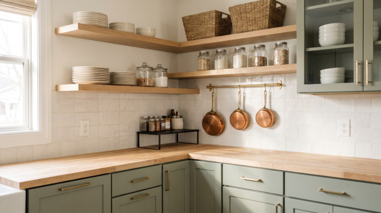
Natural butcher block against light gray inset cabinets is the pairing that keeps showing up, because the wood grain adds texture while the cabinet color stays calm. A white tile backsplash bounces light back into the room so the wood never reads heavy. The reason this combination lands is balance. One warm element, everything else quiet. Wood also takes on small marks over time, and most people end up liking the kitchen more because of them, not less.
Made for anyone who wants a clean kitchen that still feels lived in.
💡 Pro Tip: Oil butcher block with a food-safe finish once a month for the first six months, then a few times a year after that. Skipping it is why wood counters dry out and split along the seams.
4. Try Waterfall Style
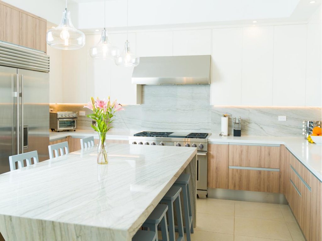
Now for something with a little more drama. A waterfall edge runs the counter straight over the side of the island and down to the floor, turning a plain slab into the piece everyone notices walking in.
The effect works because it hides the cabinet base completely. Instead of a counter sitting on top of boxes, the whole island reads as one solid form, which is what makes a modest kitchen look custom. Light gray veining on a white background keeps it from feeling heavy, and wood base cabinets nearby warm up all that stone. It also gives kids a clean surface to lean against while dinner comes together, with no hardware or edges in the way.
Proof that small choices carry the biggest weight.
5. Consider Veining in Your Kitchen Countertop
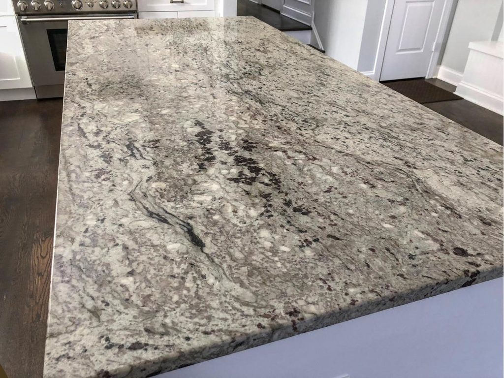
Push the stone itself a little further. Bold dark gray veining across a white background brings real movement into a kitchen, the kind that catches the eye from across the room and keeps it there.
Heavy veining acts like artwork built into the surface, which is why kitchens with plain cabinets and a dramatic counter never feel boring. Carry the same stone up onto the backsplash and the look goes from nice to expensive, because the pattern runs uninterrupted instead of stopping at the wall. Keep everything else simple so the stone stays the star. Guests almost always end up with a hand on that counter, half looking at the veins while they talk.
The pattern reads differently depending on where the light falls.
👉 Suggestion: Look for stone with veining that runs in one clear direction rather than scattered in every direction. Directional veins guide the eye along the counter and make a small island look longer than it is.
6. Contrast Marble with Black Countertops
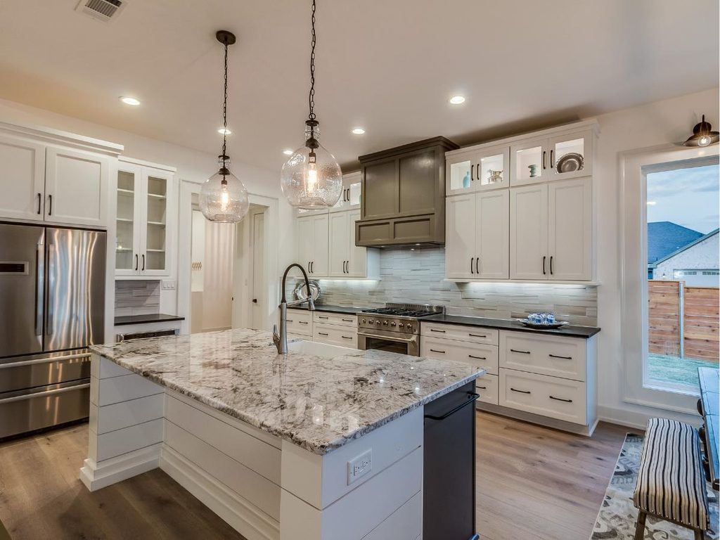
Keep that drama going, but split it across two surfaces instead of one. Light gray marble on the island paired with black counters along the perimeter gives a kitchen instant depth, and it costs less than running expensive stone through the whole room.
That split is the practical part nobody mentions. The showpiece slab only has to cover the island, while the working surfaces stay dark and forgiving. Black hardware ties the two together so the contrast looks planned instead of accidental. White cabinets keep the room from closing in, since dark counters can swallow light fast. The island ends up being where everyone sits, and the marble is the reason they stay.
A smart pick for kitchens that want a statement slab without covering every surface in it.
7. Combine Marble Countertops with Wood Finishes

Dial down the contrast and let warmth back into the room. Lightly veined marble against rich wood cabinetry is the pairing that turns a cold stone kitchen into something you actually want to stand in.
Wood grain and stone veining both carry natural pattern, so they read as relatives rather than competitors. That is why the combination never clashes the way stone against painted cabinets sometimes can. A paneled wall section behind the range hood gives the eye a place to rest, and brass or aged metal accents soften the whole thing further. It ends up being the kitchen where people linger past dinner, still leaning on the counter long after the plates are cleared.
One of those setups where every piece earns its place.
💡 Pro Tip: Match the undertone before the color. Warm-toned wood next to marble with cool gray veining will fight each other, so pick stone with a cream or beige background when the cabinets lean golden.
8. Add Drama with Black Kitchen Countertops

Flip the mood completely and go dark everywhere. Matte black counters running across the peninsula, the island, and the main workspace make a kitchen feel deliberate in a way lighter surfaces rarely manage.
Running one color across every surface is what sells it. Break it up with different materials and the room looks patched together, but keep it consistent and the whole kitchen reads as one designed piece. A black tile backsplash deepens the effect, while white accents on the walls and trim stop it from going cave-like. Matte finishes also hide fingerprints far better than gloss, which anyone with kids will notice within the first week.
The room carries a quieter, heavier mood than a bright kitchen ever could.
9. Evoke a Rustic Modern Feel with Gray Wood Counters
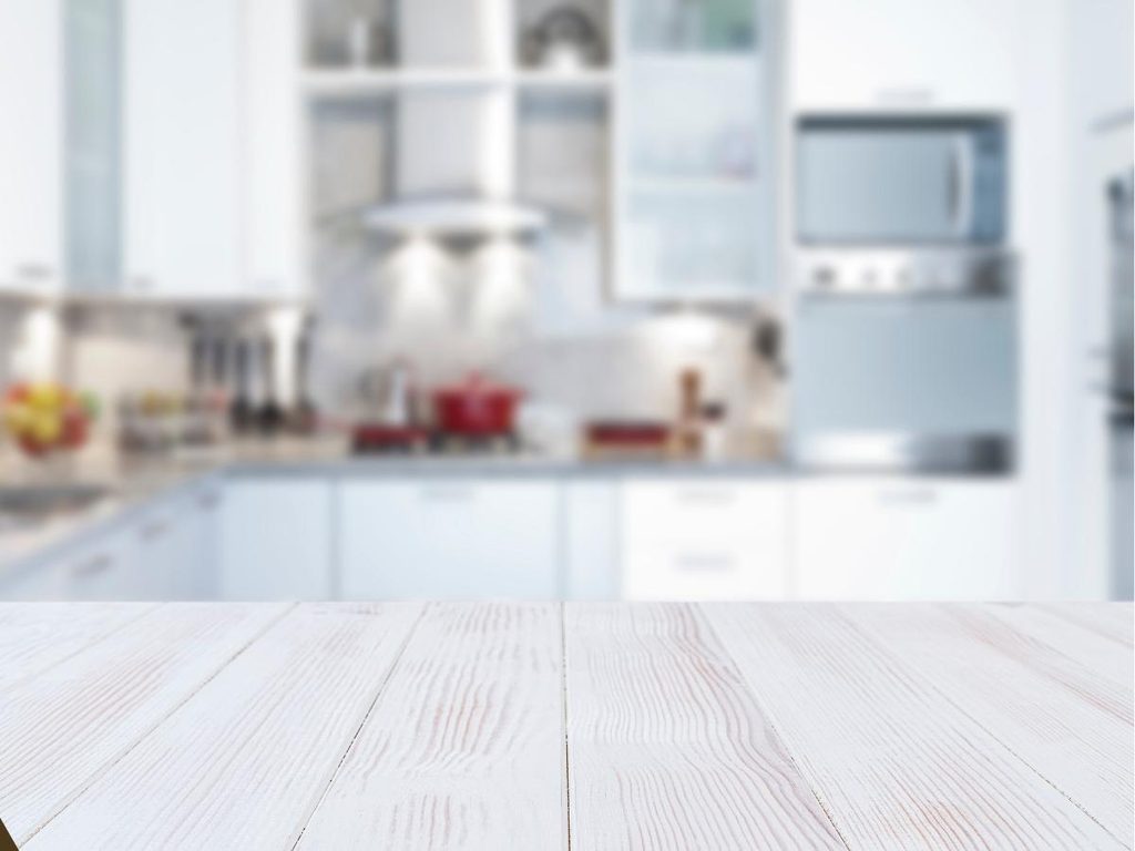
Same depth, softer material. Gray-stained wood counters land right between rustic and modern, holding onto visible grain while losing the orange tones that make plain wood look dated.
The gray stain is doing something clever. It cools the wood down so it sits comfortably beside modern cabinets and stainless steel, which raw wood often cannot do. Seal the surface with a clear protective topcoat and it shrugs off stains and scratches while staying easy to wipe down. That matters on the mornings when someone sets a wet mug down and forgets about it until afternoon.
Best suited for modern kitchens that need warmth without going full farmhouse.
10. Bring an Industrial Feel with Concrete
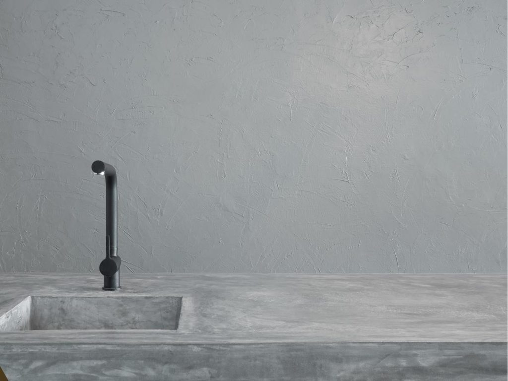
Trade soft grain for something with more weight to it. Concrete counters bring a raw, honest surface into a kitchen, and the slight color variation across the slab is what keeps them from looking like plain gray stone.
Concrete can read cold on its own, so the pairing matters more here than with most materials. Silver-toned hardware keeps the industrial edge, white accents open the room back up, and natural wood somewhere in the mix brings the temperature back to comfortable. That balance is what separates a concrete kitchen that feels designed from one that feels unfinished. It is also a surface that takes a hot pan without anyone panicking about it mid-dinner.
Made for modern spaces that want texture instead of shine.
💡 Pro Tip: Reseal concrete counters every one to two years, and always use a penetrating sealer rather than a topical one. Topical sealers look glossy at first but peel around the sink where water sits longest.
11. Opt for Dark Wood Countertops

Swap that cool industrial edge for something with history in it. Dark-stained wood counters bring a vintage feel to a kitchen fast, and the deeper tone hides daily wear far better than pale wood does.
Run the same dark butcher block across the island and the perimeter and the room gains a settled, older quality, like the kitchen has been there a while. Classic white cabinetry with long pulls keeps it from turning heavy, and that mix of old-feeling surface with clean cabinet lines is what stops it from tipping into theme-park farmhouse. Dark wood also forgives the coffee ring nobody noticed until the next morning.
The kind of kitchen that quietly becomes everyone’s favorite room in the house.
👉 Suggestion: Choose a close-grain hardwood like walnut or dark-stained maple rather than an open-grain wood. Tight grain takes stain more evenly and resists trapping crumbs and moisture along the counter edge.
12. Pair Black Backsplash with White Counters and Cabinets
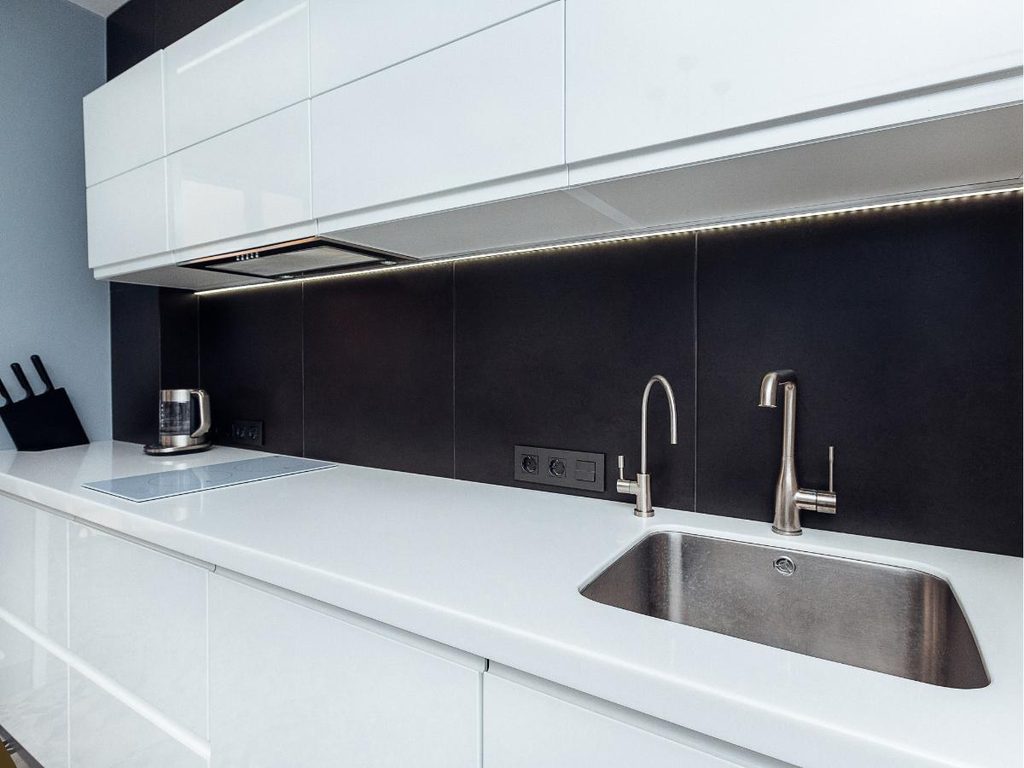
Push the dark tones up the wall instead of across the counter. A black backsplash gives a kitchen real depth, and white counters above and below keep the whole thing from feeling closed in.
Black slate works especially well because the texture catches light unevenly, so the wall has movement instead of sitting flat. Clean white stone counters and flat-panel cabinets give the eye somewhere calm to land, which is exactly why the contrast reads as intentional rather than harsh. Silver accents add a little shine at the hardware and faucet. The dark wall also hides splatter from the stove, something that becomes obvious the first time someone fries anything.
Sometimes the quietest details do the loudest work.
13. Impress with Black Granite Kitchen Countertops

Bring the dark tones back down to the counter, but with grain this time. Dark gray granite with a fine speckled effect gives a kitchen substance without the loud veining that dates a room after a few years.
Speckled stone has been around long enough that people assume it looks old-fashioned, but the difference is in the tone. Light beige speckle reads dated, while a deep gray background with a subtle grain reads timeless. Pair it with dark wood cabinetry and a white wall backsplash so the room keeps some breathing space. Granite also handles heat, knives, and general carelessness better than almost anything, which shows on the nights when cooking gets messy and nobody has time to be gentle.
One of those combinations people rarely regret choosing.
💡 Pro Tip: Test the seal with a few drops of water on the counter. If it soaks in within fifteen minutes instead of beading up, the granite is due for resealing.
14. Contrast Black Marble with White Quartzite Countertops

Split the difference instead of committing to one tone. Black marble on the island against white quartzite along the perimeter gives a kitchen a bold, high-contrast look that reads custom without needing a custom budget.
The island becomes the anchor. Dark stone pulls the eye to the center of the room, and everything lighter around it fades back and feels like background, which is what gives a plain kitchen a clear focal point. White quartzite cabinetry and counters keep the room bright enough to work in, since an all-dark kitchen can get gloomy by late afternoon. The island also turns into the natural spot for homework and half-finished projects that nobody puts away.
That rare balance of relaxed and put-together.
15. Combine Wood Cabinetry with Concrete Countertops
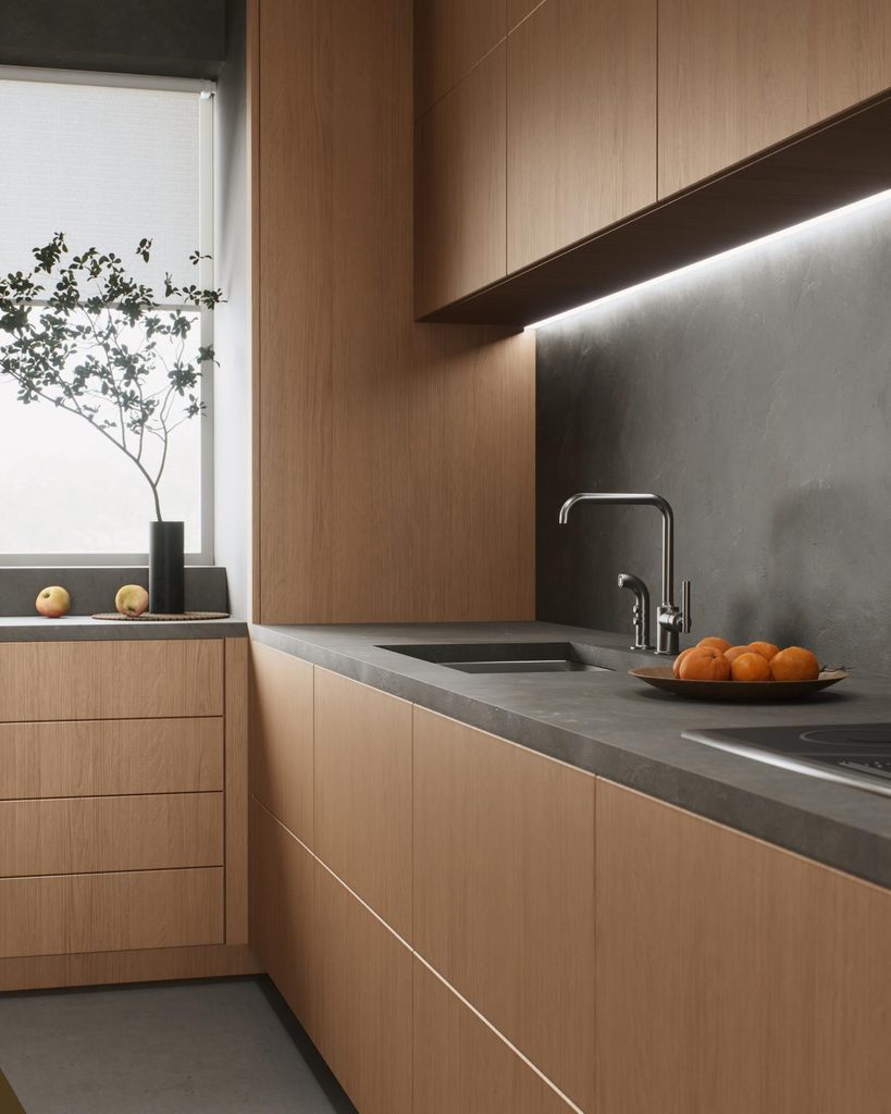
Less contrast, more texture. Natural wood cabinetry under concrete counters keeps a kitchen in one tonal family, and the difference between smooth stone and visible grain does all the work that color usually has to.
Both materials are honest about what they are, which is why the pairing looks modern instead of styled. Flat-panel cabinets keep the lines clean so the textures stay the focus, and carrying concrete up onto the backsplash makes the surfaces feel like one continuous run. Wood accents elsewhere in the room echo the cabinets and keep it from going too gray. The counter stays cool to the touch, which anyone who bakes will appreciate when dough is involved.
The textures shift as the light moves across the room through the day.
16. Evoke a Traditional Feel with Brown Marble Countertops
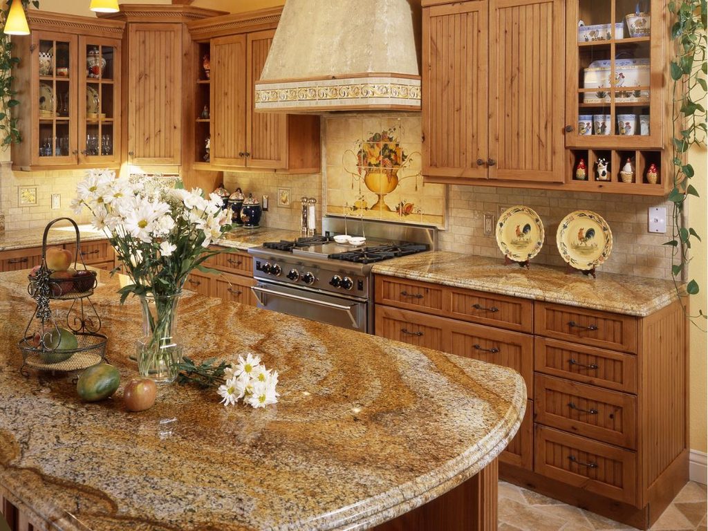
Warm the palette all the way up. Brown marble brings a traditional, settled feel into a kitchen, and matching it closely with the cabinetry and backsplash is what gives the room that pulled-together rustic look.
Brown stone gets overlooked because gray has dominated for years, but it solves a real problem. It sits comfortably next to natural wood finishes instead of fighting them, so farmhouse kitchens with a lot of timber finally get a counter that belongs. A floral motif on the backsplash below the range hood adds personality without loud color. It becomes the kind of kitchen where the table stays cluttered with mail and nobody minds, because the room already feels comfortable.
A reminder that good design starts with how a space feels.
👉 Suggestion: Look for brown marble with a matte or honed finish rather than a high polish. Honed surfaces play better with rustic wood and hide the etching that acidic spills leave on darker stone.
17. Make it Lively with Green Cabinets
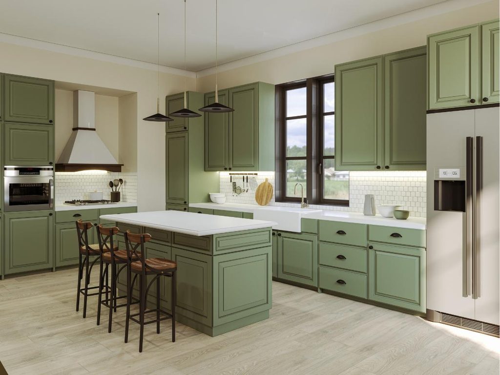
Now for something with actual color in it. Green cabinets under white counters have taken over kitchen design lately, and the reason is simple. Green sits close enough to neutral that it never overwhelms a room, but it has far more personality than gray ever did.
White quartzite counters are the right partner because they stay clean and bright, letting the cabinet color carry the whole look. A white penny tile backsplash adds small-scale texture without introducing another color to manage. Sage leans soft and calm, while deeper forest green feels grounded and a little moody. Either way, it is the kitchen that gets commented on the second someone walks in.
Best suited for anyone tired of all-white kitchens but not ready for a bold counter.
18. Bring Subtle Contrast with Countertops and Backsplash
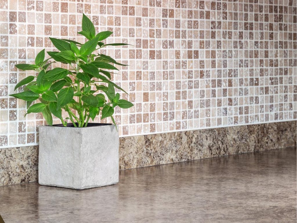
Pull the color back down and let the materials handle the interest instead. Choosing complementary tones for the counter and the backsplash creates contrast that registers quietly, without the two surfaces competing for attention.
Brown marble with a grainy effect against small square tile is a good example of why this works. The colors stay in the same family, so the difference shows up in scale and texture rather than in a hard color break. That is what keeps a vintage kitchen feeling soft instead of busy. A small potted plant on the counter adds a bit of life, and honestly, a herb pot by the window ends up being the thing that makes a kitchen feel occupied rather than staged.
The colors stay interesting from morning light through to evening.
💡 Pro Tip: Hold the tile sample against the counter in the actual kitchen, not in the store. Showroom lighting runs cool and will hide the warm undertones that decide whether these two surfaces get along.
19. Evoke a Classic Feel with Subway Tile
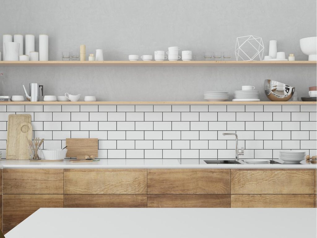
Some combinations never need updating. White counters, white subway tile, and natural wood finishes have been working together for decades, and the reason is that none of the three ever goes out of style long enough to feel dated.
Subway tile earns its place because the small repeating rectangles add rhythm to a wall without adding pattern. That keeps the backsplash active but quiet, so warm wood elsewhere gets to bring the personality. Floating wood shelves above the counter and light gray walls stop all that white from flattening out. It ends up being a kitchen that photographs well and lives well, which is rarer than it sounds.
Easy to decorate around as trends come and go.
20. Bring Rustic Charm with the Kitchen Island

Let the island carry the character instead of the counters. A barn-inspired island under a white marble top is what gives a farmhouse kitchen its anchor, and the contrast between rough wood and smooth stone is the whole reason it works.
Aged brass hardware and dark gray wood flooring build the backdrop, so the island reads as the oldest, most substantial thing in the room. That is the trick with rustic kitchens. One piece should feel like it has been there longest, and everything else supports it. Vintage pendants overhead finish the look with a soft pool of light. The island turns into the spot where people set down grocery bags, park their coffee, and end up talking for twenty minutes.
💡 Pro Tip: Leave at least 42 inches of clearance between the island and the surrounding counters. Anything tighter and two people cannot pass each other while the oven door is open, which is when a beautiful island stops being practical.
21. Make it Chic with Ceramic Kitchen Countertops
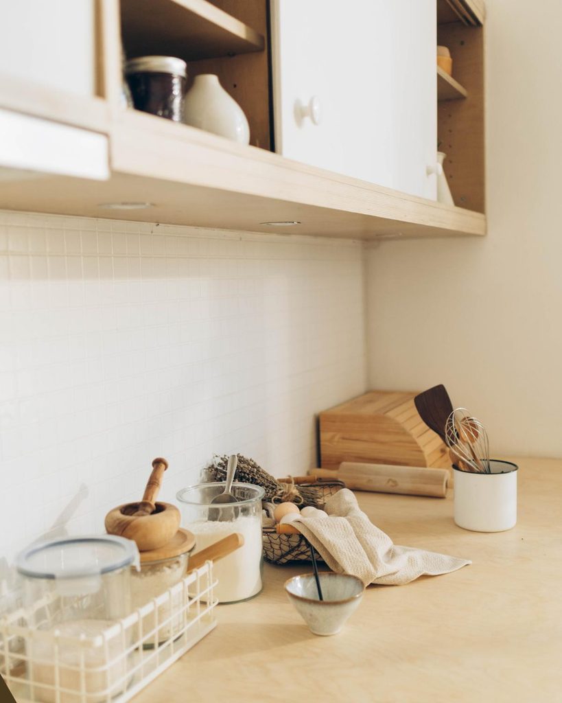
Quieter material, same polished result. Ceramic counters give a kitchen a clean, refined surface that never announces itself, which is exactly why they suit neutral rooms so well.
Ceramic sits in an interesting spot between granite and quartz. It has a distinct look, but the impact stays gentle enough that the counter blends into a neutral kitchen instead of dominating it. Against soft white walls, the contrast is barely there, and that restraint is what makes the room feel finished rather than decorated. The surface also stays cool and wipes clean in one pass, which shows on the evenings when dinner leaves more mess on the counter than on the plates.
A smart pick for neutral kitchens where nothing should shout.
👉 Suggestion: Look for large-format ceramic slabs rather than tiled sections. Fewer grout lines mean a smoother run of surface, and the counter reads far closer to solid stone from across the room.
22. Inspire with Moroccan Tile Backsplash

End on something with real personality. A Moroccan tile backsplash brings pattern, color, and handmade character into a kitchen, and it works best when the counter underneath stays completely calm.
That balance is the whole point. A shiny gray counter keeps things neutral and slightly moody, so the tile has room to be the loud one without the room turning chaotic. Patterned tile also fixes a common problem, since kitchens with plain cabinets and plain counters often have nowhere for the eye to rest. Handmade tiles vary slightly in glaze and tone, and those small inconsistencies are what keep the wall from looking machine-made. It is the detail people ask about while standing there waiting for the kettle.
The kind of kitchen that shows how much one bold surface can change the mood.
You Might Also Love These Ideas
- 19 Affordable Kitchen Storage Ideas. Clear counters, woven baskets, and warm oak shelves that make a busy kitchen feel calm again.
- 17 Small Kitchen Ideas. Bright, airy tricks that open up tight spaces and let morning light reach every corner.
- 25 Minimalist Bedroom Ideas. Soft linen layers and quiet neutrals built for slow mornings and deep, restful sleep.
Frequently Asked Questions
What is the cheapest countertop material that still looks expensive?
Butcher block and ceramic deliver the highest look for the lowest spend. Both sit in the budget-friendly range per square foot while reading as deliberate design choices rather than compromises. Butcher block in walnut or dark-stained maple pairs well with white cabinets, and large-format ceramic slabs mimic solid stone without the price. Home improvement chains like Home Depot or Lowe’s carry both in standard counter depths.
How do you clean and protect different countertop materials?
Match the cleaner to the surface, because the wrong one causes most of the damage people blame on the material. Marble and other natural stone need a pH-neutral cleaner, since vinegar and citrus etch the finish permanently. Quartz and ceramic handle mild dish soap and warm water without complaint. Wood counters want a damp cloth and a food-safe oil, never a soaking wet sponge left sitting.
Which countertop colors are going out of style?
Light beige speckled granite and yellow-toned laminate are the two that date a kitchen fastest. Both peaked in the late 1990s and early 2000s, so they read as a specific era rather than as neutral. Deep charcoal, warm cream, soft greige, and natural wood have held steady for years and show no sign of turning over. Sage and forest green cabinets underneath are the current favorite pairing.
How do you update countertops in a rental without replacing them?
Peel-and-stick counter film and removable cutting board overlays are the two renter-safe options. Marble-look and butcher-block-look films apply directly over laminate and lift off at move-out without damaging the surface underneath. A large wood board over a dated section hides the worst of it while adding warmth. Both stay well under a hundred dollars for a standard kitchen.
Where should a beginner start when choosing kitchen countertops?
Start with the cabinets, not the counter. The cabinet color and undertone are already fixed in most kitchens, so the counter has to answer to them rather than the other way around. Bring a cabinet door to the stone yard or tile aisle and hold samples against it in daylight. Retailers like Home Depot, Lowe’s, or Floor and Decor let shoppers take small samples home, which is worth doing before committing.
Conclusion
The right countertop quietly decides how a whole kitchen reads. It sets the tone before anyone notices the cabinets, the hardware, or the light fixtures, which is why one good pairing can make an ordinary room look planned from the start. None of these looks depend on the priciest slab in the yard. From bright white quartz and warm butcher block to moody black surfaces, raw concrete, and rustic farmhouse islands, there is a combination here for almost any kitchen and budget.
Pick one pairing that fits the cabinets already in place rather than chasing every idea at once. Start by holding a sample against your cabinet doors in daylight, because that single step prevents most regrets. Save the favorite look to a Pinterest board, bookmark this post for the next planning weekend, and send it to a friend stuck staring at a dated counter. The right surface has a way of making a kitchen feel finished long before anything else changes.