17 Smart Remodel Ideas : Kitchen Before and After
Look closely at any good kitchen before and after and the real change is rarely the paint color. It is the wall that came out, the peninsula that stopped blocking the doorway, the island that finally sits where people actually walk.
Finishes get the attention. Layout does the work.
That is the pattern running through almost every redo worth studying. A kitchen can have beautiful cabinets and still feel cramped if the traffic path dead-ends at a countertop. Fix the flow first and even modest finishes start looking intentional.
Some of the changes ahead are structural, the kind that need a contractor and a few weeks of eating takeout. Others are cosmetic, a weekend with a paintbrush and new hardware. Both produce real before and after photos, and knowing which category your kitchen needs saves a lot of money.
Here are 17 kitchens that had a specific problem, what the owners did about it, and what each fix actually solved.
1. Closed Off Kitchen
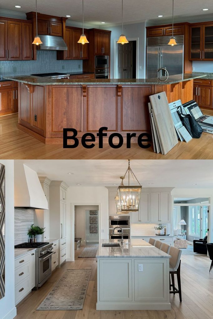
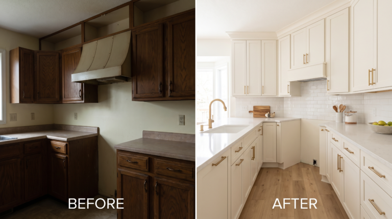
Light blue walls, a matching backsplash, and dark wood cabinets can look fine in a photo and still feel heavy to stand in. Add a peninsula cutting the room off from the rest of the house and the kitchen becomes somewhere you pass through rather than gather in.
Changing the floor plan solved more than the color ever could. Opening the wall improved the traffic path, and a proper island replaced the peninsula, so people could stand on both sides without blocking anyone. White paint across the cabinets, range hood, and walls lifted the whole room, and light gray wood flooring kept it grounded instead of floating. Cooking stopped feeling like being shut in a separate room.
Ideal for kitchens that feel cut off from the living space.
2. Misplaced Island
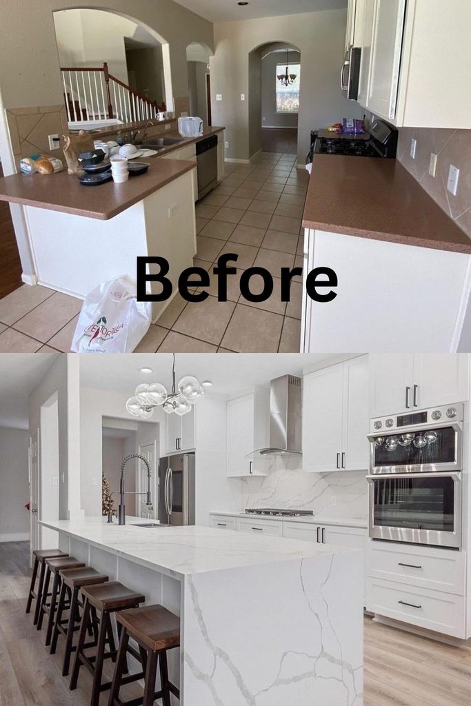
An island in the wrong spot causes more problems than no island at all. This one swallowed floor space, offered no seating, and made an eat-in kitchen impossible, which meant the room could never do the one thing the family wanted from it.
The fix started with the layout rather than the finishes. Taking out the peninsula and the adjoining wall made room for a real island with proper seating, and that single change opened up options the old plan never allowed. Bright white inset cabinets with marble and steel finishes kept everything clean and contemporary. Seating is what turns a kitchen into a room people linger in, so homework and coffee finally had somewhere to happen.
Sometimes the quietest details do the loudest work, and sometimes it takes moving a wall.
3. Disruptive Peninsula
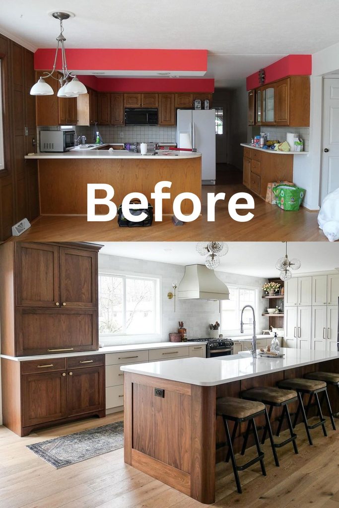
Bright red soffits and a cramped floor plan are bad enough on their own. Add a peninsula jutting into the walkway and the kitchen has no logical path through it, so everyone ends up shuffling around each other during dinner prep.
Moving one wall gave the room enough space to work with. Tall shaker cabinets and semi-stock distressed fronts brought traditional and modern together, while the sink and faucet shifted from the window to a new island. That move freed the wall for bigger windows, which is why the room went from dim to sunlit. An appliance garage cleared the counters, and open shelves gave the pretty pieces somewhere to live. Natural hardwood flooring tied the white and brown palette together.
Best suited for kitchens where the walkway dead-ends at a countertop.
💡 Pro Tip: Check what runs through a wall before planning to move it. Plumbing, gas lines, and ductwork are what turn a straightforward job into an expensive one, and an inspection hole answers the question in ten minutes.
4. Cramped Countertop
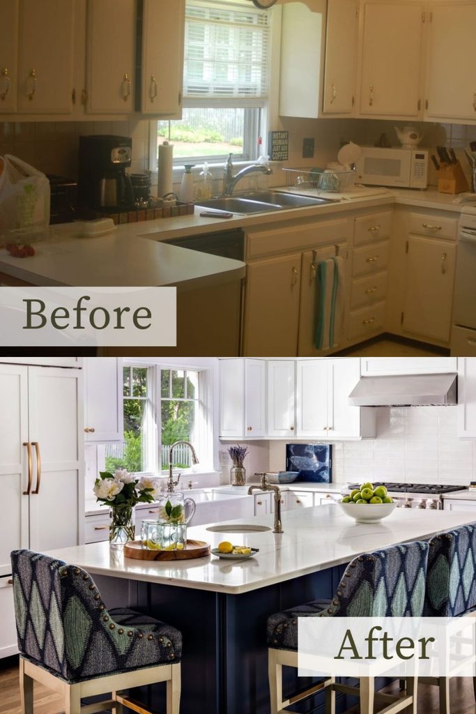
Sometimes the layout is fine and the counters are the problem. Bulky appliances lined up along every surface made this kitchen feel smaller than it was, and creamy white cabinets gave the room nothing interesting to look at.
Going brighter was the first move. A crisper white across the cabinets, walls, backsplash, and counters pushed light around the room, and adding a window brought in more of it. Navy blue on the island supplied the contrast the old palette was missing, so the room finally had a center point. Textured seating added character at counter height, which is where people actually sit. Clearing the appliances off the surfaces did as much as any of it.
The whole kitchen breathes easier once the counters are visible again.
5. Limited Space
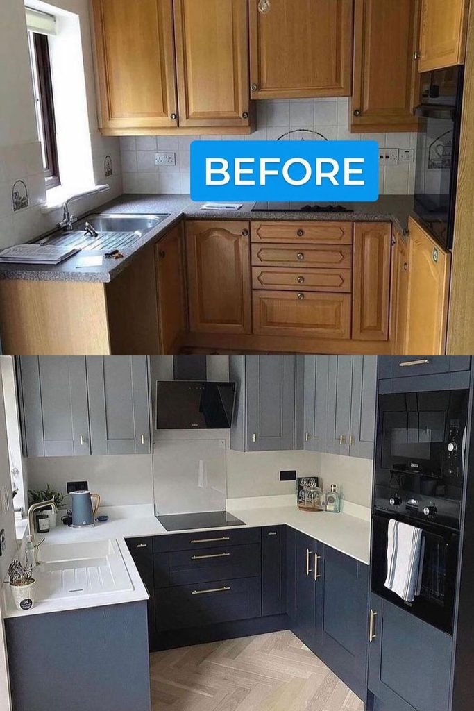
Not every kitchen needs walls moved. This small builder-grade room worked well enough already and only needed better finishes to stop looking like every other new build on the street.
Cool gray shaker cabinets paired with darker gray inset units gave the room a two-tone depth that flat builder-grade fronts never have. White counters and backsplash kept it from turning heavy, which matters in a small space where dark surfaces close in fast. A herringbone hardwood floor is what stops the whole thing feeling cold, since the pattern adds warmth underfoot without adding color. Cosmetic changes only, no walls touched, and the room reads custom rather than standard.
A smart pick for new builds that function fine but lack personality.
👉 Suggestion: Look for cabinet fronts in two shades from the same color family rather than two different colors. Tonal pairs like soft gray with charcoal read as designed, while contrasting colors in a small kitchen can look busy.
6. Underutilized Space
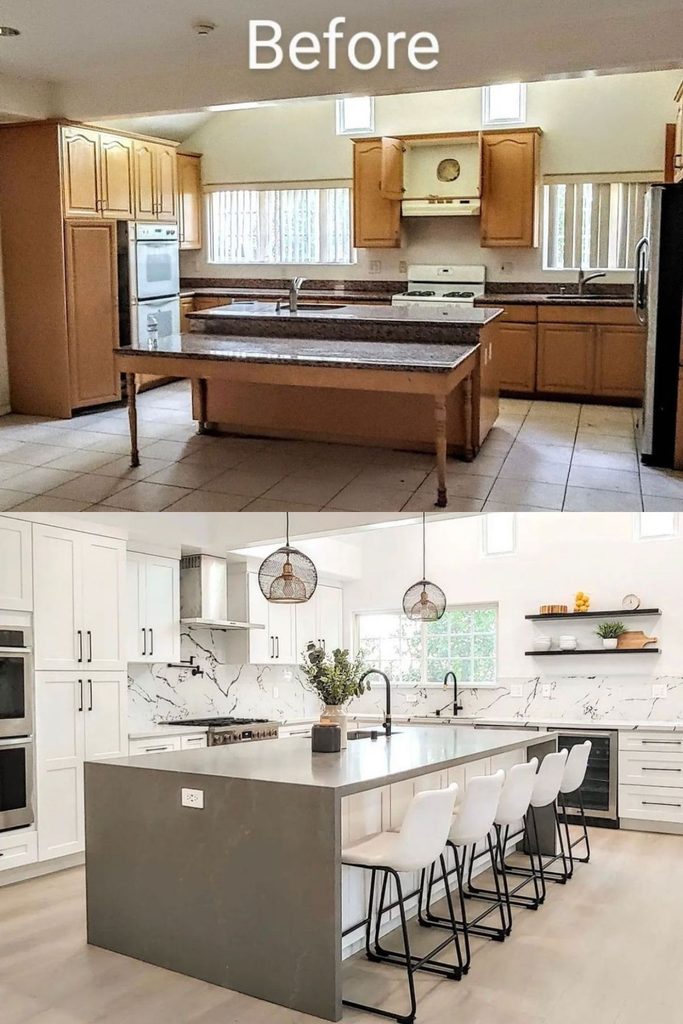
Dated dark gray granite counters and a matching table can age a kitchen faster than anything else in the room. Add builder-grade cabinets and creamy white floor tile and the whole thing reads a decade behind.
Removing the table was the change that unlocked the floor plan. A larger island took its place, giving the room prep space and seating in one piece of furniture instead of two competing ones. White perimeter cabinets and a patterned marble backsplash brightened everything above counter height, while a gray island supplied contrast so the white did not run flat. Swapping the pale tile for wood flooring grounded the palette properly. The room finally holds everyone at once without anyone squeezing past a chair.
Made for kitchens where a table is eating space an island could use better.
7. Disorganized Kitchen Corner
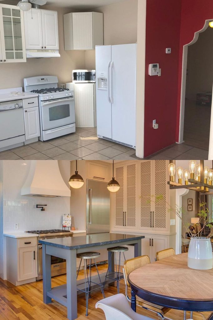
Thirty-six inches of counter space is not enough for anyone. Three different cabinet styles and every appliance crowded into one corner made this kitchen almost unusable, no matter how tidy anyone kept it.
Knocking out the red-painted wall partition changed everything. Moving the refrigerator to the adjacent wall freed the run for tall cabinets, which added the storage the room never had, and a movable island brought casual dining plus extra prep surface. Two pendants above it defined that zone so the island reads as its own space rather than furniture parked in the middle. Cane webbing on the cabinet fronts added texture and character, and a white subway backsplash carried to the ceiling gave the room height.
Proof that small choices carry the biggest weight, though this one started with a wall.
8. Small Island
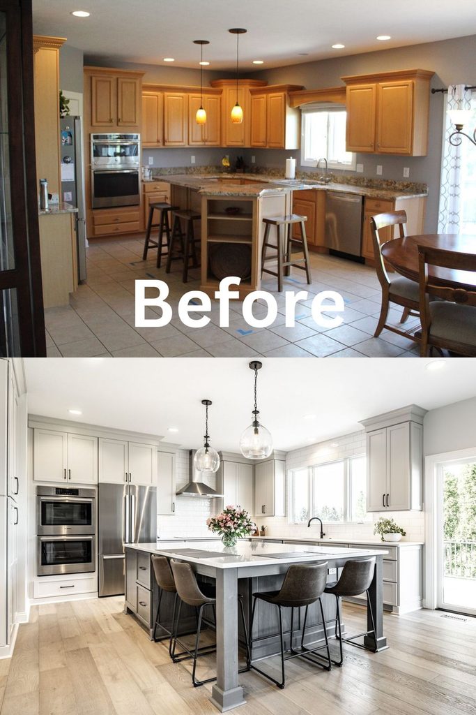
An undersized island wastes the footprint around it. This kitchen had the square footage but never used it, so tired cabinets and dated pendants left the whole room looking stuck somewhere around 2005.
Going much bigger with the island fixed the proportions. A larger surface added seating and real prep space at once, which is what the room had been missing all along. Some upper cabinets came down to make space for more windows, and the storage moved into floor-to-ceiling cabinets instead. White backsplash, counters, and cabinetry kept everything feeling open despite the added bulk. Relocating the fridge cleared the last of the awkward traffic. It became the kitchen where people sit while someone else cooks.
The room gets better the longer you stand in it.
💡 Pro Tip: Leave at least 42 inches of clearance on every side of an island, and 48 if two people cook at once. An island that looks generous on a floor plan becomes a daily obstacle once the oven door swings open.
9. Dark Backsplash
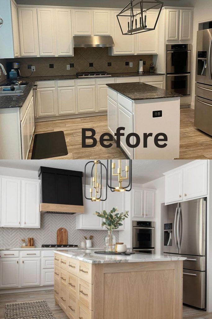
Some kitchens are not broken, just heavy. Gray and black across the counters and backsplash weighed this one down, and white raised panel cabinets sat there looking perfectly fine and completely forgettable.
Mixing and matching lifted it. A bigger island freed up counter space and added storage, while the existing cabinets kept their doors and simply got new hardware, which is the cheapest change with the biggest return. A pale light gray backsplash replaced the dark one and immediately brightened the wall between counter and cabinets. Light wood tones warmed the palette, and a matte black range hood became the focal point the room never had. Statement pendants replaced the industrial chandelier, and the builder-grade look was gone.
The room shifts through the day now, bright at noon and soft once the pendants come on.
10. Remove Wallpaper
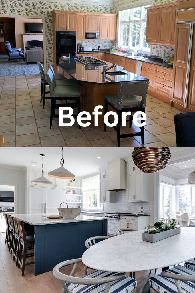
The floor plan here worked perfectly well. Floral wallpaper and a green ceiling paired with natural oak cabinets were the problem, and together they made the room feel closed in and stuck in another decade.
Stripping the wallpaper opened the walls for a glossy subway tile backsplash, which reflects light where busy pattern used to absorb it. Crisp white cabinetry and a white ceiling brightened everything overhead, since a colored ceiling drags a room down more than most people realize. A larger island brought extra seating and counter space, and its blue base picked up the fabric on the dining chairs, tying the kitchen and the eating area together as one room instead of two.
Best suited for kitchens with a good layout and dated surfaces.
💡 Pro Tip: Score the wallpaper lightly before spraying it, then let the solution sit for fifteen minutes before pulling. Rushing this step is what tears the drywall paper underneath and turns a simple job into patching and sanding.
11. Impress with Two-Tone Design

Builder-grade cabinets, dark granite, and a flat gray palette left this kitchen with nothing to say. An angular wall closed the room off, and old floor tiles made it feel dreary even on bright days.
Taking down that wall and updating the ceiling created room for actual style. Two tones did the rest, with light blue base cabinets below and bright white uppers above, which is the split that gives a kitchen presence without committing the whole room to color. Marble counters and a veined marble backsplash pulled it together. One window was lost in the process, so task and accent lighting filled the gap, and soft gray floor tiles let the beachy palette stay the focus.
That rare balance of relaxed and put-together.
👉 Suggestion: Put the darker or bolder color on the base cabinets and keep the uppers light. Color at eye level and above shrinks a room, while color below the counter grounds it and keeps the space feeling tall.
12. Switch It Up
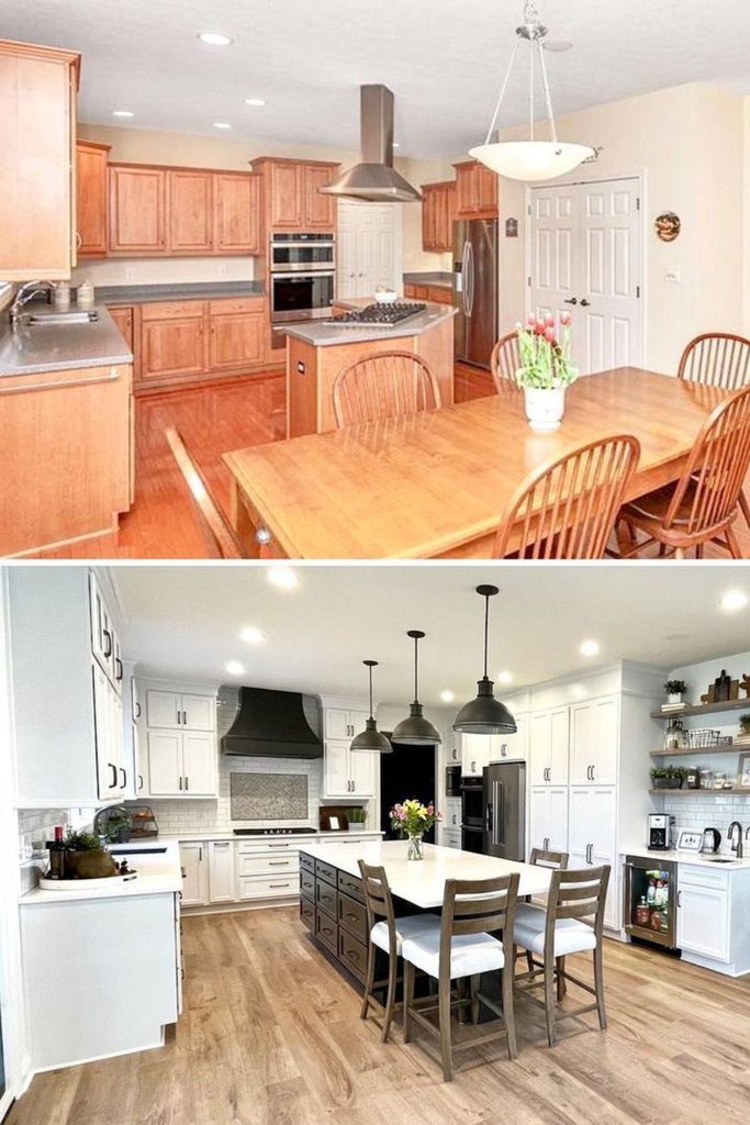
Orange-toned furniture, cabinets, and flooring can date a kitchen by thirty years on their own. Pair that with an awkward layout and the room never had a chance, no matter how well it was kept.
Removing the small peninsula opened the floor for a proper island with enough space to eat at, which is the change that turned a pass-through kitchen into a room people sit in. A custom range hood and new hardware sharpened the details, while a white and gray palette pulled the whole thing out of the eighties. Replacing the pantry with cabinets and open shelves created distinct zones, including a coffee station that gets used every single morning. Pendants and recessed lighting added symmetry and filled the room with light.
The morning routine runs smoother when everything has its own spot.
13. Bring some Vibrancy
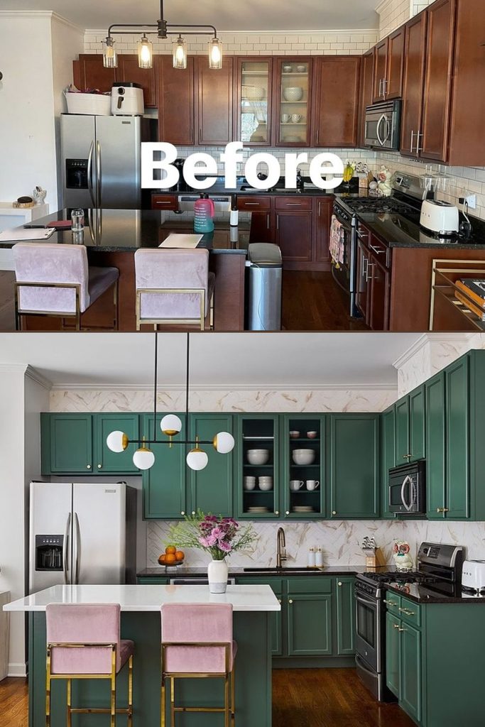
Dark brown cabinets under black countertops made this kitchen feel closed and dowdy, and the appliances sitting out on every surface did not help. The room needed color, not just cleaning up.
Deep green cabinets delivered it. Green reads almost like a neutral, which is why it updates a kitchen without overwhelming it the way a brighter color would, and a marble backsplash kept the upper half of the room light. The chairs were reupholstered in pink with gilded legs, adding two small pops that feel deliberate rather than random. A white island counter contrasts with the green and ties back to the backsplash, while a linear pendant finished the look.
The kind of kitchen that quietly becomes everyone’s favorite room in the house.
💡 Pro Tip: Test green cabinet samples against your flooring before committing. Green shifts hard depending on what sits below it, and a shade that looks perfect on a swatch can turn olive or gray once it meets warm wood.
14. Glam It Up
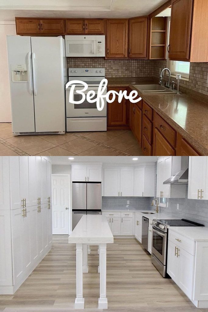
Brown floor tiles, granite counters, and a layout that never quite worked left this kitchen needing both structural changes and a proper polish. Nothing about it was terrible, and nothing about it was good either.
Floor-to-ceiling cabinets and a slim island reset the footprint first. Running cabinetry all the way up removes the broken line near the ceiling, which makes a room read taller and adds serious storage in the same move. Pure white finishes across the cabinets and island paired with silvery accents gave the space a clean modern feel. Light gray wood flooring replaced the brown tile, and a gray backsplash drew a subtle line between the counters and the upper cabinets, so the wall no longer reads as one blank stretch.
Ideal for kitchens that need more storage and a cleaner overall line.
15. Wood Galore

Too many wood tones in one room is a specific kind of dated. Cabinets, floors, trim, and furniture all sitting in the same brown family left this kitchen looking flat, because nothing had anything to contrast against.
Painting the cabinets crisp white broke the sameness immediately and cost far less than replacing them. Adding small windows above some of the upper cabinets brought in daylight from a wall that had been doing nothing, which is a smart move in a room where light was the real shortage. A broader island added function and brought in a dark countertop for contrast. Custom white doors on the built-in fridge kept the run unbroken, so the appliance disappears instead of interrupting the line.
A reminder that good design starts with how a space feels.
👉 Suggestion: When a room already has wood flooring, keep the cabinets painted rather than stained. One wood tone plus one painted finish reads intentional, while three or four competing wood tones is what makes a kitchen look unplanned.
16. Distressed Look
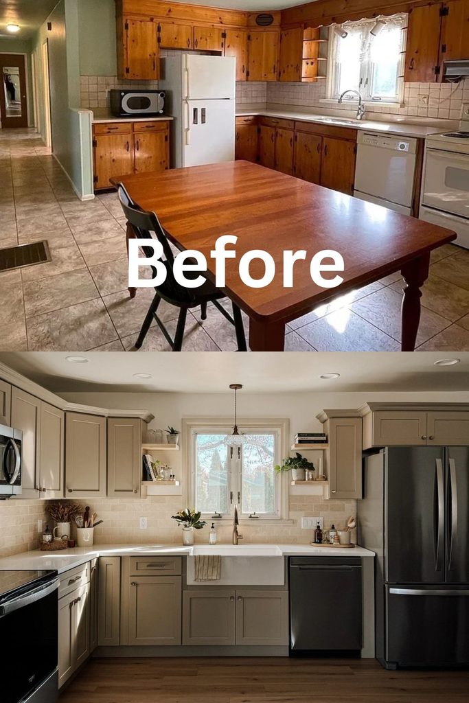
An old dining table that suits nothing else in the room quietly drags a whole kitchen down. This one did not match the cabinets or the finishes, and it blocked the natural path through the space.
Letting it go improved the traffic flow immediately, which is the sort of change that costs nothing and gets noticed daily. With the floor clear, the focus moved to charm. Builder-grade cabinets were replaced with light ivory perimeter units, softer and warmer than plain white, and a creamy backsplash carried that tone up the wall. Slim shelves holding a few chosen pieces added personality at eye level, and a farmhouse sink brought the character the room had been missing entirely.
One of those setups where every piece earns its place.
17. Awkward and Bland
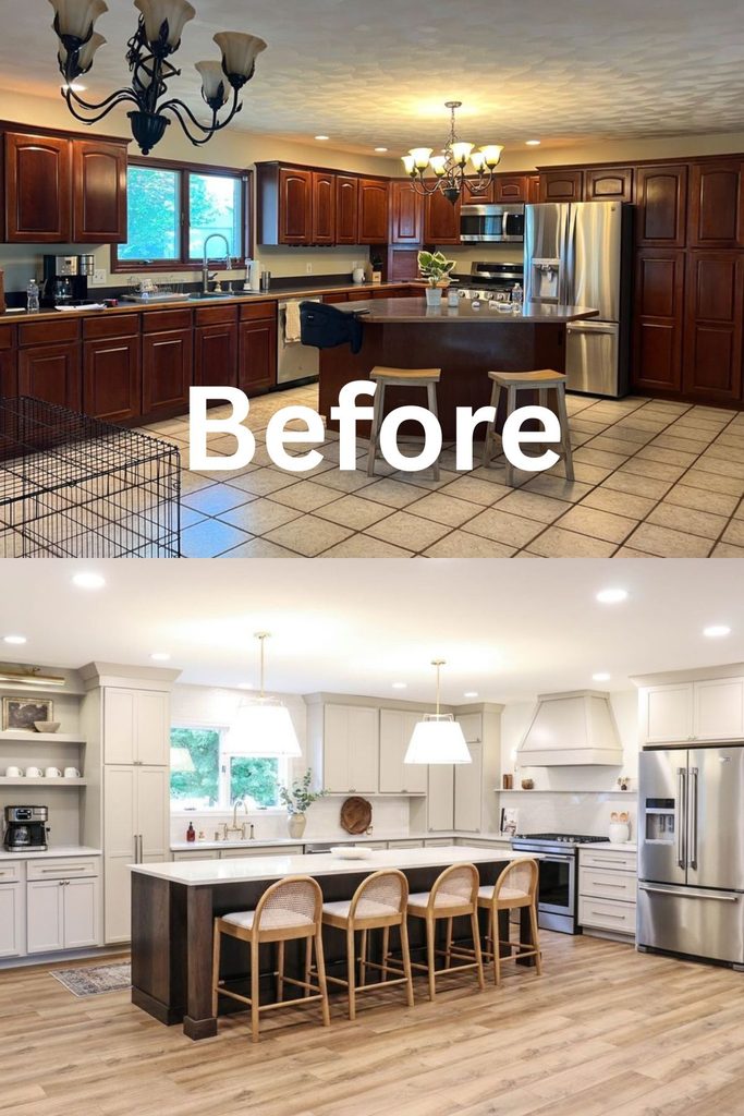
An island in the wrong shape does more damage than most people expect. This one disrupted the flow and broke up the work core, so the three points anyone actually moves between during cooking never lined up properly.
Replacing it with a slimmer island made far better use of the floor. Narrowing it opened the walkways on both sides, which is what turns a cramped kitchen into one two people can share. White cabinetry and plenty of lighting brightened the room, and swapping white floor tile for light hardwood warmed it and matched the wooden chairs for a modern farmhouse feel. Dark wood on the island gave the white palette something to push against, and tucking the fridge into the wall kept the path around the room unbroken.
Made for kitchens where the island is technically there and constantly in the way.
💡 Pro Tip: Keep the sink, stove, and fridge within a triangle where no single leg runs longer than nine feet. Most awkward kitchens fail this test, and fixing it matters more than any finish choice.
RELATED:
KITCHEN CABINET MAKEOVERS WITH REAL BEFORE AND AFTER RESULTS
Frequently Asked Questions
How much does a kitchen remodel cost?
Most full kitchen remodels land in the mid-range to high range depending on whether walls move. Cosmetic work like painting cabinets, swapping hardware, and replacing a backsplash often stays under a few thousand dollars. Structural changes are where costs climb, because moving plumbing, gas lines, or a load-bearing wall brings in trades and permits. Getting three quotes is worth the time on anything structural.
What adds the most value in a kitchen remodel?
Layout fixes and cabinet updates return the most. Buyers notice a kitchen that flows well long before they notice which quartz was chosen, so removing a blocking peninsula often beats upgrading to premium stone. Painted cabinets with new hardware deliver strong value for very little spend. Over-personalizing with bold color is what tends to hurt resale.
Do you need a permit to remove a kitchen wall?
Usually yes, especially if the wall carries load or contains plumbing and wiring. Permit rules vary by city, so checking with the local building department before demolition is the safe move. Non-structural partition walls sometimes need nothing, but a structural engineer should confirm which type it is. Skipping a required permit can cause real problems at resale.
What is the cheapest way to update a dated kitchen?
Paint the cabinets and change the hardware. That pairing costs a fraction of replacement and shifts the whole look of the room, especially on oak or dark brown fronts. Adding new lighting and a fresh backsplash covers the next biggest visual areas. Big-box stores like Home Depot or Lowe’s carry cabinet paint kits in the budget-friendly range.
Can renters do a kitchen before and after?
Yes, with removable changes only. Peel-and-stick backsplash tile, adhesive counter film, new cabinet knobs saved with the originals, a rolling island, and better lighting all lift a rental kitchen and come out cleanly. Open shelving and painted cabinets need landlord permission in most leases. The before and after photos still look dramatic.
Conclusion
The best kitchen before and afters all share one thing. Somebody stopped looking at the cabinets and started looking at the floor plan. A peninsula came out, a wall opened up, an island moved a few feet, and suddenly the room worked the way it should have from the start. Some of these redos went modern farmhouse with white cabinets and warm wood, others went moody with deep green or two-tone blue, but every single one fixed the flow first.
Pick the one kitchen above that looks most like yours and start there. Walk your own space at the busiest moment of the day, because the spot where everyone bumps into each other is usually the thing worth fixing. Save that redo to a Pinterest board, bookmark this post for the next planning weekend, and send it to a friend still staring at cabinet samples. A kitchen that flows well feels finished long before the finishes go in.