20 living room makeover ideas that transform your space on any budget
Living rooms carry more weight than any other space in a home. It’s where the family lands after dinner, where guests get their first real impression, and where that one worn-in corner of the sofa somehow becomes everyone’s favorite seat. So when a living room starts feeling flat, the whole house feels a little off.
The good news is that a makeover rarely means starting from scratch. Most of the biggest changes come from smarter choices, not bigger budgets. A gallery wall that finally fills an empty stretch. Curtains hung higher to fake a taller ceiling. A rug that quietly separates the seating zone from the walkway in an open floor plan.
The 20 makeovers ahead lean on those kinds of moves. Some go bold with color, others stay soft and neutral. A few use mirrors and white paint to stretch small rooms, while others layer wood, texture, and shine for warmth.
Each one comes with the reasoning behind it, so the ideas are easy to borrow and adjust.
1. Dramatic Gallery Wall
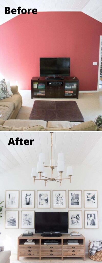
A blank wall behind the sofa is the biggest missed opportunity in most living rooms. Filling it with a floor-to-ceiling gallery wall pulls the eye upward and instantly makes the seating area feel intentional instead of leftover.
The reason this look lands is scale. Mixing a few oversized frames with smaller ones creates rhythm, while sticking to one frame finish (black, oak, or thin brass) keeps the whole thing from looking chaotic. Dark charcoal or deep green paint behind the frames adds even more punch, since the art seems to float off the wall. Guests always end up standing there longer than expected, pointing at prints and asking where things came from.
Small changes create most of the impact, and a gallery wall proves it faster than almost anything else.
2. Modernize A Room With Small Changes
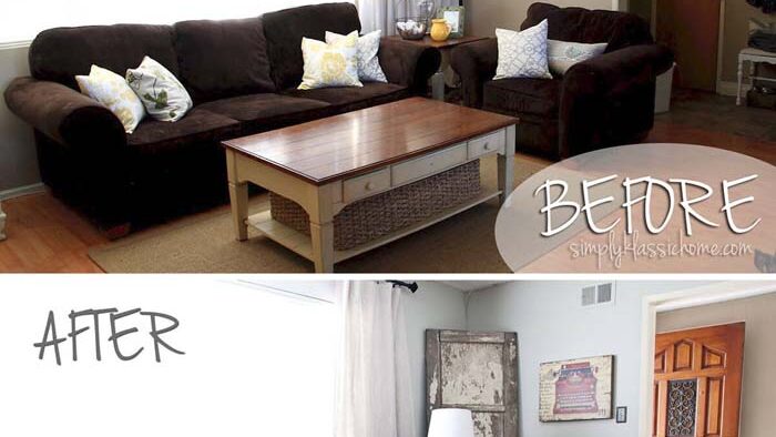
Not every update needs new furniture. Swapping out the small stuff often does more, because those are the pieces the eye actually lands on first. Think slim table lamps instead of bulky ones, a low ceramic bowl on the coffee table, and cushion covers in cleaner lines with less pattern.
The trick is editing rather than adding. Modern rooms feel modern because they breathe, so clearing two or three surfaces gives everything else room to look deliberate. Change the hardware on a media console, trade a fussy throw for a chunky knit, and suddenly the room reads current without a single big purchase.
Mornings feel different too, when the coffee table isn’t buried under six things that don’t belong there.
3. Fresh And Bright
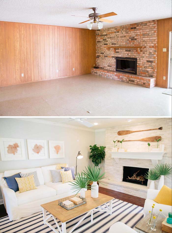
Some living rooms don’t need a redesign so much as a reset. Crisp white or soft off-white walls, light wood tones, and sheer panels at the windows lift the whole space without touching the layout.
Brightness works because it bounces. Pale walls reflect whatever daylight comes in, and light-toned floors or a cream rug push that glow back upward instead of swallowing it. Keep the palette to two or three quiet colors, then let one green plant and a pair of woven baskets carry the warmth so it never tips into cold or clinical.
There’s a certain lightness that shows up when you walk in on a sunny afternoon. The room feels calm, uncluttered, and easy to sit in for hours.
4. Add Height By Elongating Windows

Standard-height curtain rods are one of the quietest ways a room gets shortchanged. Mounting the rod just above the window frame stops the eye halfway up the wall, which makes the ceiling feel lower than it actually is.
Move that rod up near the ceiling line and hang panels that break slightly at the floor. The window reads taller, the wall feels stretched, and the whole seating area gains a sense of vertical space that wasn’t there before. Widening the rod a few inches past the frame on each side does the same thing horizontally, so the glass itself looks bigger even though nothing structural changed.
Pro Tip: Leave about four to six inches between the rod and the ceiling, and let the panels graze the floor rather than pool. That gap keeps the proportions from looking top-heavy, and the clean floor line is what makes the trick believable.
5. Chic Neutral Makeover
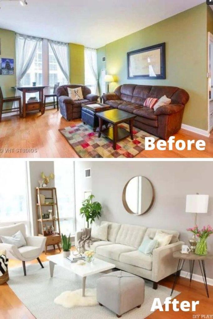
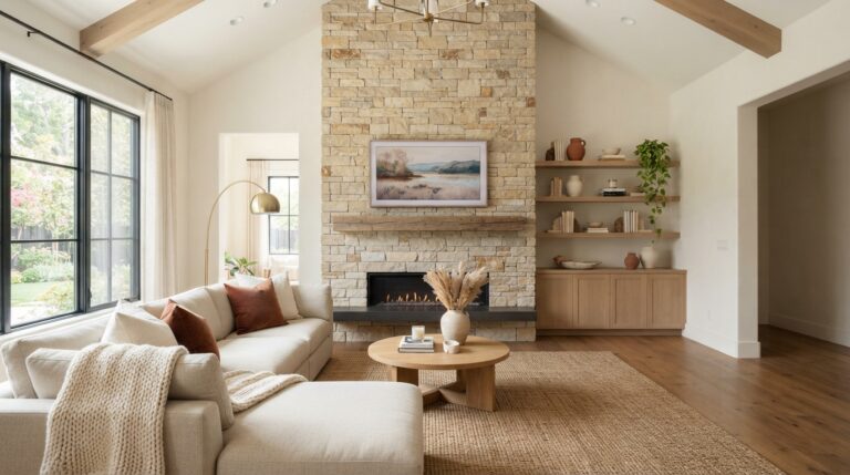
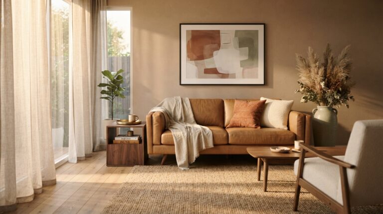
Neutral rooms get called boring, usually because someone stopped at beige and walked away. Done properly, a neutral living room is built on layers of oatmeal, greige, warm taupe, and soft ivory sitting next to each other in slightly different weights.
Texture does the heavy lifting here. A bouclé chair beside a linen sofa beside a jute rug gives the eye plenty to read, even though the color story barely shifts. Contrast comes from material rather than hue, so the space stays restful without going flat. One darker anchor, maybe a walnut side table or a black metal floor lamp, keeps everything from blurring together.
💡 Suggestion: Pull three fabric swatches into the room and check them in afternoon light before committing. Undertones fight each other quickly here, and a taupe that leans pink next to a cream that leans yellow is the usual reason neutral schemes look muddy instead of chic.
This is the kind of room that ages well. Seasons change, throw pillows get swapped, and the bones still look right five years later.
6. Bright Accents Add Contrast
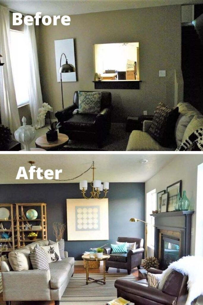
A calm room can still feel unfinished, and usually the missing piece is one loud note. Against soft grey walls or a beige sofa, a mustard cushion, a cobalt vase, or a rust-toned throw does the job of a whole redesign.
Contrast works because the eye needs somewhere to land. When everything sits in the same tonal range, nothing stands out, so the space reads sleepy. Two or three hits of a single bright color placed at different heights, low on the sofa, mid on a shelf, higher on the wall, pull the room together and make the neutrals look chosen rather than safe.
Best part is how easy it is to change your mind in October when warmer shades start feeling right.
7. Rustic Wood Walls Add Farmhouse Charm
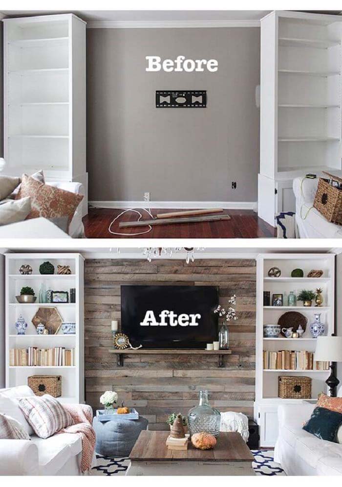
Bare drywall behind a sofa gives the eye nothing to hold. Cover that wall in reclaimed planks or wide shiplap, and the room picks up grain, shadow, and a bit of history all at once.
Wood brings warmth that paint can’t fake. Every board sits slightly differently, so light moves across the surface through the day and the wall never looks flat. Horizontal planks widen a narrow room, vertical ones stretch a low ceiling, and keeping the finish matte instead of glossy is what separates farmhouse charm from a cabin theme. One wall is plenty, since four turns cozy into closed-in.
Sit near it on a grey afternoon and the whole room feels a few degrees warmer than it really is.
8. Organized And Stylish Makeover
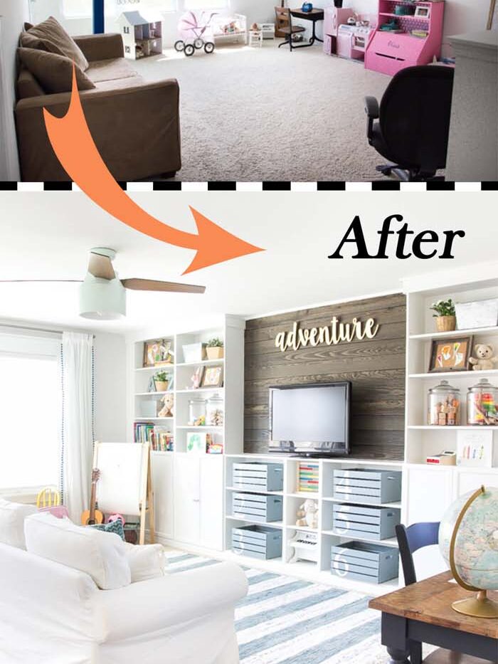
Clutter reads as bad design even when the furniture is good. The fix isn’t more storage so much as storage that doesn’t announce itself, closed cabinets instead of open cubbies, lidded baskets under the console, a bench at the window with a hollow seat.
Hidden storage works because it protects the sightlines. Remotes, chargers, board games, and kids’ books all live somewhere reachable, but the eye travels across clean surfaces instead of stopping every few inches. Then the pieces you actually want seen, a stack of books, one sculptural bowl, a small framed photo, finally get room to register as styling rather than pile-up.
✅ Pro Tip: Give every loose item a home before you buy a single basket. Count what’s actually floating around the room first, then size the storage to that list. Most people buy too small, and the overflow ends up back on the coffee table within a week.
9. Rugs Can Create Areas In An Open Space

Open floor plans look great in photos and confusing in person. Without walls, the living area bleeds into the dining space and the walkway, so nothing feels settled. A rug solves that with no construction at all.
Think of it as drawing a boundary on the floor. Once the sofa, chairs, and coffee table sit on a shared rug, they read as one group instead of furniture parked at random. Size matters more than pattern here, so the front legs of every seat should land on it, and leaving bare floor around the edges is what makes the zone visible. A second rug under the dining table repeats the trick and tells guests where one room ends.
People stop drifting through the seating area once the floor tells them not to.
10. Go For A Bold Hue

Playing safe with wall color is how rooms end up forgettable. Deep navy, forest green, terracotta, or near-black on the walls turns a plain living room into something with a point of view, and it happens in a weekend.
Saturated color works because it absorbs light instead of bouncing it, which pulls the walls closer and makes the space feel wrapped rather than empty. Keep the trim and ceiling lighter so the room still has edges, then let brass lamps, cream cushions, and pale wood break up the darkness. Rooms with weaker natural light often handle bold color better than bright ones, since there’s no daylight to fight.
11. A Stylish Living Room Grows Up
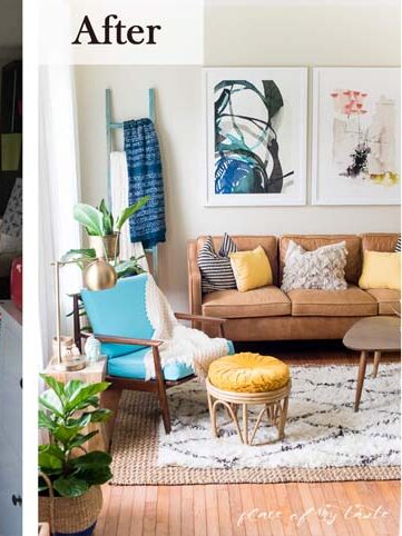
First-apartment furniture has a look, and it’s usually mismatched hand-me-downs sitting next to something flat-packed. Growing a living room up means swapping quantity for a few pieces that actually hold their own, starting with the sofa.
Maturity in a room comes from proportion and repetition. A sofa with real depth, side tables at the right height, and lamps that don’t wobble when someone walks past all signal permanence. Repeating one material, brass in the lamp and the frame and the coffee table legs, ties the space together the way a scattered collection never will. Ditching the posters for framed art does more than the frames alone suggest.
The change shows up when friends stop over unannounced and there’s no urge to explain the couch.
12. Make The Most Of Your Light
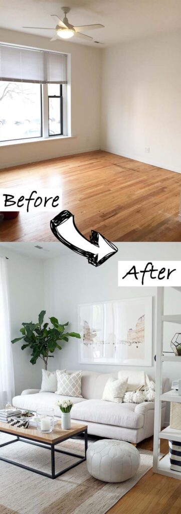
Most living rooms waste the daylight they already get. A tall bookcase parked beside the window, a heavy armchair blocking the corner, dark blinds left half-closed out of habit, and suddenly a bright room performs like a dim one.
Clearing the path is step one. After that, it’s about helping light travel further. Glossy or satin paint reflects more than flat finishes, a mirror set across from the window doubles what comes in, and swapping blackout panels for light-filtering ones keeps privacy without killing the glow. Low furniture near the glass matters too, since anything above sill height throws a shadow across half the floor.
✅ Pro Tip: Watch the room at three different hours before rearranging anything. Morning, midday, and late afternoon light hit from different angles, and the corner that looks useless at 9am is often the brightest spot by four.
13. Color And Mirrors Bright Light To A Small Space
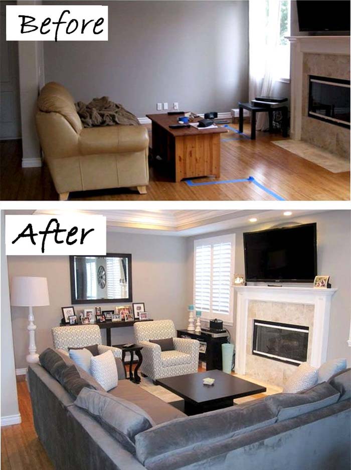
Small rooms get treated like patients, all white walls and nothing on them, when a bit of color actually helps. Soft blue, sage, or pale clay on the walls gives the space character, and a large mirror keeps it from closing in.
Mirrors work because they borrow light and depth from somewhere else. Hung opposite a window, one reflects the view and doubles the daylight, so the wall reads as an opening instead of a stopping point. Color paired with that reflection stays light rather than heavy, since half of what you see is bounced back. Leaning a tall mirror in a corner does something similar and takes about four seconds to try.
Cramped stops being the first word that comes to mind when you step through the door.
14. Revamp A Blank Space With Bold Accents
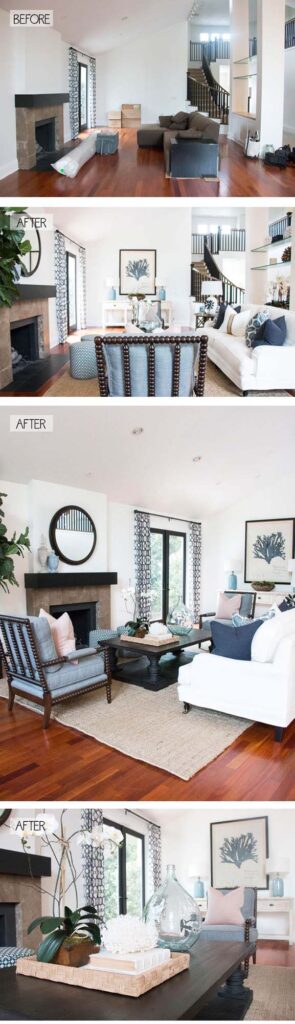
Every home has one dead zone. The wall nobody decorated, the corner holding a single sad plant, the stretch beside the doorway that never got a purpose. Bold accents fix those spots faster than furniture does.
Strong shapes and strong color claim empty space quickly. An oversized abstract canvas, a tall floor lamp with a black shade, or a striped runner leading toward the sofa gives the eye a reason to travel there. The key is committing to one big gesture instead of five small ones, because scattered decor makes a blank area look busier without making it feel filled. Height helps too, since blank walls usually suffer above eye level.
That awkward corner ends up being the spot people compliment first.
15. Coastal Makeover Emphasizes A Tall Ceiling
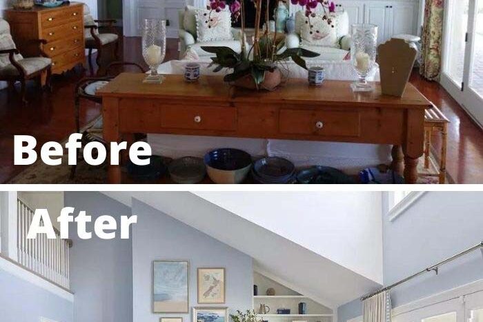
High ceilings are a gift that plenty of living rooms fail to use. Coastal style suits them well, because the palette is built on air and light rather than weight, so nothing competes with the height overhead.
Soft whites, sandy tones, and washed blues keep the walls receding, which lets the eye run all the way to the top. Then vertical elements carry it there. Long curtain panels from ceiling to floor, tall woven pendants dropped low over the seating, a ladder shelf against one wall. Painting the ceiling a shade lighter than the walls exaggerates the lift, and exposed beams left pale rather than dark keep the space breezy instead of barn-like.
💡 Suggestion: Hang one large piece of art higher than feels normal, roughly a foot above standard eye level. In tall rooms, art placed at conventional height leaves a dead band of wall above it, and that gap is what makes big ceilings look accidental instead of celebrated.
16. Use White To Brighten A Small Space
White gets picked for small rooms so often that people forget why it works. Reflection is the whole reason. Pale walls throw light back into the space instead of soaking it up, so a room with one window can still feel open through the afternoon.
The mistake is stopping at the walls. When trim, ceiling, and shelving all sit in the same white family, the corners stop announcing themselves and the boundaries soften, which makes the footprint read larger than it measures. Warm whites suit north-facing rooms, cooler ones handle strong sun better. Texture keeps it from turning sterile, so a nubby throw, a jute basket, and one wood surface do plenty.
Cleaning up feels less like a chore when the room already looks bright at seven in the morning.
17. Stunning Modern Living Room Makeover
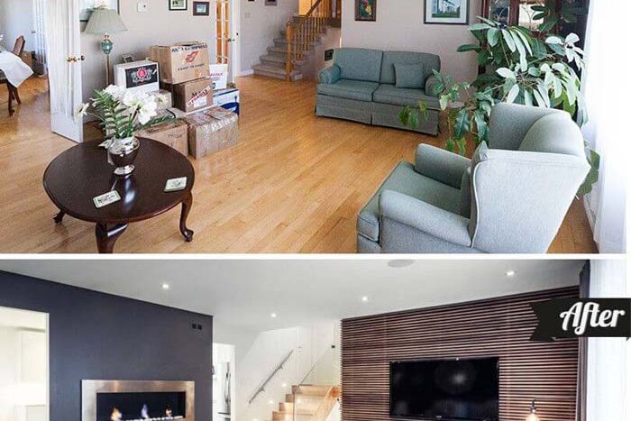
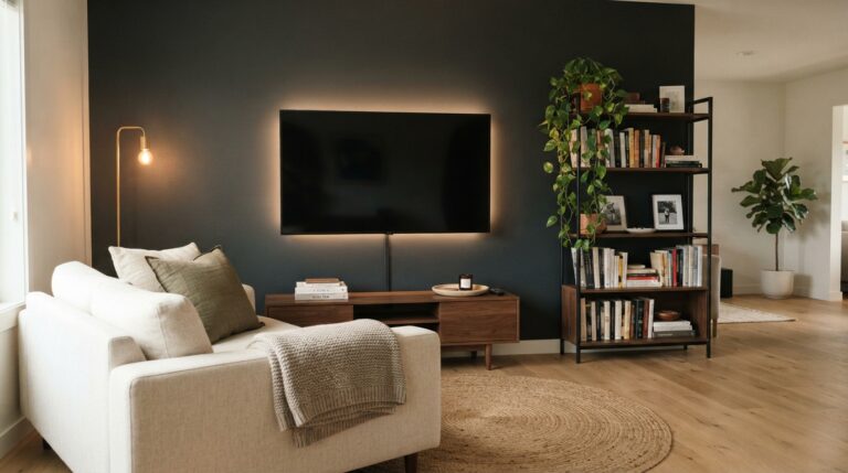
Modern doesn’t mean cold, though plenty of rooms miss that distinction. The look depends on clean lines, low profiles, and restraint, then warmth added back through material so the space still invites people to sit down.
Simple silhouettes are what make the style read as modern. A sofa with tight upholstery and slim arms, a coffee table without a shelf underneath, legs visible on most pieces so the floor stays in view. That openness underneath is a small detail with a big effect, since seeing more floor tricks the eye into reading more space. Grain in the wood, a leather chair, and one large plant stop the whole thing from feeling like a showroom.
Guests notice the room before they notice any single object in it, and that’s usually the sign it worked.
RELATED:
CLEVER PVC PIPE IDEAS TO UPGRADE YOUR HOME ON A BUDGET
18. Brighten A Dark Space With Colorful Accents
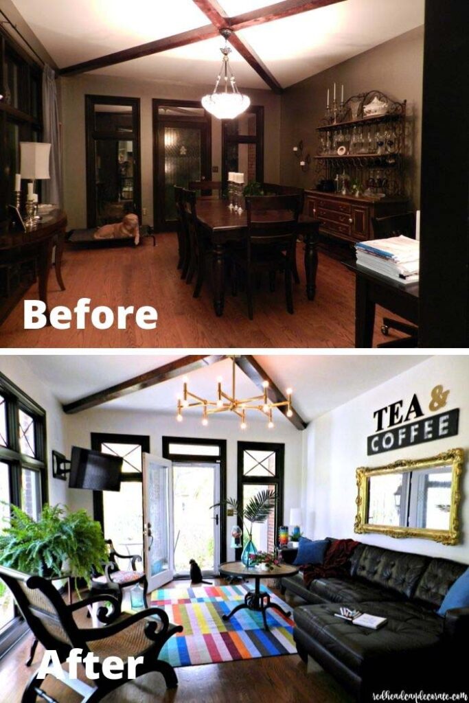
Some living rooms just don’t get much sun. North-facing windows, a neighbor’s wall blocking the view, a single opening at the far end. Fighting that with white paint alone rarely helps, because white without light turns grey and dull.
Color is the better answer. Warm accents in coral, ochre, or soft pink carry their own brightness, so the room reads cheerful even on an overcast Tuesday. Spread those hits around the space rather than clustering them, one on the sofa, one on the wall, one near the floor, and the eye keeps finding warmth wherever it lands. Metallic touches help too, since brass and gold pick up whatever lamplight there is and throw a little back.
The room stops feeling like a place people pass through on the way somewhere brighter.
19. Leaving Paneling In The Past

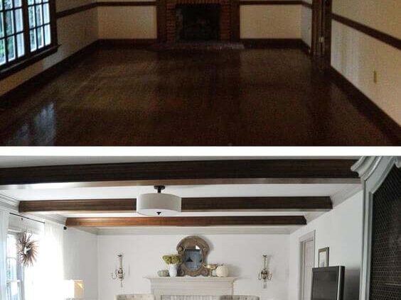
Dark wood paneling dates a living room faster than any piece of furniture. Those orange-brown boards absorb light, shrink the walls, and drag the whole space back a few decades whether the rest of the room is current or not.
Paint is the shortcut. A coat of primer followed by white, greige, or even a deep moody shade keeps the grooves as texture while erasing the dated tone completely, and the result looks intentional rather than covered up. Removing the panels works too if the drywall underneath is decent, though that turns a weekend job into a proper project. Either way, the walls stop shouting and the furniture finally gets noticed.
Photos taken in the room look different immediately, which is usually the moment the effort feels worth it.
20. Add Layered Style With Texture And Shine

A room can have the right colors and still look unfinished. What’s usually missing is contrast between surfaces, so everything sits at the same level of soft or the same level of flat and nothing stands out.
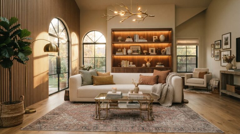
Layering fixes that by mixing how surfaces behave. Something rough like a jute rug, something soft like velvet cushions, something hard like a stone or marble tabletop, then one or two reflective pieces to catch the light. Shine matters more than people expect, because a brass lamp base or a glass side table bounces brightness into corners that fabric only absorbs. Three textures in a small room and four or five in a larger one is roughly where it starts looking designed instead of collected.
✅ Pro Tip: Photograph the room in black and white before adding anything else. Stripping out color shows exactly where the texture is missing, and any area that reads as one flat grey blob is the spot that needs a rougher weave or a reflective surface.
Frequently Asked Questions
How much does a living room makeover usually cost?
It depends entirely on how much you’re replacing. Paint, new cushion covers, a rearranged layout, and higher curtain rods can come together for very little, since the labor is mostly your own weekend. Costs climb once furniture enters the picture, especially a sofa or a properly sized rug.
The smarter approach is to spend where the room is failing. If the walls are dated, paint first. If the seating is uncomfortable, everything else can wait. Fixing the actual problem beats spreading a budget thin across five small updates that don’t address it.
What should I change first in a living room makeover?
Start with the walls, because paint resets everything around it. Once the color is right, you can judge the furniture honestly instead of guessing how it’ll look later.
After that, sort out the layout before buying anything new. Plenty of rooms feel cramped purely because the sofa is pushed against the wrong wall or a bookcase is blocking the window. Moving pieces around costs nothing and often solves the problem you were about to spend money on. Decor comes last, since it only looks right once the bones are settled.
How do I make a small living room look bigger?
Three things do most of the work. Light walls, furniture with visible legs, and a mirror placed across from the window. Seeing more floor underneath the sofa tricks the eye into reading more space, which is why bulky skirted pieces make small rooms feel tighter.
Hanging curtains close to the ceiling helps too, since the wall reads taller than it measures. Keep the palette tight, use one larger rug rather than two small ones, and resist filling every corner. Empty space is part of what makes a small room feel open.
Can I use dark paint colors in a living room with little natural light?
Yes, and it often works better than white. Pale walls need daylight to look bright, so a dim room painted white usually turns a dull grey instead. Deep navy, charcoal, or forest green skips that problem completely by leaning into the mood rather than fighting it.
The trick is lighting and contrast. Keep the ceiling and trim lighter, add lamps at two or three heights, and bring in brass, cream, or pale wood so the darkness has something to push against. The room ends up cozy rather than gloomy.
How do I choose the right rug size for my living room?
Go bigger than instinct suggests. The most common mistake is a rug that floats in the middle of the room with all the furniture stranded around it, which chops the space into pieces.
At minimum, the front legs of the sofa and every chair should sit on the rug. Ideally the whole seating group fits, with eight to ten inches of bare floor showing around the edges. In open floor plans, that boundary is what separates the living area from the walkway, so size matters far more than pattern or color.
What’s the easiest way to update a living room without buying furniture?
Change the small things the eye lands on first. Cushion covers, a different throw, lamp shades, and whatever is sitting on the coffee table. Those swaps shift the whole mood for very little.
Then edit rather than add. Clearing two surfaces makes the remaining pieces look deliberate instead of piled up. Rehanging art at the right height and moving curtain rods closer to the ceiling costs nothing but a few anchors, and both changes make the room look considered. Rearranging the layout is free and frequently the biggest improvement available.
How many colors should a living room have?
Two or three main colors, plus one accent, keeps things cohesive without going flat. Anything beyond that starts competing, and the room reads busy even when each individual piece looks good.
Neutral schemes are the exception, since they lean on texture instead of hue. There, you might use four or five shades within the same family and never feel crowded, because the contrast comes from material. Linen, bouclé, jute, and wood all behave differently in light. That’s what gives the eye something to read when the color story stays quiet.
CONCLUSION
The best living room makeovers rarely start with a shopping list. They start with a look around the room and an honest read on what’s actually holding it back. Sometimes that’s dated paneling or dark walls swallowing the light. Other times it’s nothing more than curtain rods hung too low and a rug two sizes too small.
That’s the useful thread running through all twenty of these ideas. Height came from moving a rod, not knocking out a wall. Zones came from a rug, not new construction. Depth came from mixing textures already scattered around the house. Even the bigger swings, like a bold wall color or planks behind the sofa, land in a weekend rather than a renovation schedule.
Pick one change and start there. Paint the walls, clear the path to the window, or finally fill that blank stretch behind the sofa with something worth looking at. Momentum builds quickly once the first improvement is sitting in front of you.
A living room doesn’t need to be perfect to feel good. It just needs to feel like the place everyone actually wants to end up.